Tag: font

  • manipulating type in Illustrator

    manipulating type in Illustrator

    The college homework saga continues! We are currently designing the nameplate, or title, of our magazine. After scrolling through adobe fonts, I finally found my font: casserole. Which is such a fun name and just warms my Midwest heart.

    But picking a font was just the beginning. Now I have to expand my Illustrator skill set and figure out just how to manipulate type. I haven’t done a whole lot with typography so I consulted google and found these really helpful videos.

    I learned a lot about the pencil tool! I’ve become so comfortable with the pen tool, that I haven’t tried it. That ends today!

    Brainstorming

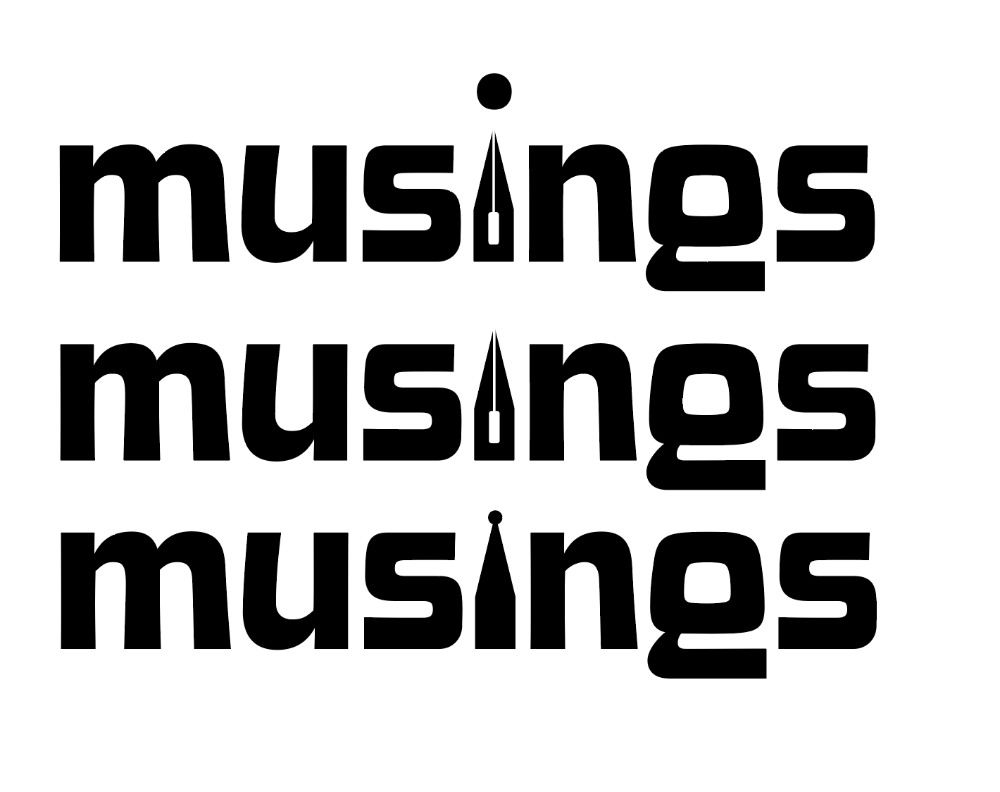
    My magazine title is musings. After thinking and surfing Pinterest, I wanted to try incorporating a quill nib into the title.

    some generic quill nibs (not my pic)

    I started sketching how I wanted the nib to replace the i in musings.

    some of my scribblings!
    some iterations

    I like the one in the middle. I don’t think I need a dot for the i. This week, I’m going to check in with my teacher and get some feedback. I couldn’t for the life of me figure out how to knock out the middle pieces of the quill either.

    That’s all for today folks! Did you learn anything new?

    • revising past projects

      I’ll be the first to admit, I wish I could do all of my projects to 210% of my ability. But with multiple school projects, working twenty hours a week, and trying to adult, it gets to be a lot sometimes. Because of my busy school and work life, sometimes my projects aren’t to the…

    • quick library flyer design

      After the exhausting saga of calling my local legislators, I wanted to draft up a quick library flyer design. I’m not looking to print them en mass from another site, so I want to print them on a 11 x 8.5″ sheet of paper. The Process The Final Flyer Design Side by Side Comparison I…

    • beefing up my Linkedin profile

      I think everyone on the planet has a linkedin profile, myself included. However, I have not done much with it besides create an account. With some extra time during my first week of school, I wanted to try to beef up my profile. What I did I’ll admit, I definitely need to learn more about…
  • typography deep dive

    Class has started! And of course on day one, I already have an assigned presentation for the second week of school. Basically the class was split into groups and given design rules we have to learn and present.

    My two design principles are:

    • Type is only type when it’s friendly
    • Use two typeface families, maximum

    So I’d figure in an effort to prepare for my presentation, I’d share my thoughts and some typography research with yall.

    Type is only type when it’s friendly

    According to the book: Type is only type when it’s friendly begs designers to keep type expressive but legible. You want your font to have some personality, but more importantly, be easy to read. So make sure you choose a friendly font and color when working with type to ensure your message comes across clearly to your audience.

    Use two typeface families, maximum

    Use two typeface families, maximum is rather straightforward. Overall, you want your two fonts to work together, and adding additional fonts may mess with the flow of unity. When you use two fonts, make sure they have a broad family with different thicknesses, italics, etc. When choosing two typeface families make sure there is some contrast like sans serif vs. serif or thick vs. thin.

    Well, that about sums it all up. Are there any other typeface rules you follow? Let me know below.

    From the blog

    Stay up to date with the latest from our blog.

    • ways to unwind without a screen

      I don’t know about you guys, but after staring at a screen for four hours, I need a little break. So, I decided to compile…

    • the final countdown: aka semester final projects

      I’ve been chipping away at my final projects! Right now, I’m finalizing my last article spread. I really want to have it nearly finished so…

    • perfume label progress

      I’ve been steadily working on my perfume label in class. Initially, I wanted the perfume to have the scent of bleeding heart flowers, but since…

    • design legends you should know #7 Jessica Walsh

      Jessica Walsh is a graphic designer, creative director, author, illustrator, design teacher, and founder of the design agency &Walsh. Her Career Walsh was born in…