Tag: font

  • manipulating type in Illustrator

    manipulating type in Illustrator

    The college homework saga continues! We are currently designing the nameplate, or title, of our magazine. After scrolling through adobe fonts, I finally found my font: casserole. Which is such a fun name and just warms my Midwest heart.

    But picking a font was just the beginning. Now I have to expand my Illustrator skill set and figure out just how to manipulate type. I haven’t done a whole lot with typography so I consulted google and found these really helpful videos.

    I learned a lot about the pencil tool! I’ve become so comfortable with the pen tool, that I haven’t tried it. That ends today!

    Brainstorming

    My magazine title is musings. After thinking and surfing Pinterest, I wanted to try incorporating a quill nib into the title.

    some generic quill nibs (not my pic)

    I started sketching how I wanted the nib to replace the i in musings.

    some of my scribblings!
    some iterations

    I like the one in the middle. I don’t think I need a dot for the i. This week, I’m going to check in with my teacher and get some feedback. I couldn’t for the life of me figure out how to knock out the middle pieces of the quill either.

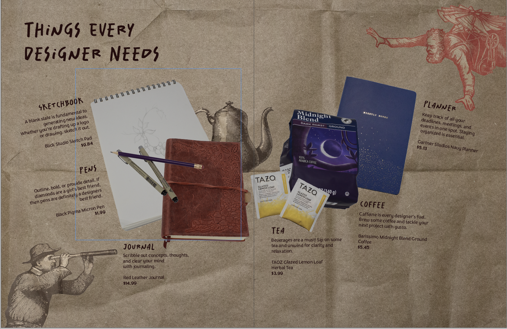
    That’s all for today folks! Did you learn anything new?

    • how do you even contact your reps?

      I’ve been wanting to make an informative social media post about contacting reps for my library awareness campaign. So, the only way I could give a lot of helpful information was to do it myself. The Process I didn’t want to go in completely blind so I found some articles. Here’s one on calling reps.…

    • managing library social media efforts

      Well team, figuring out how to find your legislators has been a hassle. It’s what I’m working on currently for my library awareness social media campaign. Right now I’m in the midst of finding out how to contact legislators about library funding. I’ll update yall on that later. Right now, I try to post every…

    • winter break update #3

      I’m alive I swear! I’ve been busy with work and catching up on adulting. The current library campaign has also been taking up a lot of my energy. (sdlibraryadvocates on Insta and FB if you wanna take a look!) I’ve been trying to create posts highlighting library resources and spreading awareness of the proposed budget…

  • typography deep dive

    Class has started! And of course on day one, I already have an assigned presentation for the second week of school. Basically the class was split into groups and given design rules we have to learn and present.

    My two design principles are:

    • Type is only type when it’s friendly
    • Use two typeface families, maximum

    So I’d figure in an effort to prepare for my presentation, I’d share my thoughts and some typography research with yall.

    Type is only type when it’s friendly

    According to the book: Type is only type when it’s friendly begs designers to keep type expressive but legible. You want your font to have some personality, but more importantly, be easy to read. So make sure you choose a friendly font and color when working with type to ensure your message comes across clearly to your audience.

    Use two typeface families, maximum

    Use two typeface families, maximum is rather straightforward. Overall, you want your two fonts to work together, and adding additional fonts may mess with the flow of unity. When you use two fonts, make sure they have a broad family with different thicknesses, italics, etc. When choosing two typeface families make sure there is some contrast like sans serif vs. serif or thick vs. thin.

    Well, that about sums it all up. Are there any other typeface rules you follow? Let me know below.

    From the blog

    Stay up to date with the latest from our blog.

    • what the heck is a lead in spread

      Well folks I hit a brick wall. Even google couldn’t give me a clear answer when googling “what is a lead in magazine spread?” I’m…

    • product spread adventures

      product spread adventures

      Making my first product spread was a rollercoaster! It challenged me to beef up my photography skills and problem-solve. My magazine is all design-centered. So…

    • creating a perfume brand

      This weeks new project was introduced and I’m soooo excited. We are making product labels! Everyone in class had to bring in a package with…

    • making more moodboards

      making more moodboards

      In my New Media Class, we are making website mood boards for a fictitious client. The website is for Chef Jaqueline, who specializes in making…