Class has started! And of course on day one, I already have an assigned presentation for the second week of school. Basically the class was split into groups and given design rules we have to learn and present.
My two design principles are:
- Type is only type when it’s friendly
- Use two typeface families, maximum
So I’d figure in an effort to prepare for my presentation, I’d share my thoughts and some typography research with yall.
Type is only type when it’s friendly
According to the book: Type is only type when it’s friendly begs designers to keep type expressive but legible. You want your font to have some personality, but more importantly, be easy to read. So make sure you choose a friendly font and color when working with type to ensure your message comes across clearly to your audience.
Use two typeface families, maximum
Use two typeface families, maximum is rather straightforward. Overall, you want your two fonts to work together, and adding additional fonts may mess with the flow of unity. When you use two fonts, make sure they have a broad family with different thicknesses, italics, etc. When choosing two typeface families make sure there is some contrast like sans serif vs. serif or thick vs. thin.
Well, that about sums it all up. Are there any other typeface rules you follow? Let me know below.
From the blog
Stay up to date with the latest from our blog.
-
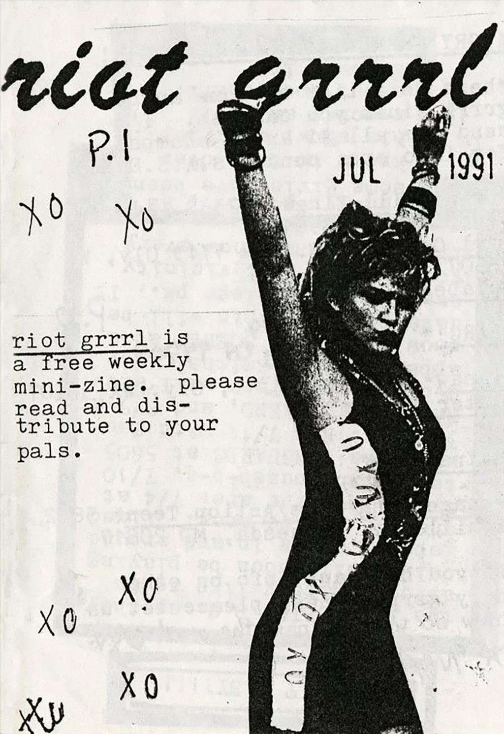
delving into magazines and zines
Today I started my morning with a video from one of my favorite Youtubers, Mina Le. She made a video essay detailing the rise and…
-
trying sticker design
In an effort to stay in Illustrator, I messed around with the idea of making stickers. Usually if I wanted to buy stickers, I’d scour…
-
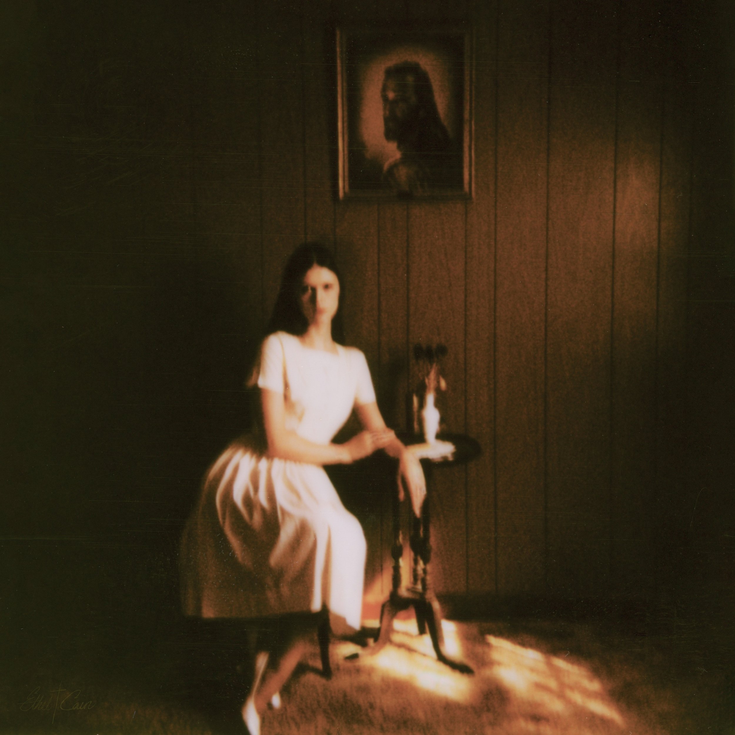
preacher’s daughter inspired design
Lately I’ve been listening to Ethel Cain’s album Preacher’s Daughter. The music takes you on a journey from the perspective of Ethel as she journeys…
-
staying in design software over the summer
Summer for me goes by super fast! Whether I’m passing the days working full time, visiting family, or going on trips it can be hard…