Tag: typography

  • making more moodboards

    making more moodboards

    In my New Media Class, we are making website mood boards for a fictitious client. The website is for Chef Jaqueline, who specializes in making cakes and baked goods for big events. I first started off with making up a moodboard template in Photoshop and then filling it in. There are various mood board templates online that you can find as well.

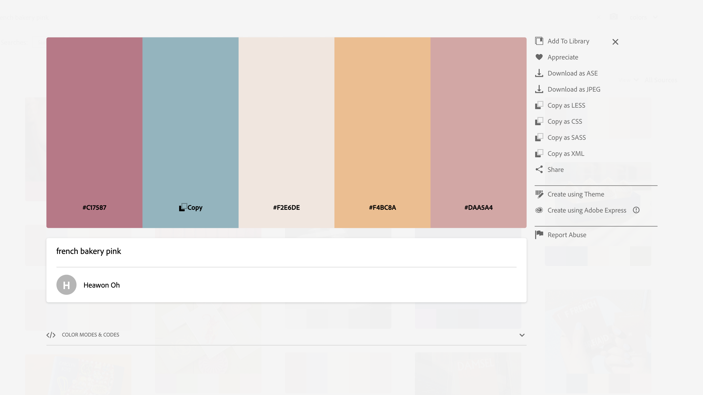
    I love color and decided to hop onto color.adobe.com. They have all sorts of color palettes. I searched up terms like bakery, cookies, and cake to get some potential color options. I ended up going with a pink French bakery color palette.

    For fonts, I wasn’t too sure. I looked at other local bakery sites for ideas. Most headline fonts were bold, readable, and sans serif.

    I found a font I really liked for headlines, called New Kansas. I usually get my fonts from Adobe fonts. I went with a sans serif sub headline font, Elza. And then a simple serif font, Dolly Pro, for the body copy.

    I also had to make sure my navbar colors were easily readable. I experimented with my different palette colors to find the best option. To make sure, I used this color checker website.

    Ta Da! The finished mood board

    Read more posts for design insights. Until next time 🙂

    From the blog

    Stay up to date with the latest from our blog.

    • intern diaries #3

      I finally finished my first assigned ticket/project! It was a really simple task but still. I had to turn a bookmark file into an 8.5…

    • finishing up odds and ends

      With the clock ticking until graduation, I’ve got a lot of irons in the fire. This week has been crazy hectic and so far I’ve…

    • the intern diaries #2

      Currently, I’m working on an ultra top-secret (not really) chatbot design. I’ve been given the chance to determine a chatbot’s graphic and overall branding. I…

    • new etching design: the process

      Thanks to a tour at JDS Industries, I am the new owner of a leatherette journal. I can etch into it with the school’s laser…
  • design legends you should know #5 Paula Scher

    design legends you should know #5 Paula Scher

    Paula Scher is a painter, album covers, educator, layout artist and renowned graphic designer.

    Her Work Through The Years

    With a start at the Tyler School of Art, Scher graduated with a Bachelor in Fine Arts in 1970. She then became a layout artist at the children’s division at Random House. Switching gears, she worked at CBS and then Atlantic Records. Her album covers received four Grammy nominations.

    In the 80’s she sought out freelance graphic design, before starting a firm in 1984 with Tyler Koppel. The firm dissolved during the recession and Scher went to work for the design firm, Pentagram, in 1991. Currently, she is the principal at Pentagram.

    As well as working Pentagram, Scher taught at the School of Visual Arts, Tyler School of Art, Yale, and Cooper Union.

    Iconic Work

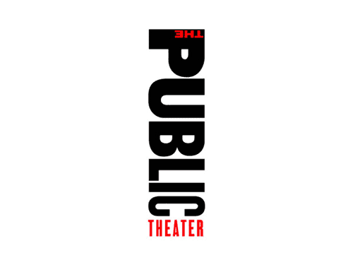
    What put Scher on the map, was her identity creation for the Public Theater in New York City. Through her unique, graffiti-inspired typography, Scher was able to inspire the graphic design world.

    One of Paula Scher’s poster design for The Public Theater
    Scher’s rebranded Public Theater Logo

    Other notable logo designs are Tiffany and Co., Citibank, Windows, and the Metropolitan Opera.

    Album Covers

    Album Ginseng Woman designed by Paula Scher and Andy Engel
    Boston’s album designed by Paula Scher and illustrated by Roger Huyssen

    That’s really just a snippet of her expansive portfolio. Here’s a great book of her work! Preview it here.

    Sources

    From the blog

    Stay up to date with the latest from our blog.

    • intern diaries #3

      I finally finished my first assigned ticket/project! It was a really simple task but still. I had to turn a bookmark file into an 8.5…

    • finishing up odds and ends

      With the clock ticking until graduation, I’ve got a lot of irons in the fire. This week has been crazy hectic and so far I’ve…

    • the intern diaries #2

      Currently, I’m working on an ultra top-secret (not really) chatbot design. I’ve been given the chance to determine a chatbot’s graphic and overall branding. I…

    • new etching design: the process

      Thanks to a tour at JDS Industries, I am the new owner of a leatherette journal. I can etch into it with the school’s laser…

  • manipulating type in Illustrator

    manipulating type in Illustrator

    The college homework saga continues! We are currently designing the nameplate, or title, of our magazine. After scrolling through adobe fonts, I finally found my font: casserole. Which is such a fun name and just warms my Midwest heart.

    But picking a font was just the beginning. Now I have to expand my Illustrator skill set and figure out just how to manipulate type. I haven’t done a whole lot with typography so I consulted google and found these really helpful videos.

    I learned a lot about the pencil tool! I’ve become so comfortable with the pen tool, that I haven’t tried it. That ends today!

    Brainstorming

    My magazine title is musings. After thinking and surfing Pinterest, I wanted to try incorporating a quill nib into the title.

    some generic quill nibs (not my pic)

    I started sketching how I wanted the nib to replace the i in musings.

    some of my scribblings!
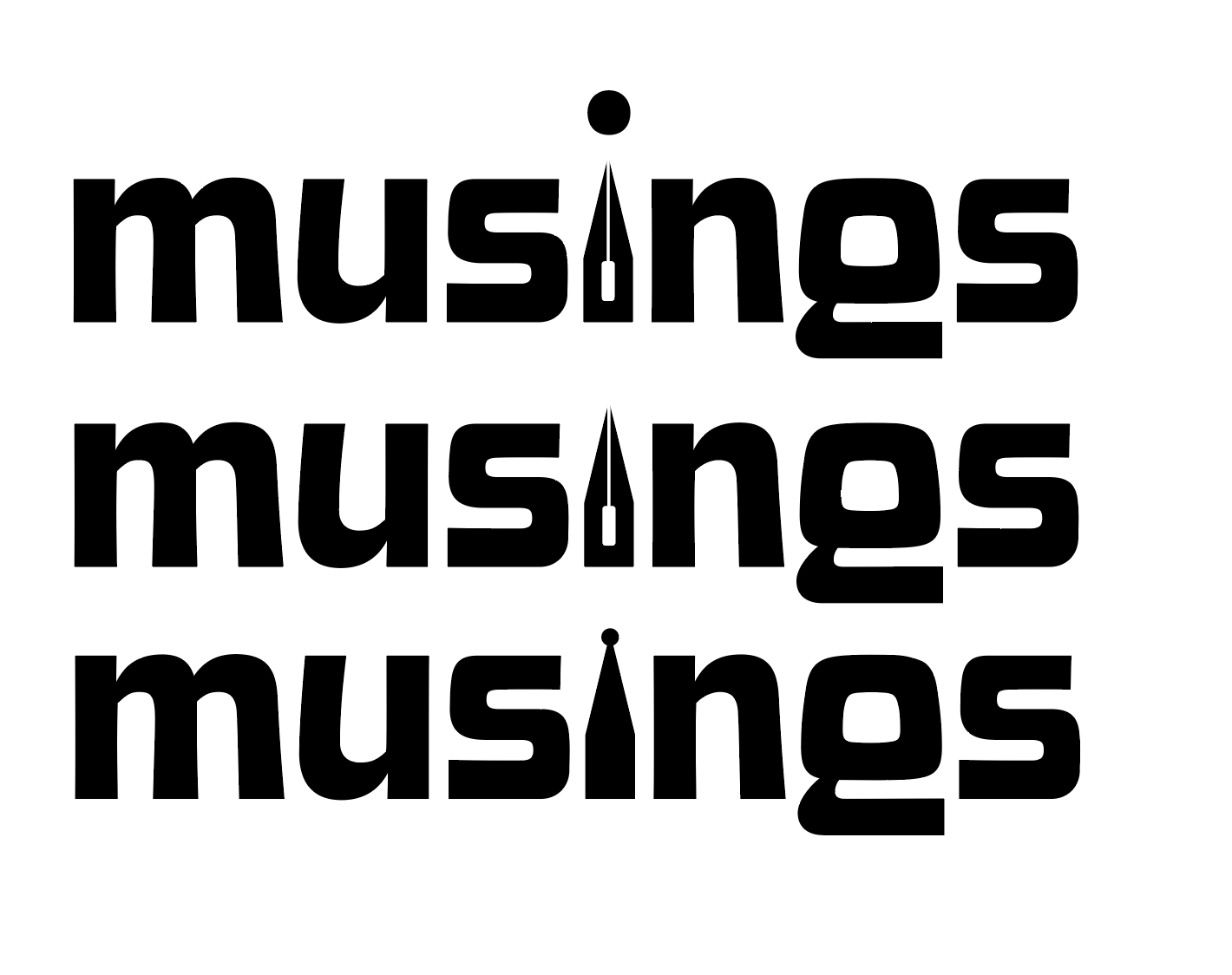
    some iterations

    I like the one in the middle. I don’t think I need a dot for the i. This week, I’m going to check in with my teacher and get some feedback. I couldn’t for the life of me figure out how to knock out the middle pieces of the quill either.

    That’s all for today folks! Did you learn anything new?

    • the ten piece poster final form

      After way too long, I’ve finally finished the ten-piece campaign poster. Deep down, I wanted to create more of an art-centered poster. But with all of my classes and working part-time, I’m left with minimal time. I opted for a simple and sleek poster design. I scrapped most of what I started with. Throughout a…

    • intern diaries #3

      I finally finished my first assigned ticket/project! It was a really simple task but still. I had to turn a bookmark file into an 8.5 x 11″ flyer. There were some bumps in the road. The bookmark functioned as a coupon for a free library bag, which would be odd for a flyer. I asked…

    • finishing up odds and ends

      With the clock ticking until graduation, I’ve got a lot of irons in the fire. This week has been crazy hectic and so far I’ve crossed some stuff off my to do list like: and believe it or not I still have a lot more to do 🙁 My growing to do list: I’m gonna…