In my New Media Class, we are making website mood boards for a fictitious client. The website is for Chef Jaqueline, who specializes in making cakes and baked goods for big events. I first started off with making up a moodboard template in Photoshop and then filling it in. There are various mood board templates online that you can find as well.
I love color and decided to hop onto color.adobe.com. They have all sorts of color palettes. I searched up terms like bakery, cookies, and cake to get some potential color options. I ended up going with a pink French bakery color palette.

For fonts, I wasn’t too sure. I looked at other local bakery sites for ideas. Most headline fonts were bold, readable, and sans serif.
I found a font I really liked for headlines, called New Kansas. I usually get my fonts from Adobe fonts. I went with a sans serif sub headline font, Elza. And then a simple serif font, Dolly Pro, for the body copy.
I also had to make sure my navbar colors were easily readable. I experimented with my different palette colors to find the best option. To make sure, I used this color checker website.

Read more posts for design insights. Until next time 🙂
From the blog
Stay up to date with the latest from our blog.
-

design legends you should know #4 David Carson
Rulebreaker, Father of Grunge Typography, prolific surfer. All things that aptly describe David Carson. Carson started out as a high school teacher in Oregon, where…
-

manipulating type in Illustrator
The college homework saga continues! We are currently designing the nameplate, or title, of our magazine. After scrolling through adobe fonts, I finally found my…
-
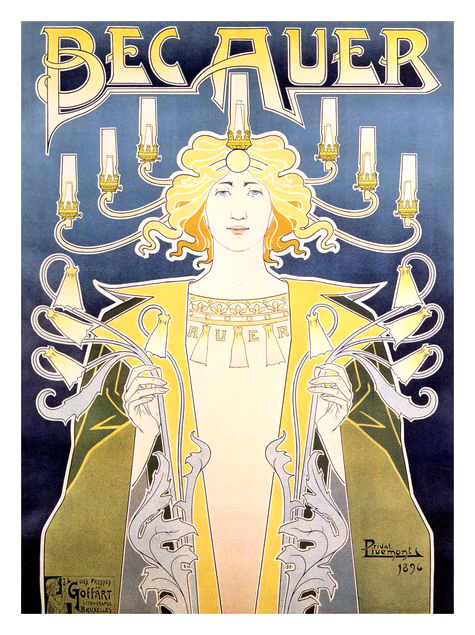
design legends you should know #3 Henri Privat-Livemont
Let me take you way back to the 1890s, when minimalism is out and fanciful Art Nouveau is in. My first exposure to this style…
-
SD AAF student day reflections
I was able to go to the SD AAF (American Advertising Federation) student day! It was such a great opportunity and I thought I’d share…