Tag: typeface

  • manipulating type in Illustrator

    manipulating type in Illustrator

    The college homework saga continues! We are currently designing the nameplate, or title, of our magazine. After scrolling through adobe fonts, I finally found my font: casserole. Which is such a fun name and just warms my Midwest heart.

    But picking a font was just the beginning. Now I have to expand my Illustrator skill set and figure out just how to manipulate type. I haven’t done a whole lot with typography so I consulted google and found these really helpful videos.

    I learned a lot about the pencil tool! I’ve become so comfortable with the pen tool, that I haven’t tried it. That ends today!

    Brainstorming

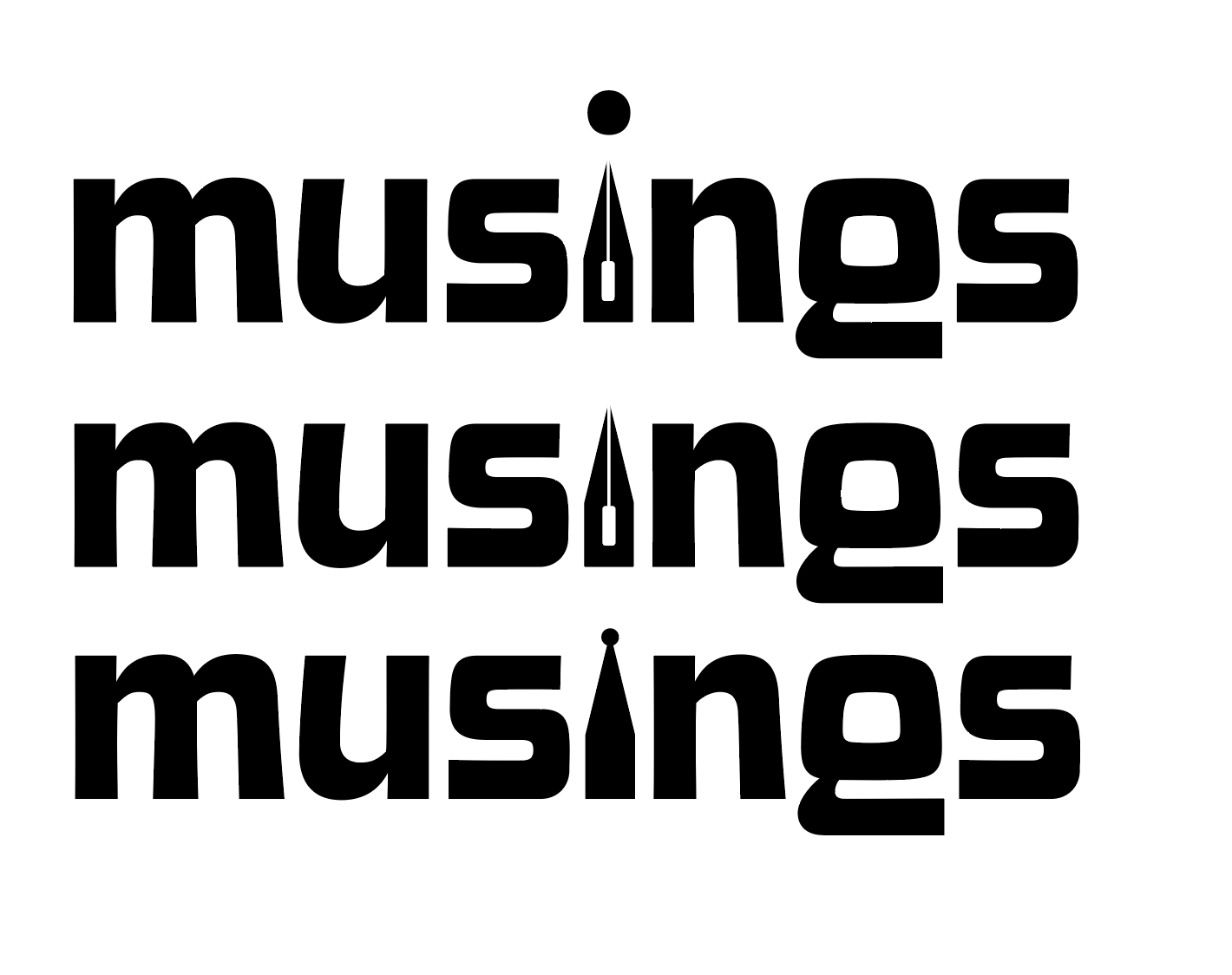
    My magazine title is musings. After thinking and surfing Pinterest, I wanted to try incorporating a quill nib into the title.

    some generic quill nibs (not my pic)

    I started sketching how I wanted the nib to replace the i in musings.

    some of my scribblings!
    some iterations

    I like the one in the middle. I don’t think I need a dot for the i. This week, I’m going to check in with my teacher and get some feedback. I couldn’t for the life of me figure out how to knock out the middle pieces of the quill either.

    That’s all for today folks! Did you learn anything new?

    • finally making a dent in my to do list

      After a crazy week, I’ve managed to cross most of my things off my list! So far I’ve finished: It’s hard to believe that the portfolio show is this week! And then graduation the week after. In the middle of the chaos, I still found time to work, dogsit, and make some shrinky-dink earrings. I’m…

    • almost done with my ten-piece campaign

      After what seems like actual AGES, I’m almost done with my ten-piece campaign for Layout 3. I’ve finished I only have the festival map left! Thank goodness. Here are some snippets of my finished products.

    • the library hiatus is over

      After all of the advocacy work I’ve done for the library, I was hopeful that I was done. However, with the shutdown of the Institute of Library and Museum Services (ILMS), I am far from it. A lot of South Dakotans (myself included) made numerous calls to our SD legislators in hopes of restoring the…

  • design legends you should know #1 Susan Kare

    In school they teach you about influential people, founding fathers, famous artist, etc. But in college, we haven’t discussed important graphic designers. So I’ve taken it upon myself to educate myself and ya’ll while I’m at it.

    Today’s design star is Susan Kare

    So who is Susan Kare, the “woman who gave the Macintosh a smile”?

    Susan Kare is most known for her work at Apple. She got her start there in 1983 as a Macintosh Artist. Despite not knowing anything about computer graphics and typefaces, she educated herself at the local library and aced the interview.

    At Apple, Kare was in charge of designing icons and typefaces for the Mac operating system. She worked with graph paper to design some of Apple’s most iconic icons such as the ticking bomb for system error, trash can, the pointed arrow cursor and more.

    Because her icon designs were universal and friendly, they encouraged technology-illiterate users to try out computers.

    Susan Kare’s icon designs, courtesy of kareprints.com

    She also designed fonts, contributed to the Mac rollout campaign, and demonstrated the capabilities of the MacPaint application.

    Kare went on to create her own design firm, Susan Kare LLP, in 1989. Her design skills were used at companies like Microsoft, Oracle, Facebook, and even Pinterest.

    source

    Have you heard of Susan Kare? Are there any graphic designers I should look into next? Let me know 🙂

    From the blog

    Stay up to date with the latest from our blog.

    • finally making a dent in my to do list

      After a crazy week, I’ve managed to cross most of my things off my list! So far I’ve finished: It’s hard to believe that the…

    • almost done with my ten-piece campaign

      After what seems like actual AGES, I’m almost done with my ten-piece campaign for Layout 3. I’ve finished I only have the festival map left!…

    • the library hiatus is over

      After all of the advocacy work I’ve done for the library, I was hopeful that I was done. However, with the shutdown of the Institute…

    • the ten piece poster final form

      After way too long, I’ve finally finished the ten-piece campaign poster. Deep down, I wanted to create more of an art-centered poster. But with all…

  • typography deep dive

    Class has started! And of course on day one, I already have an assigned presentation for the second week of school. Basically the class was split into groups and given design rules we have to learn and present.

    My two design principles are:

    • Type is only type when it’s friendly
    • Use two typeface families, maximum

    So I’d figure in an effort to prepare for my presentation, I’d share my thoughts and some typography research with yall.

    Type is only type when it’s friendly

    According to the book: Type is only type when it’s friendly begs designers to keep type expressive but legible. You want your font to have some personality, but more importantly, be easy to read. So make sure you choose a friendly font and color when working with type to ensure your message comes across clearly to your audience.

    Use two typeface families, maximum

    Use two typeface families, maximum is rather straightforward. Overall, you want your two fonts to work together, and adding additional fonts may mess with the flow of unity. When you use two fonts, make sure they have a broad family with different thicknesses, italics, etc. When choosing two typeface families make sure there is some contrast like sans serif vs. serif or thick vs. thin.

    Well, that about sums it all up. Are there any other typeface rules you follow? Let me know below.

    From the blog

    Stay up to date with the latest from our blog.

    • finally making a dent in my to do list

      After a crazy week, I’ve managed to cross most of my things off my list! So far I’ve finished: It’s hard to believe that the…

    • almost done with my ten-piece campaign

      After what seems like actual AGES, I’m almost done with my ten-piece campaign for Layout 3. I’ve finished I only have the festival map left!…

    • the library hiatus is over

      After all of the advocacy work I’ve done for the library, I was hopeful that I was done. However, with the shutdown of the Institute…

    • the ten piece poster final form

      After way too long, I’ve finally finished the ten-piece campaign poster. Deep down, I wanted to create more of an art-centered poster. But with all…