I’ll be the first to admit, I wish I could do all of my projects to 210% of my ability. But with multiple school projects, working twenty hours a week, and trying to adult, it gets to be a lot sometimes. Because of my busy school and work life, sometimes my projects aren’t to the caliber that I try to uphold. So with some extra time this week, I wanted to revise some past projects.
Victim number one, I mean project number one, was my packaging design from last semester. I love the idea of it, but it just felt a little flat to me. The back seemed too plain.
The original packaging design
I made some minor adjustments, by increasing the size of the tagline above the rainbow, and keeping the rectangle motif. I think that helped it feel a bit more streamlined and professional feeling.
slightly tweaked packaging designnew logo type w/tweaked packaging design
I wanted to play around with the logo design as well. It just felt a bit rushed. In the future, I’ll take my revised versions to my teacher to get some feedback. The new logo design is growing on me. What do you think?
Hopefully I’ll post some more revised projects. Until then!
I think everyone on the planet has a linkedin profile, myself included. However, I have not done much with it besides create an account. With some extra time during my first week of school, I wanted to try to beef up my profile.
What I did
Added work experience and skills
I included soft skills and more technical ones
Started watching Learning Linkedin (on linkedin learning)
Change my profile and banner picture
Eventually, I need to update my headshot
Added my college details (degree type, AAS, awards, etc)
Connected with classmates/previous classmates to expand my network
I’ll admit, I definitely need to learn more about how to manage my LinkedIn profile. But I have a great start and hopefully will have more to add in the next months before graduation!
How do you clean up your LinkedIn profile? Any tips or tricks?
I’ve been asked to create some Facebook ads (for Amaryllis bulbs) and let me tell you, I have no idea where to start. Facebook isn’t something I interact with a whole lot, I’m more drawn to Instagram or Pinterest. However, I thought I’d look into Facebook ads and take ya’ll along for the ride.
So my main questions I need to figure out are as follows:
What Photoshop dimensions should I use?
What are the photo copyright rules for ads?
What do typical flower ads look like?
What makes an ad successful?
Which brings me to research!
Here are my findings:
Facebook dimensions vary by preferred ad layouts. However, my client will be posting the ads as Facebook posts. So I really need to figure out FB Photoshop post dimensions. I kept on running into dimensions for Facebook image/video post sizes. (Will report back with my final answer soon🫡)
When it comes to image copyright research, here is the situation. I’ve been tasked with creating amaryllis bulb ads. I want to be able to show customers the final amaryllis blooms, but the florist doesn’t have any of her own pictures with her current bulbs. Soo.. then I need to figure out the image situation. I found this website that brings up a few legal good points. My temporary solution is to use some of her old photos if possible.
General flower ads all display big, colorful arrangements. Then it has the basic ad elements such as a headline, call to action, etc. I’m kind of on my own because my client is advertising wax-dipped amaryllis bulbs. (Which is a bit too niche for Google)
Keeping your ad message clear and directed towards your audience is one way to create a successful ad. So my audience is primarily older women looking to buy flowers for themselves or others. My headline and visuals should align with my desired target market. Some more great tips are here.
Phew that was a lot. Hopefully, I can hit the ground running and drum up some great ideas. I’ll keep you posted! Until next time, keep designing.
Well guys, it’s been a busy break! I visited more family, worked on more projects, and am trying to stay in my software. After seeing my mom’s side of the family for Christmas, I used my days off of work to start an awareness campaign. Right now, the proposed South Dakota budget reduces the SD…
Winter break is in full swing! I’ve been meaning to blog, but I’ve been sooo busy. Between working, I went to see my family in Minnesota and then caught up with some old friends. What have ya’ll been up to? Happy Holidays! Posts
I don’t know about you guys, but after staring at a screen for four hours, I need a little break. So, I decided to compile some things you can do to when you need to get away from the screen. things to do other than staring at a screen Additional Ideas: For me, I’ll be…
I’ve been chipping away at my final projects! Right now, I’m finalizing my last article spread. I really want to have it nearly finished so I can get feedback and turn in my magazine before class ends tomorrow. Here are my different iterations: I think I’m leaning towards the last one. Maybe I’ll change the…
I’ve been steadily working on my perfume label in class. Initially, I wanted the perfume to have the scent of bleeding heart flowers, but since the bottle is an amber color, I decided on an orange scent. I’m still playing around with font combinations for the brand. But I am happy with the body copy…
Jessica Walsh is a graphic designer, creative director, author, illustrator, design teacher, and founder of the design agency &Walsh. Her Career Walsh was born in Rhode Island in 1986. Before even stepping foot in college, she coded and designed websites at 11 years old. She got her BFA at Rhode Island School of Design in…
Well folks I hit a brick wall. Even google couldn’t give me a clear answer when googling “what is a lead in magazine spread?” I’m furiously researching this because I happen to have a lead in spread due tomorrow afternoon for class. I’ve scavenged the internet and found resources for how to write a lead…
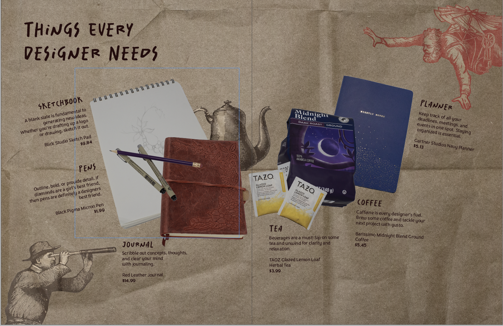
Making my first product spread was a rollercoaster! It challenged me to beef up my photography skills and problem-solve. My magazine is all design-centered. So I wanted my product spread to align with that. I decided to make the theme of the spread: things designers need. (That way I could scavenge my apartment for things…
This weeks new project was introduced and I’m soooo excited. We are making product labels! Everyone in class had to bring in a package with an inset label. I dug up a funky shaped body spray bottle. So my task is to make another label for the bottle. We get to make a brand, logo,…
In my New Media Class, we are making website mood boards for a fictitious client. The website is for Chef Jaqueline, who specializes in making cakes and baked goods for big events. I first started off with making up a moodboard template in Photoshop and then filling it in. There are various mood board templates…
I was able to go to the SD AAF (American Advertising Federation) student day! It was such a great opportunity and I thought I’d share what I learned with you guys.
Some recurring pieces of advice that kept coming up during different panels were:
Keep learning
Graphic design is a vastly evolving practice. You need to learn relevant skills and keep up with new software to survive in this industry
Check out free online classes, local conferences, and webinars!
Just start!
Whether it’s a project, application, or class, just start. You can’t figure out your strengths if you won’t try things.
Ask questions
Questions are great for clarifying things or learning more about a certain topic. You’ll never know if you stay silent. So speak up and stay curious.
Most agencies/designers/professionals are willing to help students
Industry professionals shared that they are open to job shadowing, portfolio reviews, and questions. The worst people can say is no, so go for it! What do you have to lose?
Explain
Communication is key in this field. You need to be able to explain design processes and reasoning.
Overall, I learned so much at this event. Hands down the best $35 I’ve ever spent. I was able to network, learn about different parts of the design and marketing industry, and get a second portfolio review opinion, headshots (and lunch!).
Hey yall, I’m back! Before jumping into the software I decided to look for a tutorial. I found this one and it was pretty straightforward. If you’re looking for a tutorial on how to make a zine by hand check out this video from brattyxbre.
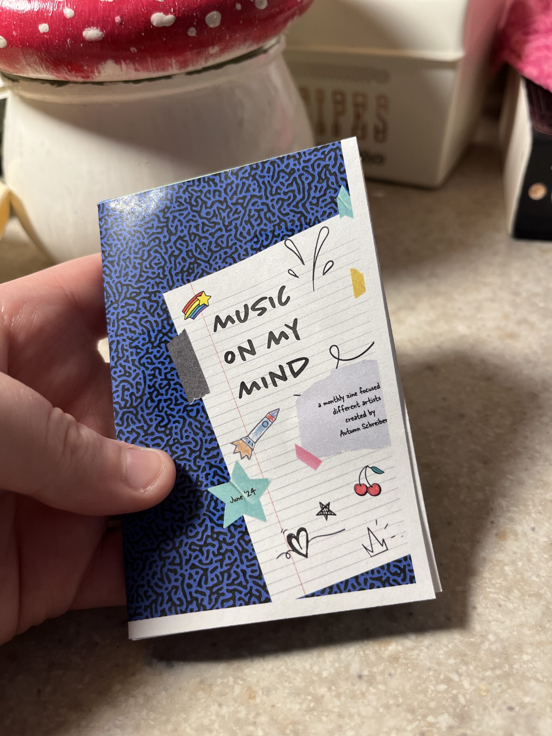
So first up is finding inspiration. Right now I’ve been really into musicians Chapell Roan and Ethel Cain. I’d be a shell of myself without Spotify. My zine will be called music on my mind to reflect my current song infatuations.
Now that I have my topic, I split my pages up.
Cover
Intro Page
Artist
Artist
Artist
Artist
Artist
Back
Here’s the rough sketched out page design layout!
Designing
The hardest part is next. I followed this tutorial to figure out my layout in the software. From there I found corresponding fonts and scrapbook-like elements. The colors, elements, and fonts corresponded with the main picture and the vibe of the artist. I got most of my fonts and elements from Adobe Fonts and Adobe Stock Images.
The Final Product
Initially, I had the layout similar to the video tutorial. However I ran into issues figuring out how to print it. More on that below.
Printing
Printing is a different beast entirely. At first, I printed my facing pages as spreads. But I thought I’d be smart and print them doublesided to save on paper. However, my double sided pages didn’t face the same way and one side was up and the other was flipped. To save my remaining sanity I brought the pages into a 8.5″ x 11″ document (split into 8). This allowed me to save on paper and simply fold and cut to make a zine without needing binding. For some reason, I still ended up with a white border after printing. I used the school’s printers but will try UPS next time.
This is how I folded my mini zine!
Thoughts
If I were to do this again (hopefully soon!) I would change a couple of things.
Font Unity
I used a lot of fonts to try to adhere to the featured artist, but doing so made it hard to read and overall not uniform
Readability
I’d change the font size to be legible, it was hard to tell before printing
Printing Process
I ran into patchy ink printing so I’d find another way to print next time
Layout
Instead of doing multiple facing pages, I’d stick to a 8.5 x 11″ split into 8 sections. The simplified layout doesn’t make my head hurt as much and would save money on printing if I decide to sell/print multiple.
What would you make a zine about? Have you made one before? Let me know below 🙂
One thing about me is that I like tattoos! I only have one, but as soon as I have some money saved up I’m gonna get some fresh ink. I love music, so most of my ideas for tattoos come from meaningful song lyrics. My approach to designing tattoos always starts with a sketch. Sometimes my sister and I bounce ideas off of each other.
Here’s some rough sketches for a potential tattoo. My sister loves Matt Maltese’s song Oldest Trick in the Book, so I wanted to come up with something to reference that.
I’ve really only ever messed around with tattoo design and haven’t gotten anything of my own design inked.
Some cool resources I found for tattoo design are as follows: