Tag: sketch

  • manipulating type in Illustrator

    manipulating type in Illustrator

    The college homework saga continues! We are currently designing the nameplate, or title, of our magazine. After scrolling through adobe fonts, I finally found my font: casserole. Which is such a fun name and just warms my Midwest heart.

    But picking a font was just the beginning. Now I have to expand my Illustrator skill set and figure out just how to manipulate type. I haven’t done a whole lot with typography so I consulted google and found these really helpful videos.

    I learned a lot about the pencil tool! I’ve become so comfortable with the pen tool, that I haven’t tried it. That ends today!

    Brainstorming

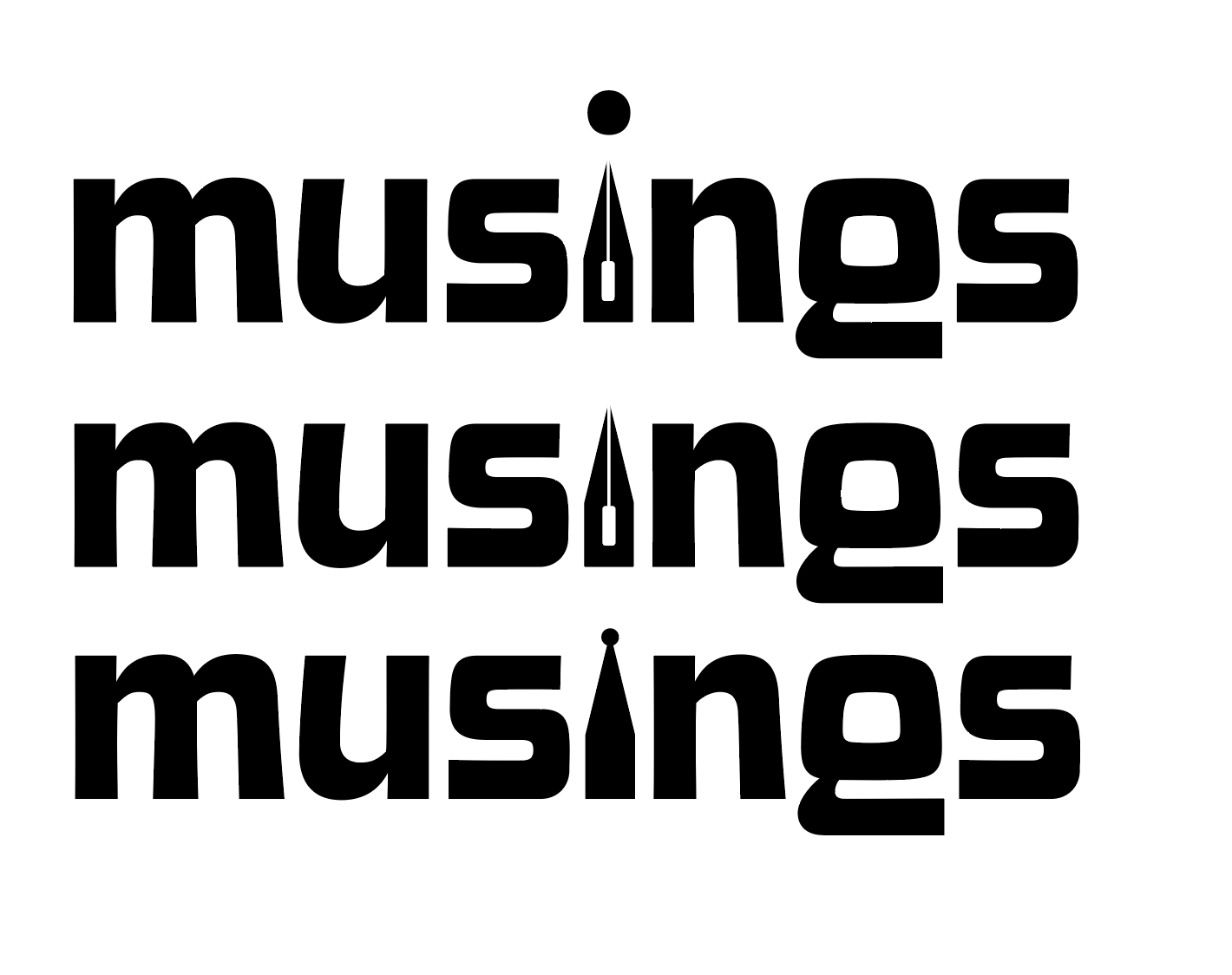
    My magazine title is musings. After thinking and surfing Pinterest, I wanted to try incorporating a quill nib into the title.

    some generic quill nibs (not my pic)

    I started sketching how I wanted the nib to replace the i in musings.

    some of my scribblings!
    some iterations

    I like the one in the middle. I don’t think I need a dot for the i. This week, I’m going to check in with my teacher and get some feedback. I couldn’t for the life of me figure out how to knock out the middle pieces of the quill either.

    That’s all for today folks! Did you learn anything new?

    • the final countdown: aka semester final projects

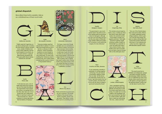
      I’ve been chipping away at my final projects! Right now, I’m finalizing my last article spread. I really want to have it nearly finished so I can get feedback and turn in my magazine before class ends tomorrow. Here are my different iterations: I think I’m leaning towards the last one. Maybe I’ll change the…

    • perfume label progress

      I’ve been steadily working on my perfume label in class. Initially, I wanted the perfume to have the scent of bleeding heart flowers, but since the bottle is an amber color, I decided on an orange scent. I’m still playing around with font combinations for the brand. But I am happy with the body copy…

    • design legends you should know #7 Jessica Walsh

      Jessica Walsh is a graphic designer, creative director, author, illustrator, design teacher, and founder of the design agency &Walsh. Her Career Walsh was born in Rhode Island in 1986. Before even stepping foot in college, she coded and designed websites at 11 years old. She got her BFA at Rhode Island School of Design in…

  • trying out t-shirt design

    This summer has flown by so fast! One thing I like to do every summer is some sort of craft. So I dug out my fabric paint and made some sick custom t-shirts. There’s something cool about bringing a sketched out design to life and then being able to wear it out and about.

    Here’s the sketch w/some of the shirt in the background

    My chosen playlist for this project: click here

    But yesterday I finished a sketch and thought it was decent enough to actually mock up in Adobe Illustrator. It reminded me of a similar project I did last semester at STC. The goal was to create a school club t-shirt that could potentially be sold in the bookstore. We considered graphic placement, fonts, and school colors.

    My goal with this design was to create my own fan merch that was simple and true to the artist. Instead of a actual picture I opted for a silhouette. I used bold contrasting fonts to convey the song lyrics complicated heavy message.

    I brought the sketch into illustrator and started tracing it. I liked my initial design, but it was a bit hard to read the bold font.

    After some feedback, I expanded the size of the halo to include the text and tried a solid color font.

    I like the reworked design (above) but I think the halo could be thinner. The contrast of thickness seems a bit off and the halo and the text seem to be competing for dominance.

    Here’s the initial mockup! I added the Ethel Cain logo to the back because some of her merch includes it. (example of her merch below)

    I’m gonna look for some more free tshirt psd mock ups, clean up the design and then share the final product with you!

    Thanks for reading! Let me know your thoughts and check out my posts below.

  • trying sticker design

    In an effort to stay in Illustrator, I messed around with the idea of making stickers. Usually if I wanted to buy stickers, I’d scour Etsy or Redbubble. But sometimes the stickers I want aren’t there, hence me trying this out. For some reason, I decided to build off of my tattoo idea from this previous post.

    Gathering Resources

    I started looking up youtube videos and came across two semi helpful ones. (video 1 and video 2)

    After getting some insight on how to merge shapes, etc. in Illustrator I dug out my original sketch.

    Designing

    Then I started designing, keeping the lyric in mind as well as typical interstate signage references. I wanted to keep my sign looking accurate as possible. I discovered that the font (Highway Gothic) was created by the United States Federal Highway Administration for all road signage.

    Here’s my first draft, not too shabby. But not the right font.

    I really wanted the sticker to feel more fun than just a white and green sign. I think adding the additional lyric “I can’t leave it be” in graffiti type font helps elevate it, adding variety.

    Currently I’m rocking with either of these two designs. I think I like the sticker without the extra rectangle at the top right. I can’t decide on the graffiti font, but the texture of the bottom one seems to catch my eye. I like the idea of the state number crest, but it might be too much. Let me know your thoughts!

  • preacher’s daughter inspired design

    preacher’s daughter inspired design

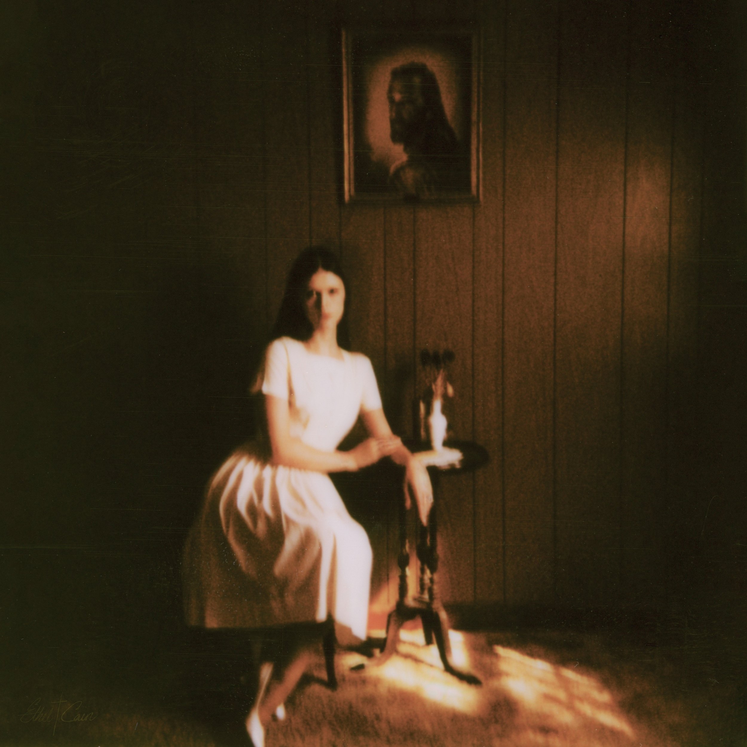
    Lately I’ve been listening to Ethel Cain’s album Preacher’s Daughter. The music takes you on a journey from the perspective of Ethel as she journeys west in search of love and a life of her own. It’s a haunting concept album that keeps on drawing me in.

    I’ve been thinking about drawing inspiration from the songs and themes of the overall project into my design work. A few possible design ideas I’ve had are tattoo designs or a poster design. One potential poster design idea is a missing person poster. (Later on during the album, the character Ethel Cain goes missing) I like to lean towards poster design because it keeps me in the software outside of class while also bridging my passion for music.

    When it comes to tattoo designs, initially I wanted to design something from the lyric:

    And you said, “Hey, do you wanna see the West with me? ‘Cause love’s out there and I can’t leave it be

    Thoroughfare by Ethel Cain
    The circled doodle is my first draft of a potential tattoo/sticker design.

    To me this piece of the song makes me think of young love and roadtrips, the kind that are highlighted in a indie coming of age movie. My initial thought is to make a tattoo in the shape of a exit sign but instead of a road/city name it reads: LOVE’S OUT THERE with a arrow that says West. Upon sketching it, the design seemed blocky and maybe more suited to a sticker design.

    From the blog

    Stay up to date with the latest from our blog.

    • designing a portfolio: the saga

      Welcome back ya’ll! Today I thought I’d walk you through my current challenge: creating a graphic design portfolio. I am by no means an expert,…

    • design legends you should know #5 Paula Scher

      design legends you should know #5 Paula Scher

      Paula Scher is a painter, album covers, educator, layout artist and renowned graphic designer. Her Work Through The Years With a start at the Tyler…

    • figuring out Facebook ads

      I’ve been asked to create some Facebook ads (for Amaryllis bulbs) and let me tell you, I have no idea where to start. Facebook isn’t…

    • analyzing design in movies: Labyrinth

      analyzing design in movies: Labyrinth

      Design is all around us! It’s on labels, posters, papers, hand towels, you name it. So today, I thought I’d look at one of my…