Last time we left I had a rough wip poster. I resketched a guitar for the bottom right frame. Then I took it into illustrator, image traced the guitar, etc.
I liked the idea of it, but it just seemed off. The idea didn’t really look like what I had envisioned. I really like the tree, so I pivoted.
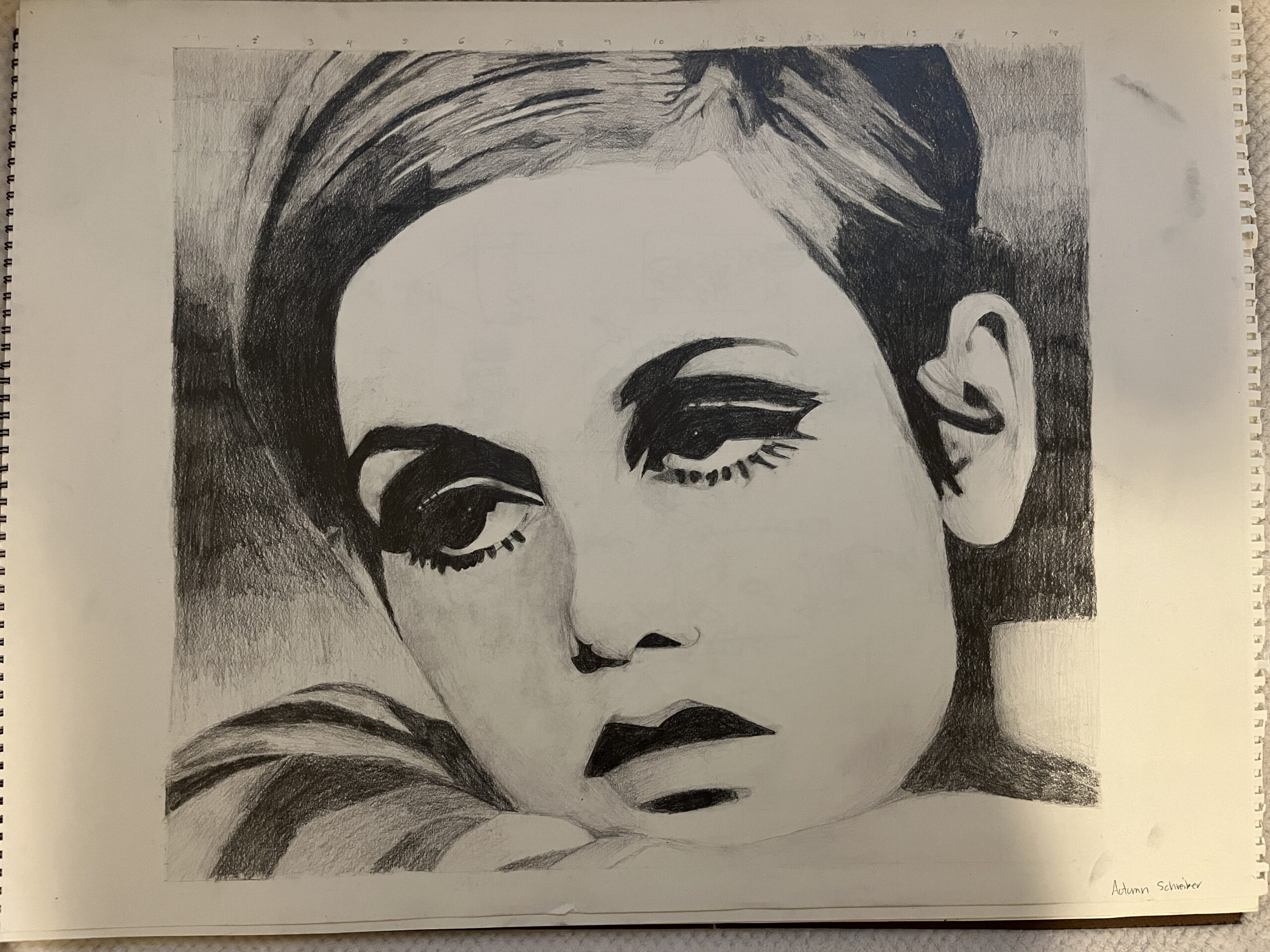
I like the simple version better
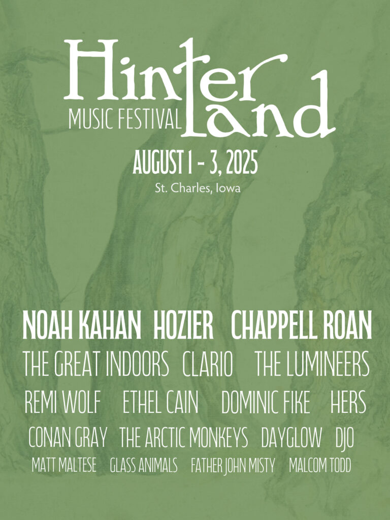
I like the second version, it still needs a finalized font for the dates. I want to experiment with some colors. Part of me wants to add more elements to the poster but I’m drawn to the simplicity.
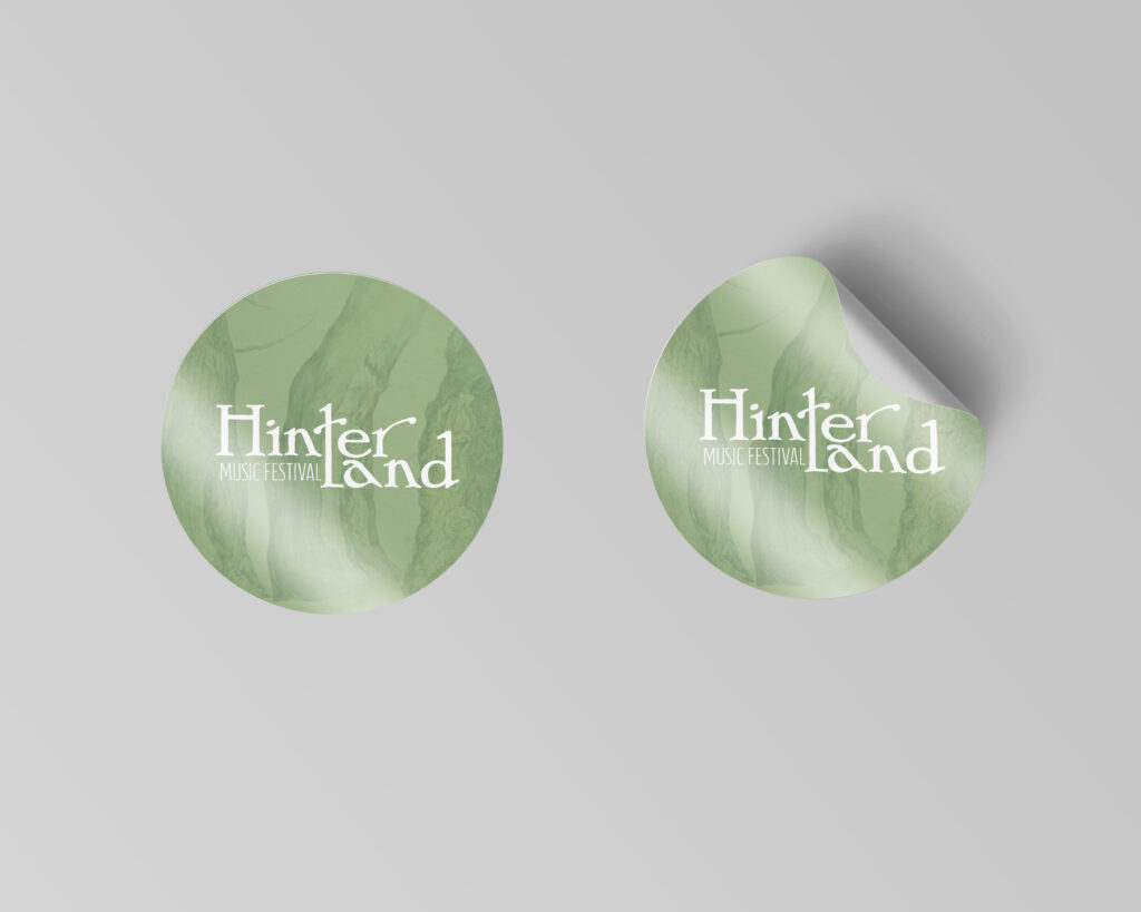
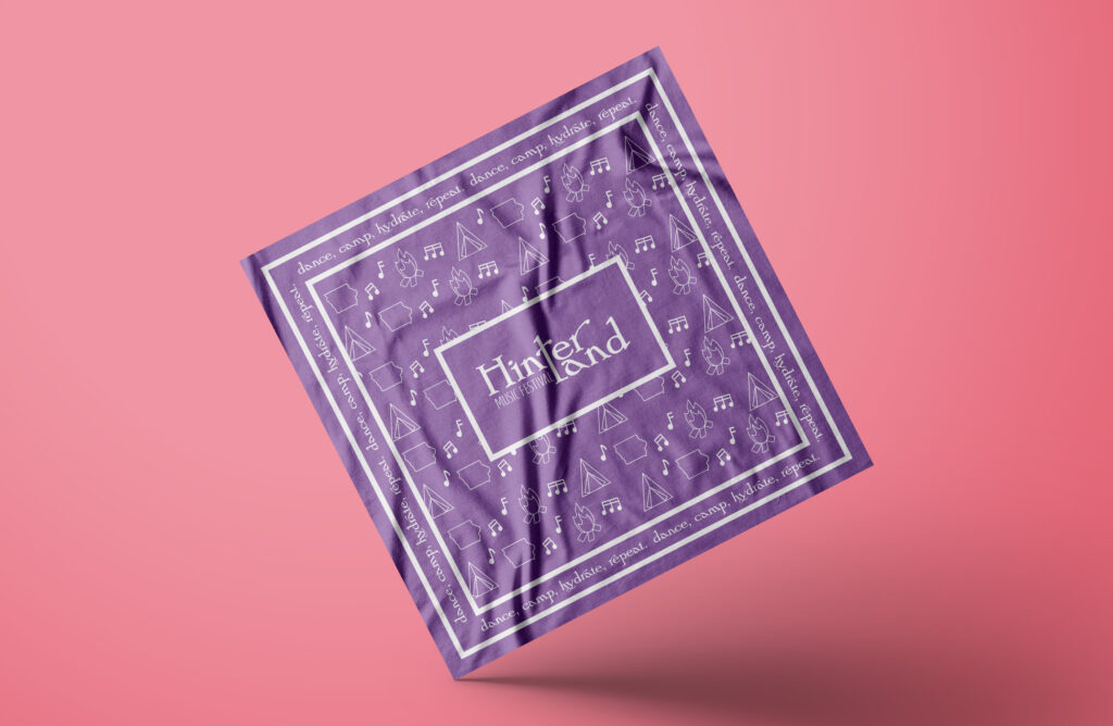
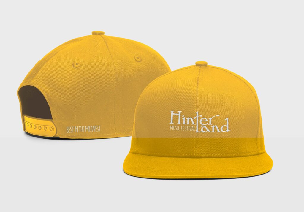
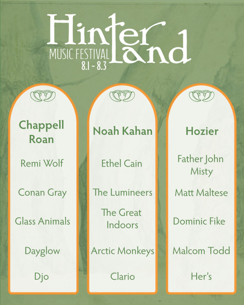
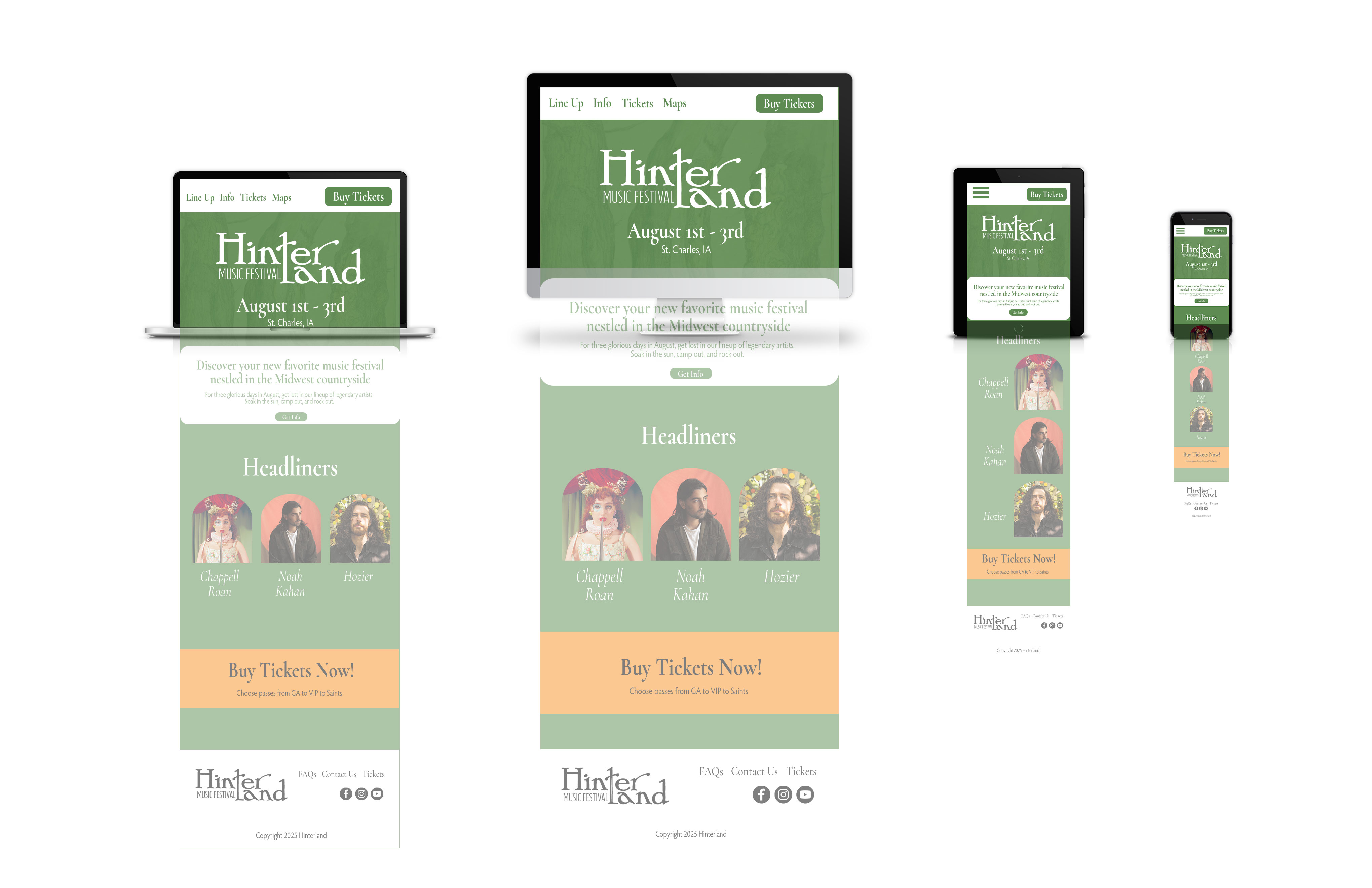
As I wrote in my last post, I am designing a 10 piece campaign for a music festival. I have finished the logo and stage banner. The current work in progress is the poster. I wanted the poster to be artsy, and be able to be hung on a wall. There’s the easy route of including all of the head liners, but I wanted a more fun approach.
I started with a bunch of small sketches. Nothing really stood out to me. I really wanted to capture the atmosphere of the festival. It’s set in a small Iowa town with mainly indie and alternative artists. The past festival themes have been kinda folksy and hippie ish, or trendy. I wanted to have a ren faire adjacent theme. Something that felt homey, backroads, fun, and comforting.
Initial poster ideas (as well as my dream lineup lol)More sketches!
After a bunch of sketching and scouring Pinterest, I came across a cool frame/medieval banner template.
After looking online for similar frames and borders, I had an idea. I wanted to include snapshots of the festival (the hinter tree, guitar, and a lineup) but in a framed way.
This was my more finalized ROUGH sketchThis is the current work in progress
Right now, I’m in the process of editing the sketched snapshots, and finalizing color combos. The tree sketch isn’t my own work, it’s from the public domain. I found it on public.works. That’s a really cool site for images in the public domain.
After the exhausting saga of calling my local legislators, I wanted to draft up a quick library flyer design. I’m not looking to print them en mass from another site, so I want to print them on a 11 x 8.5″ sheet of paper.
The Process
I opened up InDesign and started with a 11 x 8.5” size file. I snapped guides to divide it into four even sections.
I looked at my original poster design. I wanted to take the elements of the big poster and condense it into a small flyer.
After looking at the previous poster, I decided I wanted: a headline, short summary, and a qr code with resources.
The Final Flyer Design
Side by Side Comparison
The Flyer The Original Poster
I can’t decide if I need the black outline or not. It might make the flyers easier to cut (or at least, that was the idea).
How do you design flyers? I’m off to finish some homework. Ciao!
Well guys, it’s been a busy break! I visited more family, worked on more projects, and am trying to stay in my software.
Adding the yarnAlmost done!Hung out with my family at Falls Park
After seeing my mom’s side of the family for Christmas, I used my days off of work to start an awareness campaign. Right now, the proposed South Dakota budget reduces the SD Library budget by 64%! Click here for the article. I’ve always loved the library and want to let South Dakotans know. Together we can let our voices be heard and retain our amazing library resources.
So as a start for my campaign, I wanted to create posters. I like my initial Lorax idea but upon second glance, the Lorax is a copyrighted icon. So he had to go.
The first poster idea
I decided to keep my poster simple. I really wanted to make it eye-catching and memorable, but time is of the essence in this moment. By going with a simple poster, I’m able to redirect my energy into the social media aspect.
The final form! (for now)
Now that I have a poster made, my plan is to print off copies and hang them up around town. Maybe even in surrounding towns. I also created a social media account (sdlibraryadvocates) on Facebook and Instagram. My goal is to highlight the many resources that our state library provides for us, as well as how to fight the proposed budget cut.
I’ll keep you posted on my library crusade! Until next time 🙂
Rulebreaker, Father of Grunge Typography, prolific surfer. All things that aptly describe David Carson.
Carson started out as a high school teacher in Oregon, where he caught wind of a graphic design summer program at University of Arizona. Soon after he was off to Switzerland to another summer program under the instruction of instructor Hans-Rudolf Lutz. He began working at various magazines such as, Transworld Skateboarding, Beach Culture, and Surfer. In the early 90s, he landed at an alternative music magazine, Ray Gun, and really developed his style. Working at Ray Gun in the peak grunge era, Carson was able to lean into it and make it his own. After three years, Carson left Ray Gun in pursuit of his own design business.
What makes David Carson so unique is his fresh perspective on design. He tosses out the traditional design rules and forges his own. This take on design is what gives him his edge and personality. That’s essentially his brand.
Some of his work
poster for his 2014 AIGA lecture (not my pic)dvd navigation design for Nine Inch Nails (not my pic)obama election design from 2009 (not my pic)
A really great interview article to better understand Carson and his philosophies: click here!
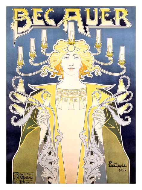
Another one of Privat’s works that advertises light fittings
Let me take you way back to the 1890s, when minimalism is out and fanciful Art Nouveau is in. My first exposure to this style was seeing one of my mom’s favorite prints in her room, Absinthe Robette.
The iconic Absinthe Robette by Henri Privat-Livemont
What is Art Nouveau?
New art, or Art Nouveau was a popular art movement from around the 1890s to the start of WW1. It mimicked aspects of nature with its curving, free-flowing, organic feel. It encompassed paintings, furniture, architecture, patterns, and art. It was the precursor to the more modern movements, such as Art Deco, that focused on sleek lines and eliminated excessive decoration.
Henri Privat-Livemont
Henri was born in 1861, Schaerbeek, Brussels, Belgium. At age 12, he studied at École des Arts Decoratifs in Sint-Joost-ten-Node, Belgium under Louis Hendrickx. Then, he moved to Paris in the 1880s to work with the studios of Lemaire, Lavastre & Duvignaud to learn interior decorating. Henri was initially an interior decorator for very wealthy families. Although most famous for his iconic posters, it happened by chance. He won a local poster competition around 1889 and decided to lean more into them. With new economic demands, the need for poster advertisements increased and Privat-Livemont rode the wave. Some prominent works of his include the aforementioned Absinthe Robette and the 1897 Exposition Internationale (a World’s Fair held in Belgium) poster. He kept himself busy teaching ‘Ornament, Figure and Ornamental Composition’ at the Josephat School for Drawing and Crafts from 1891-1935. After the decline of poster art he kept interior decorating, oil painting, and photography.
Non-poster-related work
1 of 4 tile panels designed by Privat-Livemont for the Grande Maison de Blanc in Brussels, Belgiumstained glass window designed by Privat-Livemont and made by Raphaël Évaldre for the Hotel Saintenoy in Brussels, Belgium
For more info I highly suggest checking out this blog post! It goes more into depth on Privat-Livemont as well as his rival Alphonse Mucha.
Summer for me goes by super fast! Whether I’m passing the days working full time, visiting family, or going on trips it can be hard to stay in the software. Read on to see some of my suggested summer projects.
Potential Summer Projects
Poster Design
One of my favorite things to do is to design posters! I like to make music posters (band tour posters, lyric poster, etc). You can even print them out at your local Fedex for cheap.
Here’s a band tour poster I made! I used Illustrator and tried layering text for a grunge feel.
Rebranding
Whether you have a brand in mind, or you want to make up a fictional one, creating a logo can be a lot of fun! Personally, I like the idea of creating a fictional fairy tavern and then designing the logo, Pinterest board, ad campaign, signage, etc.
Tattoo Design
I’ve gone over this a few times, so feel free to check out my last post! Or click here. But basically, the idea is to sketch out a potential tattoo (inspired by your favorite, books, or games!) Try sketching and then bring it into software to clean it up.