I’m still at a standstill with my poster. I think I need some time away from it so I can attack with a new perspective. Right now I’ve gotten the website mock up done (below)
The website mock up took ages! I had to make sure my colors were accessible. I used https://contrast-grid.eightshapes.com/. Something that challenged me was trying to place images into unorthodox shapes. To take my image to the arch shape, I had to turn the shape into a smart object and then place the image on top, before using a clipping mask. There has got to be an easier way lol.
I also finished my social media lineup post. This is an imaginary campaign, so I made sure to include my dream lineup.
I tried to make sure the artists matched the same vibe of music. I also hopped on spotify and made a playlist modeled after my lineup. That helped me find flow and before I knew it I had two pieces done!
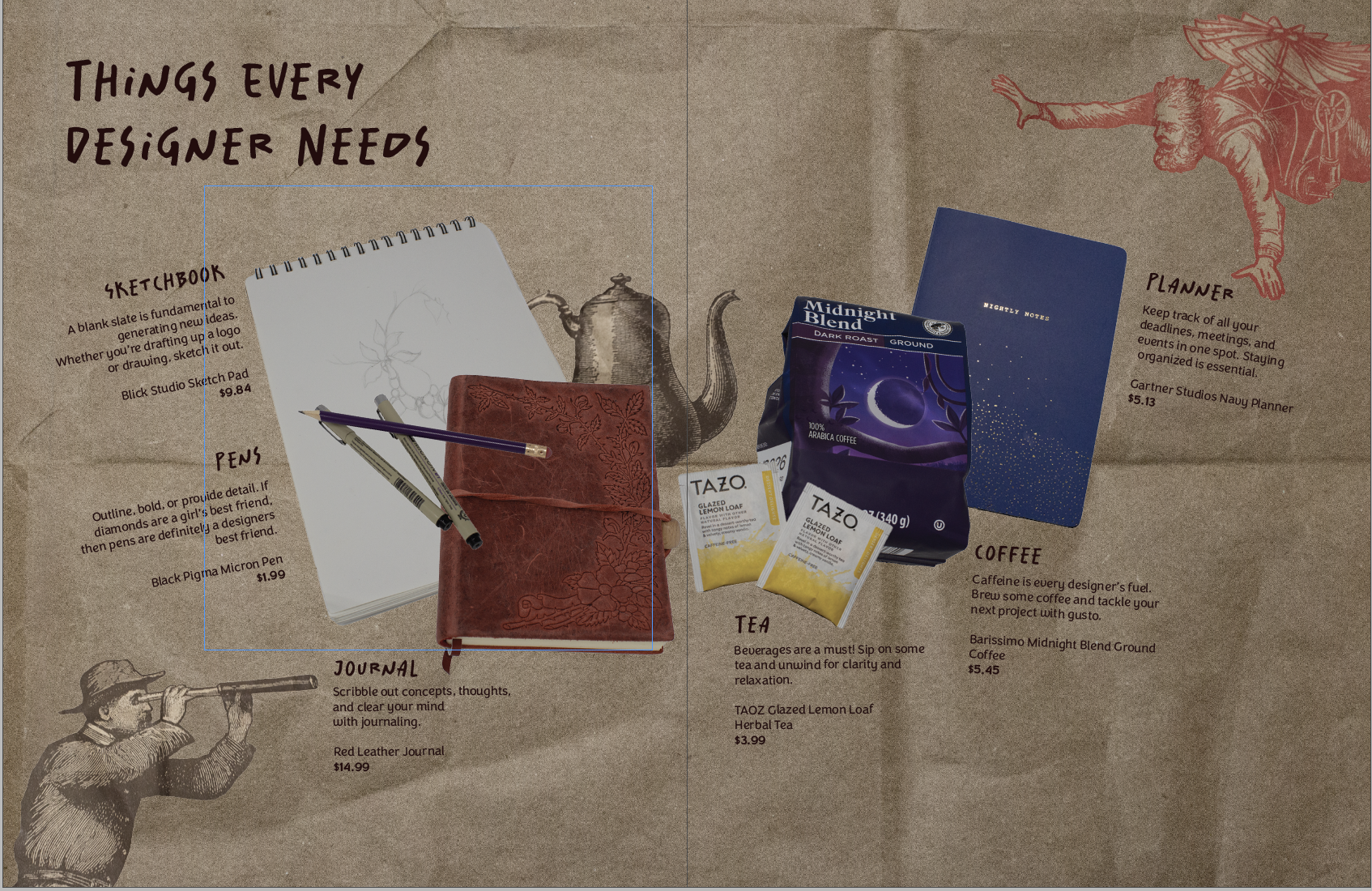
Making my first product spread was a rollercoaster! It challenged me to beef up my photography skills and problem-solve.
My magazine is all design-centered. So I wanted my product spread to align with that. I decided to make the theme of the spread: things designers need. (That way I could scavenge my apartment for things I already had)
The (Pinterest) Inspo
The Trials and Tribulations of The Product Spread
My intial thought was that I could take one picture with everything laid out in the lightbox. However, I had trouble getting a wide enough shot. It was also tricky to get enough height to take the picture.
So, I pivoted to taking individual pictures of my products. This way, I could place everything on the spread wherever I wanted it. I had a hard time taking a picture of a mug. When I placed it on its side, it rolled, and angling the camera was a bust. I ended up with six product pictures of tea, coffee, pens, a sketchbook, a planner, and a journal.
I took my pictures into Photoshop and got rid of the background, fixed the brightness, etc. Placement was difficult to pin down. I wanted the spread to resemble a semi-messy desk. But the finished spread had the products more centered and neat.
Honestly, at this point I wasn’t too happy with what I had. I didn’t consider all of the colors of my products. The colors didn’t really go together, so I ended up finding a different planner and teabags to reshoot.
Then I tackled the background. I wanted it to have some sort of texture. I found two different brown paper bags and some wrinkled wrapping paper. The wrapping paper ended up being the wrong color and a bit too wrinkly. But the brown paper bag worked out just right. I got inspired by a Trader Joe’s bag and took pictures of the illustrations. Then I removed the backgrounds in post and added them to my spread for some fun.
The Evolution of My Product Spread
The early iteration with the old planner and tea bagsAfter talking with my teacher, I moved some things aroundI moved the kettle behind to allow more space for the text (the final form)
That’s all she wrote! Comment your design roadblocks and how you overcame them.
In my New Media Class, we are making website mood boards for a fictitious client. The website is for Chef Jaqueline, who specializes in making cakes and baked goods for big events. I first started off with making up a moodboard template in Photoshop and then filling it in. There are various mood board templates online that you can find as well.
I love color and decided to hop onto color.adobe.com. They have all sorts of color palettes. I searched up terms like bakery, cookies, and cake to get some potential color options. I ended up going with a pink French bakery color palette.
For fonts, I wasn’t too sure. I looked at other local bakery sites for ideas. Most headline fonts were bold, readable, and sans serif.
I found a font I really liked for headlines, called New Kansas. I usually get my fonts from Adobe fonts. I went with a sans serif sub headline font, Elza. And then a simple serif font, Dolly Pro, for the body copy.
I also had to make sure my navbar colors were easily readable. I experimented with my different palette colors to find the best option. To make sure, I used this color checker website.
Ta Da! The finished mood board
Read more posts for design insights. Until next time 🙂
I’ve been asked to create some Facebook ads (for Amaryllis bulbs) and let me tell you, I have no idea where to start. Facebook isn’t something I interact with a whole lot, I’m more drawn to Instagram or Pinterest. However, I thought I’d look into Facebook ads and take ya’ll along for the ride.
So my main questions I need to figure out are as follows:
What Photoshop dimensions should I use?
What are the photo copyright rules for ads?
What do typical flower ads look like?
What makes an ad successful?
Which brings me to research!
Here are my findings:
Facebook dimensions vary by preferred ad layouts. However, my client will be posting the ads as Facebook posts. So I really need to figure out FB Photoshop post dimensions. I kept on running into dimensions for Facebook image/video post sizes. (Will report back with my final answer soon🫡)
When it comes to image copyright research, here is the situation. I’ve been tasked with creating amaryllis bulb ads. I want to be able to show customers the final amaryllis blooms, but the florist doesn’t have any of her own pictures with her current bulbs. Soo.. then I need to figure out the image situation. I found this website that brings up a few legal good points. My temporary solution is to use some of her old photos if possible.
General flower ads all display big, colorful arrangements. Then it has the basic ad elements such as a headline, call to action, etc. I’m kind of on my own because my client is advertising wax-dipped amaryllis bulbs. (Which is a bit too niche for Google)
Keeping your ad message clear and directed towards your audience is one way to create a successful ad. So my audience is primarily older women looking to buy flowers for themselves or others. My headline and visuals should align with my desired target market. Some more great tips are here.
Phew that was a lot. Hopefully, I can hit the ground running and drum up some great ideas. I’ll keep you posted! Until next time, keep designing.
I’ve been chipping away at my final projects! Right now, I’m finalizing my last article spread. I really want to have it nearly finished so I can get feedback and turn in my magazine before class ends tomorrow. Here are my different iterations: I think I’m leaning towards the last one. Maybe I’ll change the…
I’ve been steadily working on my perfume label in class. Initially, I wanted the perfume to have the scent of bleeding heart flowers, but since the bottle is an amber color, I decided on an orange scent. I’m still playing around with font combinations for the brand. But I am happy with the body copy…
Jessica Walsh is a graphic designer, creative director, author, illustrator, design teacher, and founder of the design agency &Walsh. Her Career Walsh was born in Rhode Island in 1986. Before even stepping foot in college, she coded and designed websites at 11 years old. She got her BFA at Rhode Island School of Design in…
Well folks I hit a brick wall. Even google couldn’t give me a clear answer when googling “what is a lead in magazine spread?” I’m furiously researching this because I happen to have a lead in spread due tomorrow afternoon for class. I’ve scavenged the internet and found resources for how to write a lead…
Making my first product spread was a rollercoaster! It challenged me to beef up my photography skills and problem-solve. My magazine is all design-centered. So I wanted my product spread to align with that. I decided to make the theme of the spread: things designers need. (That way I could scavenge my apartment for things…
This weeks new project was introduced and I’m soooo excited. We are making product labels! Everyone in class had to bring in a package with an inset label. I dug up a funky shaped body spray bottle. So my task is to make another label for the bottle. We get to make a brand, logo,…
In my New Media Class, we are making website mood boards for a fictitious client. The website is for Chef Jaqueline, who specializes in making cakes and baked goods for big events. I first started off with making up a moodboard template in Photoshop and then filling it in. There are various mood board templates…
I’m not sure if anyone noticed, but the KitKat packaging looks different. I wasn’t sure if I was hallucinating or if it had actually changed. But when you put the new and old logos side by side you can start to see the changes. Maybe I’m just a sucker for the original but the new…
Chip Kidd is a book jacket designer, associate art director for Alfred A. Knopf, certified comic nerd, freelancer, and novelist. Kidd’s Career Kidd got his start in the design world with a graphic design degree at Penn State in 1986. From there he moved to New York, and became a junior assistant in the Alfred A.…
So this semester is all about making a magazine, quite literally, from scratch. We have to write the articles, conduct interviews, photograph interviewees and products, design our own advertisements– you get the idea. I kinda dove in headfirst, working on assignments as they were given. Because of this slapstick approach, I haven’t really fully thought…