Thanks to a tour at JDS Industries, I am the new owner of a leatherette journal. I can etch into it with the school’s laser (like I did with the tree ornament).
I just had a new assignment: a laser/engraving portfolio design piece. Some classmates are buying keychains, pens, etc. I am just rolling with the neat journal. I knew I wanted my design to be lyric-based. After listening to one of my favorite songs (Sunbleached Flies) I knew I had some verses to pick from.
I ended up creating my file in Illustrator and going with an eye-catching cathedral window. Picking out fonts was really fun, I wanted the font to match the tone of the lyric. Script fonts are really fun to play around with and I’ve curated a collection of fun cursive fonts on Adobe Fonts.
The final design 🙂
With the complex window, I opted to keep the rest of the design simple. I can’t wait to fire up the laser and engrave my notebook. Stay tuned!
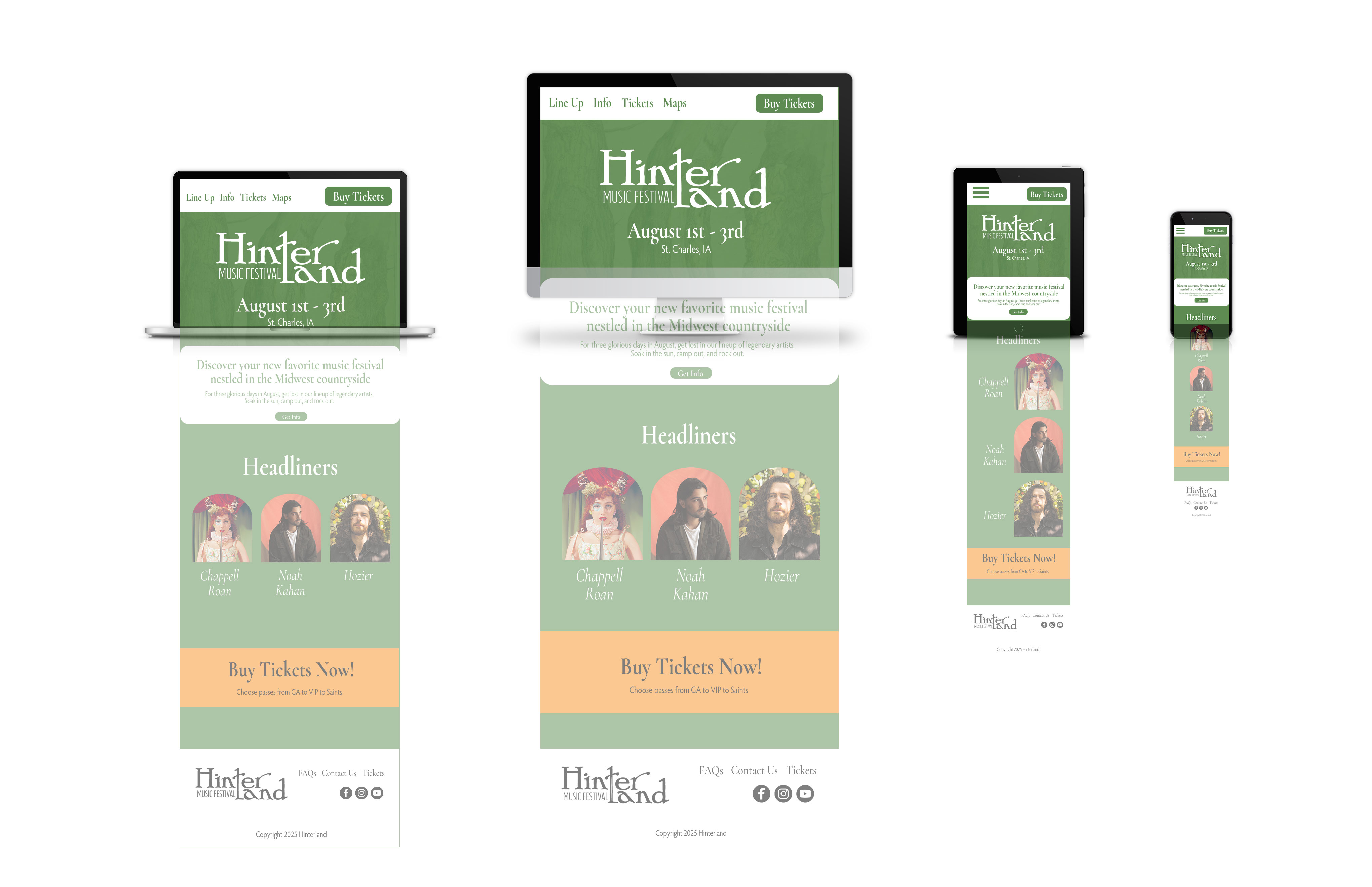
I’m still at a standstill with my poster. I think I need some time away from it so I can attack with a new perspective. Right now I’ve gotten the website mock up done (below)
The website mock up took ages! I had to make sure my colors were accessible. I used https://contrast-grid.eightshapes.com/. Something that challenged me was trying to place images into unorthodox shapes. To take my image to the arch shape, I had to turn the shape into a smart object and then place the image on top, before using a clipping mask. There has got to be an easier way lol.
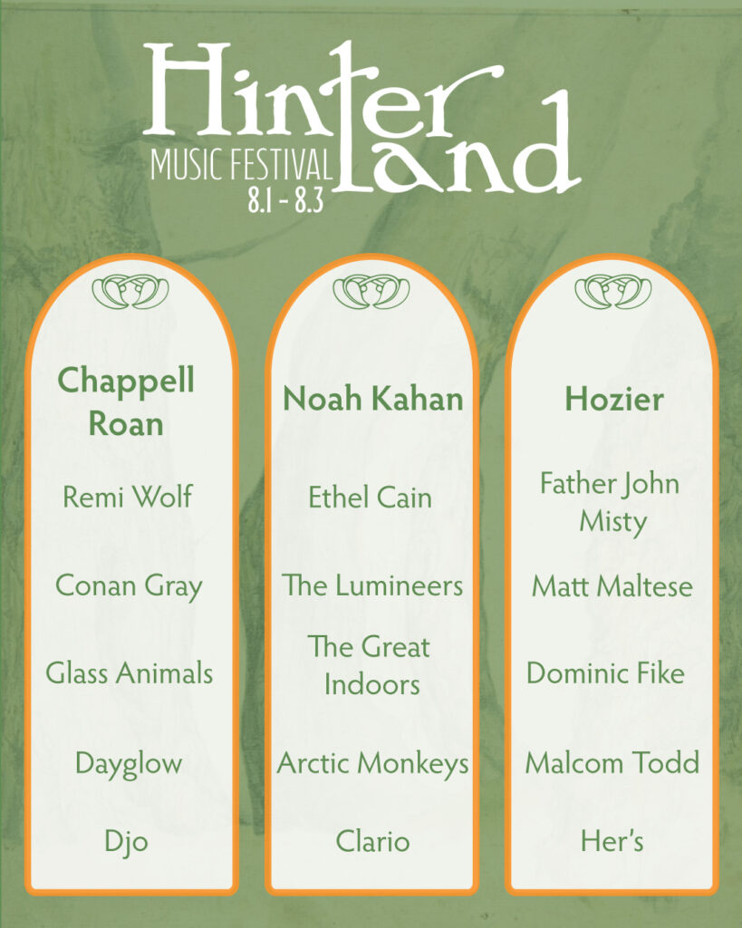
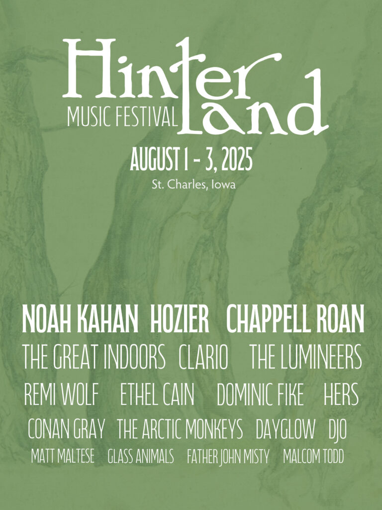
I also finished my social media lineup post. This is an imaginary campaign, so I made sure to include my dream lineup.
I tried to make sure the artists matched the same vibe of music. I also hopped on spotify and made a playlist modeled after my lineup. That helped me find flow and before I knew it I had two pieces done!
Last time we left I had a rough wip poster. I resketched a guitar for the bottom right frame. Then I took it into illustrator, image traced the guitar, etc.
I liked the idea of it, but it just seemed off. The idea didn’t really look like what I had envisioned. I really like the tree, so I pivoted.
I like the simple version better
I like the second version, it still needs a finalized font for the dates. I want to experiment with some colors. Part of me wants to add more elements to the poster but I’m drawn to the simplicity.
As I wrote in my last post, I am designing a 10 piece campaign for a music festival. I have finished the logo and stage banner. The current work in progress is the poster. I wanted the poster to be artsy, and be able to be hung on a wall. There’s the easy route of including all of the head liners, but I wanted a more fun approach.
I started with a bunch of small sketches. Nothing really stood out to me. I really wanted to capture the atmosphere of the festival. It’s set in a small Iowa town with mainly indie and alternative artists. The past festival themes have been kinda folksy and hippie ish, or trendy. I wanted to have a ren faire adjacent theme. Something that felt homey, backroads, fun, and comforting.
Initial poster ideas (as well as my dream lineup lol)More sketches!
After a bunch of sketching and scouring Pinterest, I came across a cool frame/medieval banner template.
After looking online for similar frames and borders, I had an idea. I wanted to include snapshots of the festival (the hinter tree, guitar, and a lineup) but in a framed way.
This was my more finalized ROUGH sketchThis is the current work in progress
Right now, I’m in the process of editing the sketched snapshots, and finalizing color combos. The tree sketch isn’t my own work, it’s from the public domain. I found it on public.works. That’s a really cool site for images in the public domain.
In Layout III we are doing a 10 piece campaign. Thank goodness for creative liberty and freedom in topic! I am doing a 10 piece campaign for Hinterland Music Festival.
Before I got into software I:
looked at previous Hinterland Festival themes
researched music festival logos
ex: Bonnaro, Coachella, Austin City Limits, etc.
created a Pinterest mood board
I think I will need a more organized mood board for future reference
sketched logo ideas
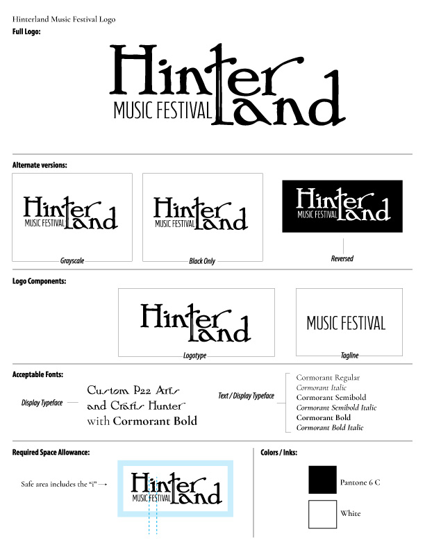
Right now I have a logo (yay!) only nine more pieces to go.
The logo in question
So now I need to design:
Festival map
VIP lanyard badge
Festival poster
Festival merch
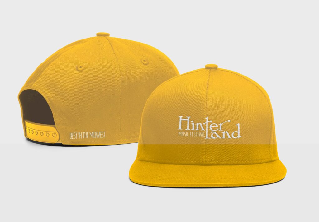
baseball cap
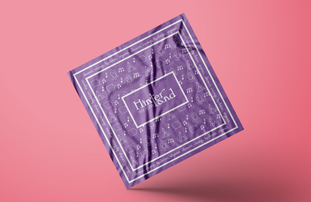
bandana
shirt
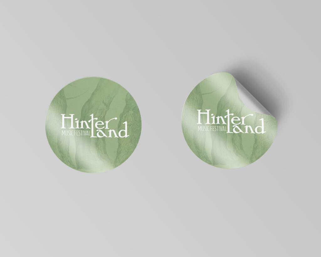
stickers (2)
Stage banner
Social media lineup post
Ads (2)
Festival wristband
I’ve made progress on a stage banner. I’ve kept it simple (there’s not much real estate on a long narrow banner). I used the same font because I was worried to use the logo and have a unreadable banner. (The logo has a width that would be difficult to scale and fill up a majority of the banner)
The banner (it looks small but it is BIG)The banner with a more defined “r”
I’m working on the poster next. I’ll update you soon!
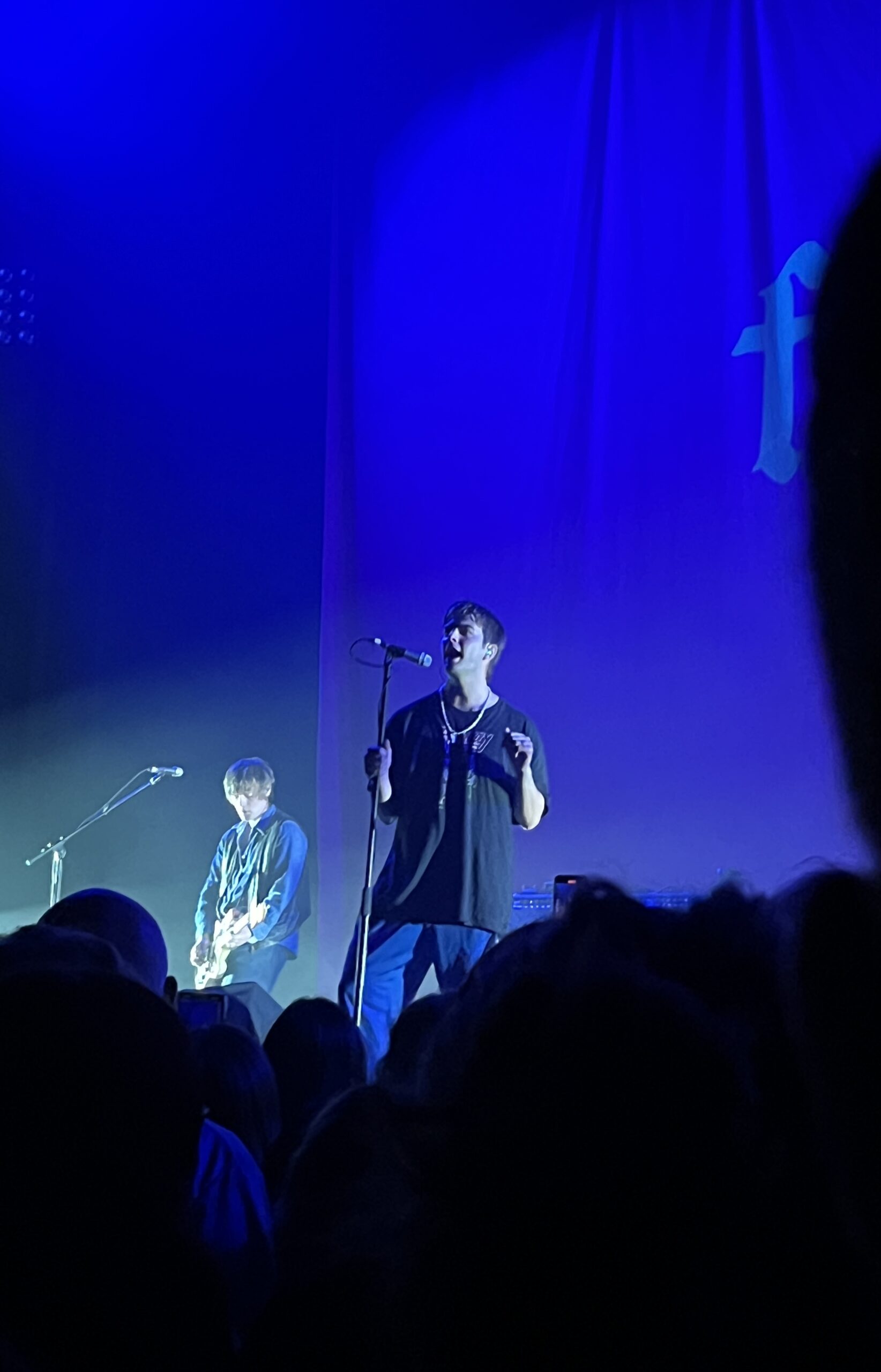
Another concert for the books! This September I was able to see Conan Gray at the Armory in Minneapolis. I was able to go with my mom. She wasn’t a huge Conan Gray fan, but his performance and songs was enough to get a 10/10 rating from her.
My mom and I in line outside the Armory
It felt like it took ages to get inside the venue. The doors opened around 6pm and we lined up a little after 3pm.
The stage backdrop! Which quickly fell as the concert started… So cool.
As someone who has been to the armory twice, my advice is as follows:
Line up early (if you want a front row spot)
Get balcony seats (if you want a decent view without having your personal space violated for a few hours lol)
Get merch towards the end of the show (merch lines will be slow to nonexistent)
Know where you parked
Make sure to check in with your body!
Conan had to stop in the middle of a song because someone in the crowd needed medical attention
Make friends in line/at the venue!
Whether it’s just small talk, gushing about the artist, or passing out cute friendship bracelets.
It’s been awhile! I’ve really gotten engulfed in my internship. I started working full 40 hour weeks since the end of May. Here’s the rundown of my current projects: Yeah you read that right. It’s dog week at my internship and I definitely could use all the puppy love. (Pic for proof, otherwise it didn’t…
My internship has been so fun! It honestly doesn’t even feel like work. I’ve been working on a bunch of different projects. The chat bot has been ongoing for awhile now. Currently we have four strong designs that need to be voted on! I’m secretly rooting for the Sherman graphic (below). I’ve also been working…
I’m back! I graduated and headed straight to Hawaii. Literally. The morning after graduation I was on a plane to see my sister in Oahu. It was sooo much fun and the week went by so fast. Right now I’m diving headfirst into my internship, fulltime. I hope to update you guys on my summer.
Hey guys! As I’m sure you’re all aware, I’m really into music. I like pop, musicals, indie, rock, jazz, and even a bit of country. So I figured I’d walk you through some of the concerts I’ve been to and let you get to know me a bit better 🙂
My First Concert Ever May 2019
When I was 15 I went to my very first concert in Chicago. I was really into k-pop at the time and I was so psyched to see BTS (a very popular Korean boyband). I dragged my dad along with me and it was a really memorable trip. The concert, however, was out of this world and felt unreal. It was pretty windy and chilly. I remember BTS saying it felt like a winter concert! (If only they knew what winter really is like in the Midwest)
The Eras Tour June 2023
And yes, I made that mirror disco cowgirl hat. I’m crafty like that 😉
Surprise, surprise: I’m a bit of a Swiftie! While I’m not a super fan by any means, I still love Taylor Swift’s music and lyricism. I was able to use some of the money I had been saving up through high school to be able to experience the Eras Tour with my sister. It was so nostalgic for us, I remember getting her first CD and playing nonstop. The atmosphere was great and Taylor was soooo good. The backup dancers, the props, I just can’t say enough good things about it.
The Car Tour August 2023
This was a concert I decided to go to on a whim. My sister and I went to Minneapolis to see the Arctic Monkeys at the Armory. They’re a British rock band that’s been together since 2006. General admission was all standing, so we lined up hours before the doors opened to get a decent spot. It was so cool being that close to the band, and the opener was pretty good too! It was so fun being able to hear all of my favorite songs live.
TopHouse June 2024
TopHouse was a cool band that I was able to see for free in Sioux Falls! Every summer, Sioux Falls has free concerts at the Levitt. The band’s sound was very reminiscent of the Lumineers. It kinda had a bit of southern twang and was really cool to hear.
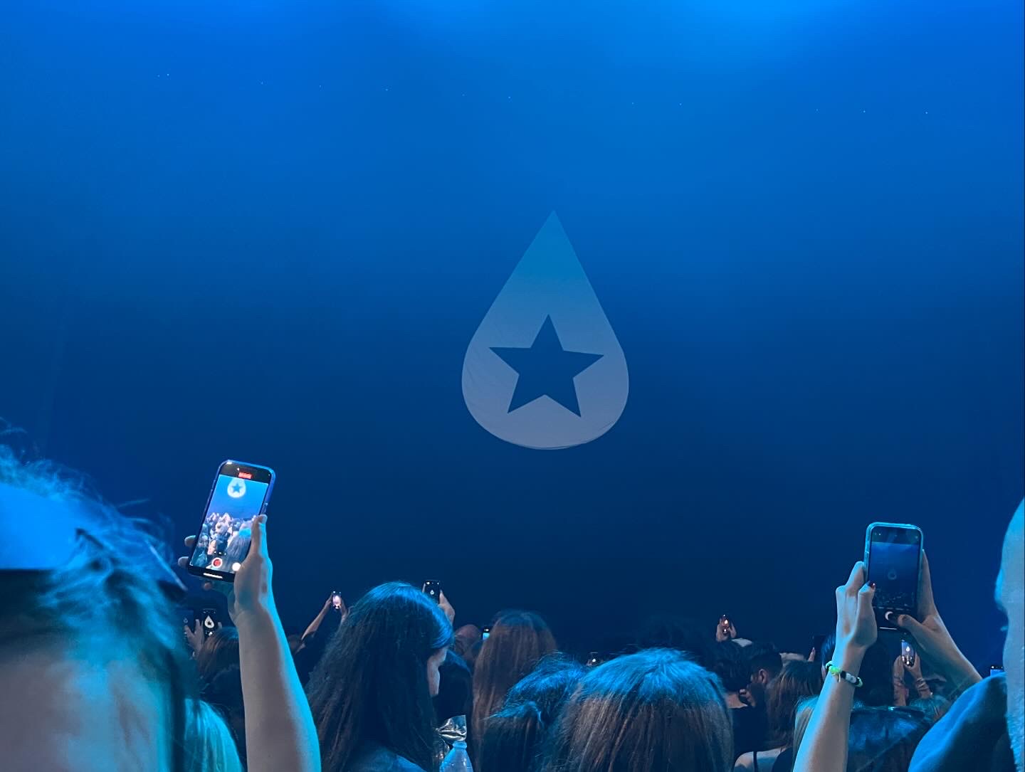
Hinterland Music Festival August 2024
Yep, it was that crowded. Only like 18,000 people
Most recently I was able to go to a music festival in Iowa for a day! This was a lot different than most concerts I’ve been to. It was neat to be able to see a line up of musicians that I liked. While the live music was incredible, it was really overcrowded and super hot. Despite the heat, I had so much fun and was finally able to see Chappell Roan and Ethel Cain live! They had such different vibes but the energy was electric and I’d bear the 96 degree heat all over again.
I do have a concert lined up next month, but we’ll see what happens.
Until then, see ya! Read more of my blog posts below.
Hey yall, I’m back! Before jumping into the software I decided to look for a tutorial. I found this one and it was pretty straightforward. If you’re looking for a tutorial on how to make a zine by hand check out this video from brattyxbre.
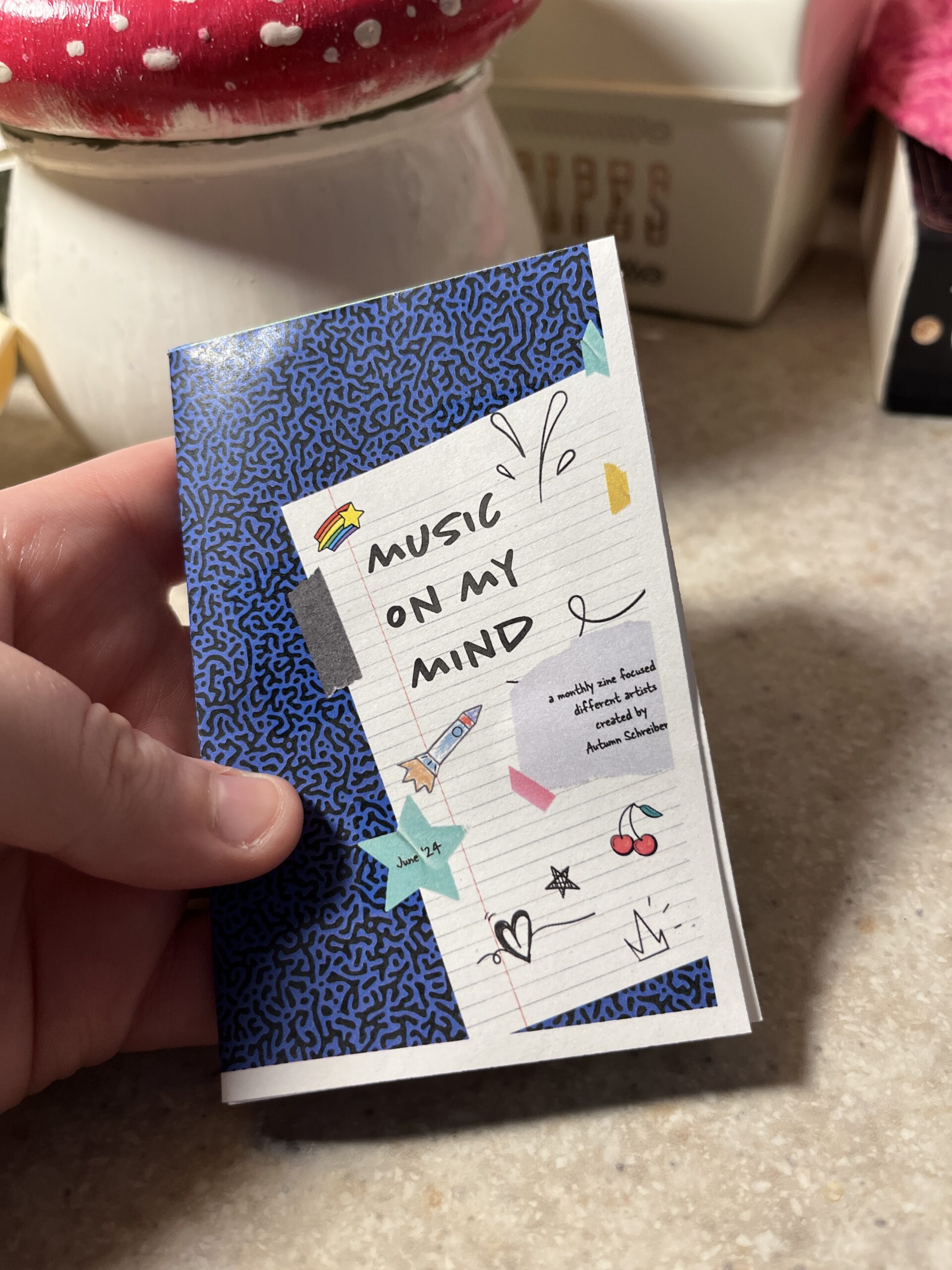
So first up is finding inspiration. Right now I’ve been really into musicians Chapell Roan and Ethel Cain. I’d be a shell of myself without Spotify. My zine will be called music on my mind to reflect my current song infatuations.
Now that I have my topic, I split my pages up.
Cover
Intro Page
Artist
Artist
Artist
Artist
Artist
Back
Here’s the rough sketched out page design layout!
Designing
The hardest part is next. I followed this tutorial to figure out my layout in the software. From there I found corresponding fonts and scrapbook-like elements. The colors, elements, and fonts corresponded with the main picture and the vibe of the artist. I got most of my fonts and elements from Adobe Fonts and Adobe Stock Images.
The Final Product
Initially, I had the layout similar to the video tutorial. However I ran into issues figuring out how to print it. More on that below.
Printing
Printing is a different beast entirely. At first, I printed my facing pages as spreads. But I thought I’d be smart and print them doublesided to save on paper. However, my double sided pages didn’t face the same way and one side was up and the other was flipped. To save my remaining sanity I brought the pages into a 8.5″ x 11″ document (split into 8). This allowed me to save on paper and simply fold and cut to make a zine without needing binding. For some reason, I still ended up with a white border after printing. I used the school’s printers but will try UPS next time.
This is how I folded my mini zine!
Thoughts
If I were to do this again (hopefully soon!) I would change a couple of things.
Font Unity
I used a lot of fonts to try to adhere to the featured artist, but doing so made it hard to read and overall not uniform
Readability
I’d change the font size to be legible, it was hard to tell before printing
Printing Process
I ran into patchy ink printing so I’d find another way to print next time
Layout
Instead of doing multiple facing pages, I’d stick to a 8.5 x 11″ split into 8 sections. The simplified layout doesn’t make my head hurt as much and would save money on printing if I decide to sell/print multiple.
What would you make a zine about? Have you made one before? Let me know below 🙂
Lately I’ve been listening to Ethel Cain’s album Preacher’s Daughter. The music takes you on a journey from the perspective of Ethel as she journeys west in search of love and a life of her own. It’s a haunting concept album that keeps on drawing me in.
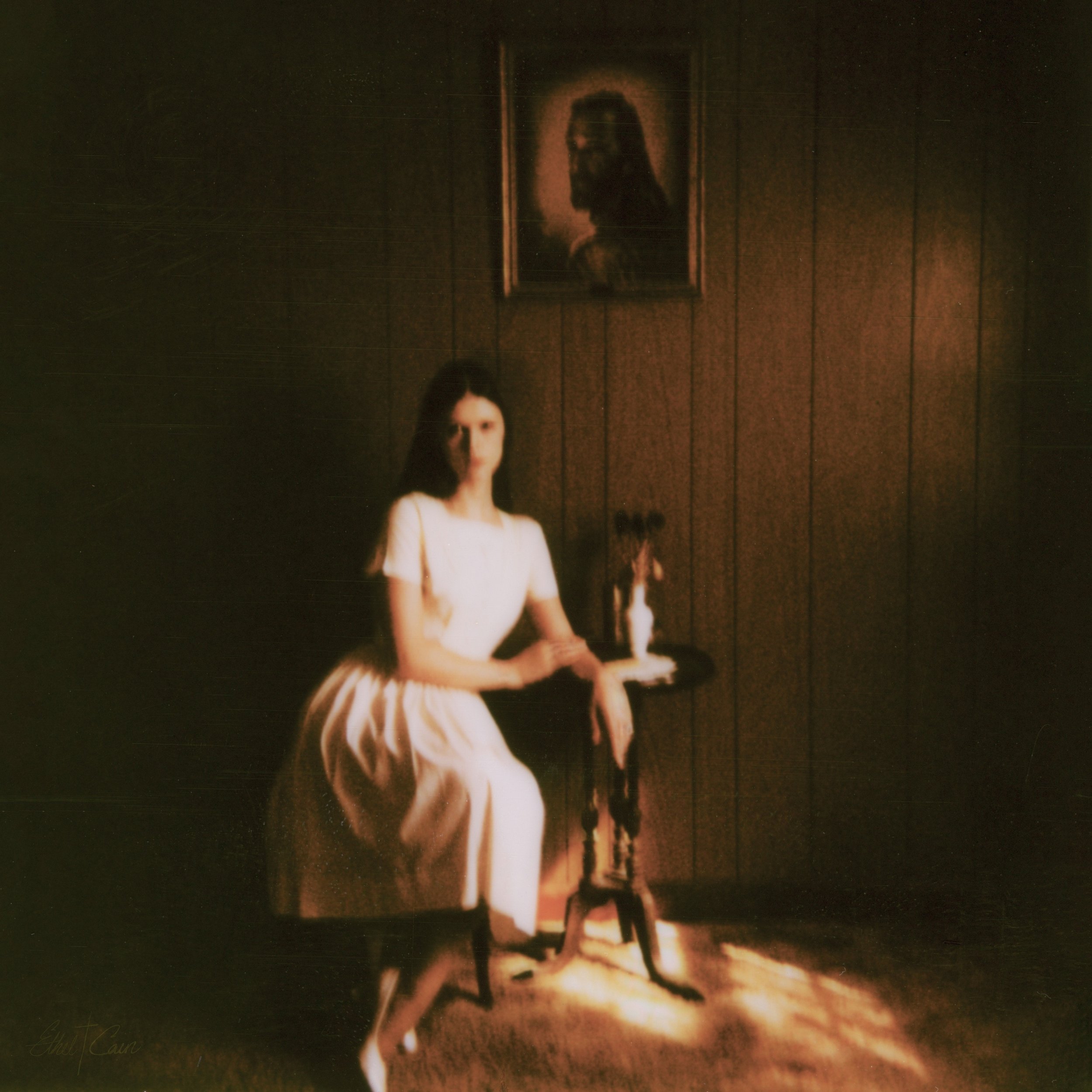
I’ve been thinking about drawing inspiration from the songs and themes of the overall project into my design work. A few possible design ideas I’ve had are tattoo designs or a poster design. One potential poster design idea is a missing person poster. (Later on during the album, the character Ethel Cain goes missing) I like to lean towards poster design because it keeps me in the software outside of class while also bridging my passion for music.
When it comes to tattoo designs, initially I wanted to design something from the lyric:
And you said, “Hey, do you wanna see the West with me? ‘Cause love’s out there and I can’t leave it be
Thoroughfare by Ethel Cain
The circled doodle is my first draft of a potential tattoo/sticker design.
To me this piece of the song makes me think of young love and roadtrips, the kind that are highlighted in a indie coming of age movie. My initial thought is to make a tattoo in the shape of a exit sign but instead of a road/city name it reads: LOVE’S OUT THERE with a arrow that says West. Upon sketching it, the design seemed blocky and maybe more suited to a sticker design.