Tag: magazine

  • another zine finished!

    Almost a year ago, an old friend gave me some cool old magazines. It was so cool to flip through them and see old ads and stories. There was a 1925 needlework magazine that was battered and it had such neat illustrations, that I just had to turn it into a zine. I did feel bad about cutting into it but it was practically falling apart and it had been scribbled in. (I still feel a little guilty)

    I went for the easiest and most basic zine method. Which is basically folding a letter size paper into 8 sections. For the zine, I used paper, the old magazine, elmers glue, and some dried forget me nots. The process took a long time. I wasn’t sure what direction I wanted to go. I started by cutting out my favorite illustrations and bigger words.

    The original zine scan

    This project took a long time and stayed halfway done buried in a sea of half-finished projects. But I finally finished it a week ago! Once I was done with the original, I scanned it and printed off copies. I like the grayscale look, but the original yellow would also be cool. I cut and folded the copies and wham bam I had multiple zines.

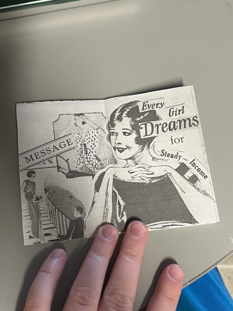
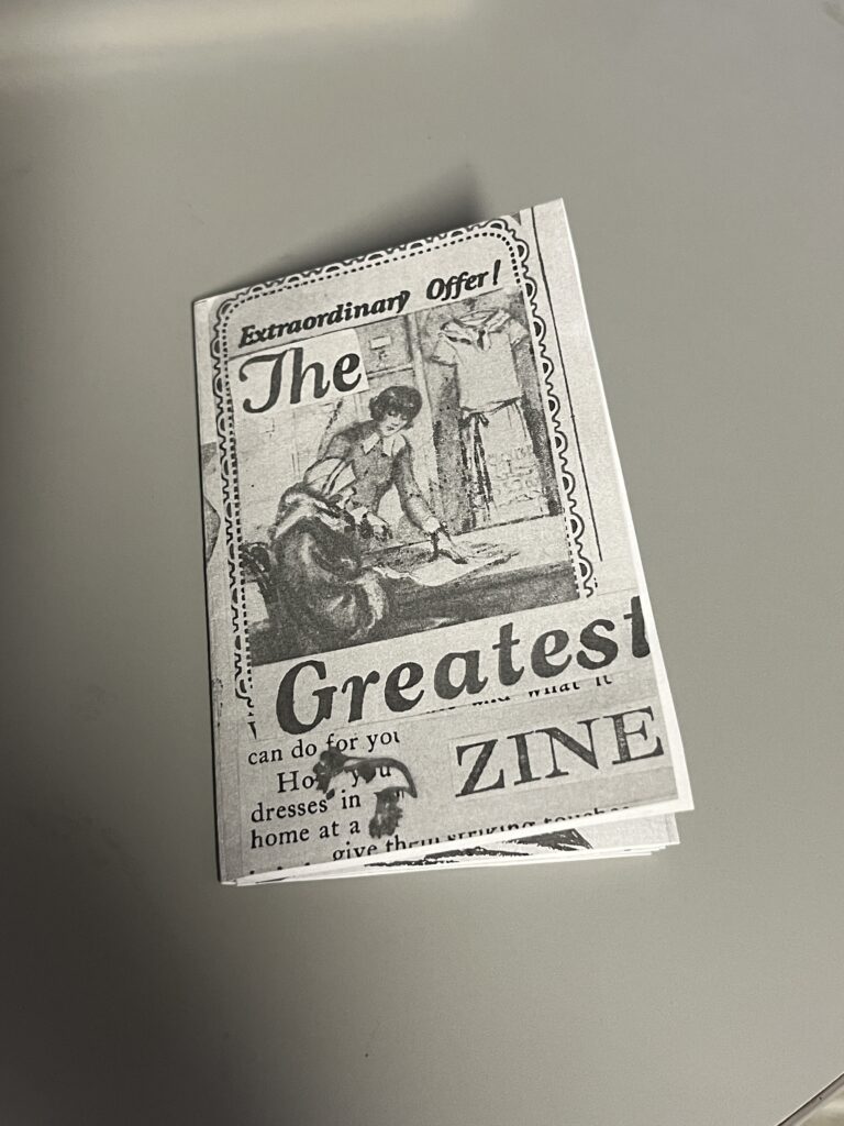
    The printer did cut off some of the edges, but I’m not bothered. I’m so proud of it!

  • the final countdown: aka semester final projects

    I’ve been chipping away at my final projects! Right now, I’m finalizing my last article spread. I really want to have it nearly finished so I can get feedback and turn in my magazine before class ends tomorrow.

    Here are my different iterations:

    I think I’m leaning towards the last one. Maybe I’ll change the top bar color.

    I’m also working on my perfume label. It’s come a long way since my last update.

    When I got some pointers from my teacher, it was clear that he wanted imagery instead of illustration. I might switch the colors from green to orange because it is an orange scent. Not too sure right now.

    That’s all she wrote! (for now) Wishing all students an easy finals week.

  • what the heck is a lead in spread

    Well folks I hit a brick wall. Even google couldn’t give me a clear answer when googling “what is a lead in magazine spread?” I’m furiously researching this because I happen to have a lead in spread due tomorrow afternoon for class. I’ve scavenged the internet and found resources for how to write a lead in spread, but nothing on how to design one. I’ve looked at Linkedin Learning and haven’t found anything directly relating to lead in spreads.

    My basic understanding of a lead in spread is that it is a spread that mainly has a large image across one page and a blurb of writing that teases the article.

    Here are some Fast Company magazine lead in spreads below

    So it seems the formula is simply

    large image + banner+ title and introduction blurb= lead in spread

    Here is my finished lead in spread

    If anyone else has any resources or clarifying information, please let me know in the comments below!

  • product spread adventures

    product spread adventures

    Making my first product spread was a rollercoaster! It challenged me to beef up my photography skills and problem-solve.

    My magazine is all design-centered. So I wanted my product spread to align with that. I decided to make the theme of the spread: things designers need. (That way I could scavenge my apartment for things I already had)

    The (Pinterest) Inspo

    The Trials and Tribulations of The Product Spread

    My intial thought was that I could take one picture with everything laid out in the lightbox. However, I had trouble getting a wide enough shot. It was also tricky to get enough height to take the picture.

    So, I pivoted to taking individual pictures of my products. This way, I could place everything on the spread wherever I wanted it. I had a hard time taking a picture of a mug. When I placed it on its side, it rolled, and angling the camera was a bust. I ended up with six product pictures of tea, coffee, pens, a sketchbook, a planner, and a journal.

    I took my pictures into Photoshop and got rid of the background, fixed the brightness, etc. Placement was difficult to pin down. I wanted the spread to resemble a semi-messy desk. But the finished spread had the products more centered and neat.

    Honestly, at this point I wasn’t too happy with what I had. I didn’t consider all of the colors of my products. The colors didn’t really go together, so I ended up finding a different planner and teabags to reshoot.

    Then I tackled the background. I wanted it to have some sort of texture. I found two different brown paper bags and some wrinkled wrapping paper. The wrapping paper ended up being the wrong color and a bit too wrinkly. But the brown paper bag worked out just right. I got inspired by a Trader Joe’s bag and took pictures of the illustrations. Then I removed the backgrounds in post and added them to my spread for some fun.

    The Evolution of My Product Spread

    The early iteration with the old planner and tea bags
    After talking with my teacher, I moved some things around
    I moved the kettle behind to allow more space for the text (the final form)

    That’s all she wrote! Comment your design roadblocks and how you overcame them.

  • design legends you should know #4 David Carson

    design legends you should know #4 David Carson

    Rulebreaker, Father of Grunge Typography, prolific surfer. All things that aptly describe David Carson.

    Carson started out as a high school teacher in Oregon, where he caught wind of a graphic design summer program at University of Arizona. Soon after he was off to Switzerland to another summer program under the instruction of instructor Hans-Rudolf Lutz. He began working at various magazines such as, Transworld Skateboarding, Beach Culture, and Surfer. In the early 90s, he landed at an alternative music magazine, Ray Gun, and really developed his style. Working at Ray Gun in the peak grunge era, Carson was able to lean into it and make it his own. After three years, Carson left Ray Gun in pursuit of his own design business.

    What makes David Carson so unique is his fresh perspective on design. He tosses out the traditional design rules and forges his own. This take on design is what gives him his edge and personality. That’s essentially his brand.

    Some of his work

    poster for his 2014 AIGA lecture (not my pic)
    dvd navigation design for Nine Inch Nails (not my pic)
    obama election design from 2009 (not my pic)

    A really great interview article to better understand Carson and his philosophies: click here!

    Sources

  • manipulating type in Illustrator

    manipulating type in Illustrator

    The college homework saga continues! We are currently designing the nameplate, or title, of our magazine. After scrolling through adobe fonts, I finally found my font: casserole. Which is such a fun name and just warms my Midwest heart.

    But picking a font was just the beginning. Now I have to expand my Illustrator skill set and figure out just how to manipulate type. I haven’t done a whole lot with typography so I consulted google and found these really helpful videos.

    I learned a lot about the pencil tool! I’ve become so comfortable with the pen tool, that I haven’t tried it. That ends today!

    Brainstorming

    My magazine title is musings. After thinking and surfing Pinterest, I wanted to try incorporating a quill nib into the title.

    some generic quill nibs (not my pic)

    I started sketching how I wanted the nib to replace the i in musings.

    some of my scribblings!
    some iterations

    I like the one in the middle. I don’t think I need a dot for the i. This week, I’m going to check in with my teacher and get some feedback. I couldn’t for the life of me figure out how to knock out the middle pieces of the quill either.

    That’s all for today folks! Did you learn anything new?

    • almost done with my ten-piece campaign

      After what seems like actual AGES, I’m almost done with my ten-piece campaign for Layout 3. I’ve finished I only have the festival map left! Thank goodness. Here are some snippets of my finished products.

    • the library hiatus is over

      After all of the advocacy work I’ve done for the library, I was hopeful that I was done. However, with the shutdown of the Institute of Library and Museum Services (ILMS), I am far from it. A lot of South Dakotans (myself included) made numerous calls to our SD legislators in hopes of restoring the…

    • the ten piece poster final form

      After way too long, I’ve finally finished the ten-piece campaign poster. Deep down, I wanted to create more of an art-centered poster. But with all of my classes and working part-time, I’m left with minimal time. I opted for a simple and sleek poster design. I scrapped most of what I started with. Throughout a…

  • delving into magazines and zines

    delving into magazines and zines

    Today I started my morning with a video from one of my favorite Youtubers, Mina Le. She made a video essay detailing the rise and fall of fashion magazines. It was a fun watch, especially because I grew up with magazines like American Girl, Highlights, and even Seventeen. Even magazines like People and Us Weekly hold a certain sense of nostalgia because I remember reading headlines while unloading groceries with my mom. But somewhere along the way magazines fell off. With the rise of the internet it makes sense. You didn’t have to rely on magazines for gossip, national news, or trends when you had the internet at your fingertips.

    While some magazines survived the internet age, some went digital or died completely. Despite this, I really want to make my own. A magazine is a big undertaking, so I’m more drawn to zines.

    What is a zine?

    According to Purdue University a zine is a “small-batch, independently published work that circulates less than 1,000 copies”. Purdue also walks through zine history and a tutorial (click here).

    Zines have a history of activism, science fiction, and punk culture stemming back from the 1930s. Although zines are known for their rebellious nature, the content can be anything and everything. Read on for some examples.

    Sniffin’ Glue is a punk fanzine from the 70s.
    Riot Grrrl is a punk driven feminist zine that started in the 90s

    When creating a zine (or magazine) it can be done digitally or created by hand. I tend to gravitate towards making my zines by hand because it comes naturally to me. I’m still learning and improving my Adobe skills, but I’m not as adept as I’d like to be. I’ve decided to go about it with Adobe InDesign to stay in the software.

    However, creating a zine by hand can be just as much fun as doing it digitally. You can draw, glue, and glitter to your hearts content! After finishing your master copy zine, most people scan the pages to print and assemble additional zines.

    Next week I’ll detail my zine process, but until then…

    Rock on and read my latest posts below!