I finally finished my first assigned ticket/project! It was a really simple task but still. I had to turn a bookmark file into an 8.5 x 11″ flyer. There were some bumps in the road. The bookmark functioned as a coupon for a free library bag, which would be odd for a flyer. I asked about that and then scrapped the coupon paragraph. Turning a bookmark into a flyer also made it interesting when trying to place images.
I learned how communication between a client and a designer goes. It was good practice! Another graphic designer was also able to look over my file. I’m still learning what versions of logos to use and where everything is on the I drive. I’ve never used the Share for Review feature in Adobe. It’s pretty handy and I think I’ll remember that for future projects.
Now I’ve got the hang of things (a little bit at least). I can’t wait to update yall on what I work on next 🙂
After the exhausting saga of calling my local legislators, I wanted to draft up a quick library flyer design. I’m not looking to print them en mass from another site, so I want to print them on a 11 x 8.5″ sheet of paper.
The Process
I opened up InDesign and started with a 11 x 8.5” size file. I snapped guides to divide it into four even sections.
I looked at my original poster design. I wanted to take the elements of the big poster and condense it into a small flyer.
After looking at the previous poster, I decided I wanted: a headline, short summary, and a qr code with resources.
The Final Flyer Design
Side by Side Comparison
The Flyer The Original Poster
I can’t decide if I need the black outline or not. It might make the flyers easier to cut (or at least, that was the idea).
How do you design flyers? I’m off to finish some homework. Ciao!
Well folks I hit a brick wall. Even google couldn’t give me a clear answer when googling “what is a lead in magazine spread?” I’m furiously researching this because I happen to have a lead in spread due tomorrow afternoon for class. I’ve scavenged the internet and found resources for how to write a lead in spread, but nothing on how to design one. I’ve looked at Linkedin Learning and haven’t found anything directly relating to lead in spreads.
My basic understanding of a lead in spread is that it is a spread that mainly has a large image across one page and a blurb of writing that teases the article.
Here are some Fast Company magazine lead in spreads below
So it seems the formula is simply
large image + banner+ title and introduction blurb= lead in spread
Here is my finished lead in spread
If anyone else has any resources or clarifying information, please let me know in the comments below!
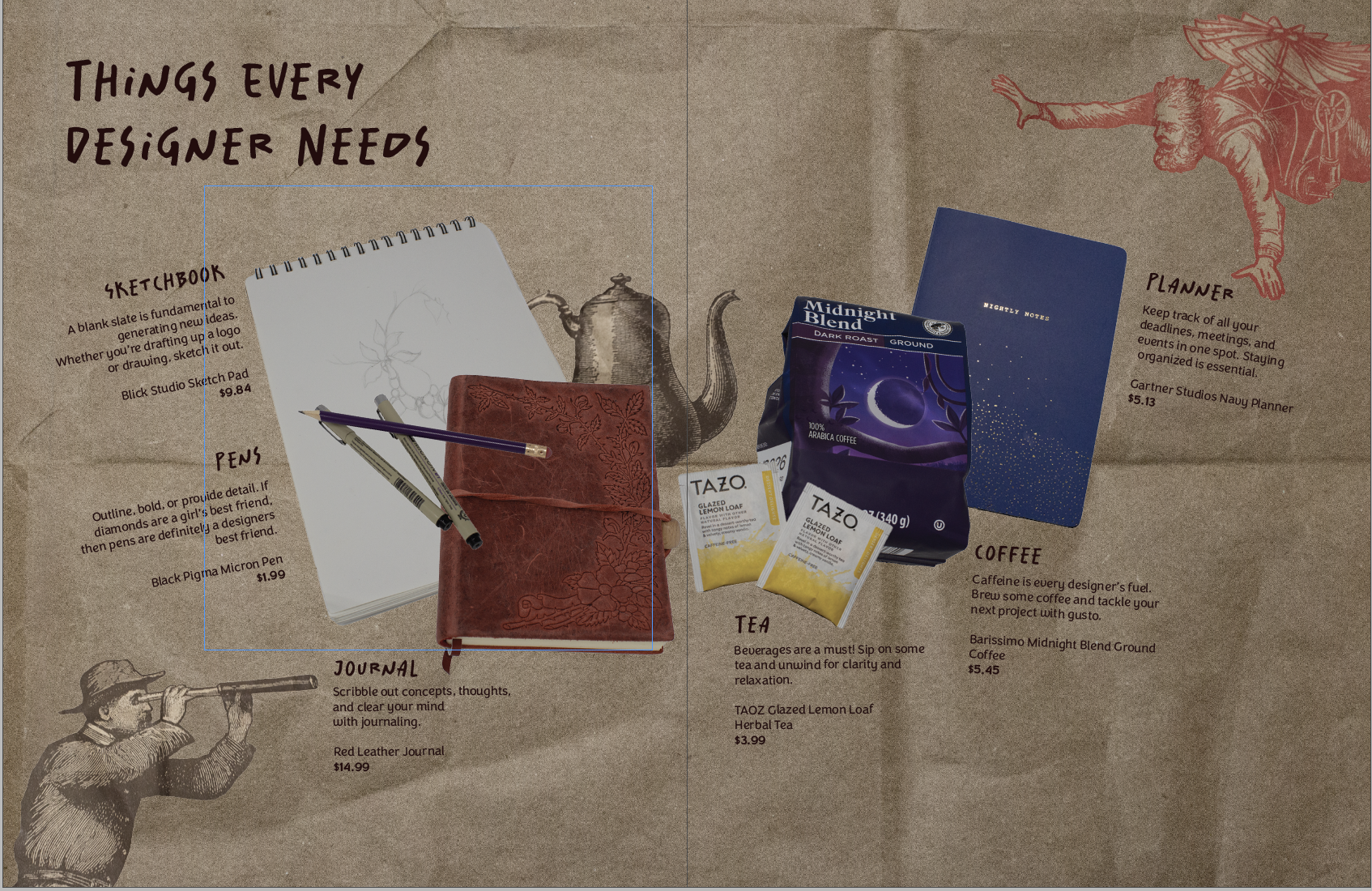
Making my first product spread was a rollercoaster! It challenged me to beef up my photography skills and problem-solve.
My magazine is all design-centered. So I wanted my product spread to align with that. I decided to make the theme of the spread: things designers need. (That way I could scavenge my apartment for things I already had)
The (Pinterest) Inspo
The Trials and Tribulations of The Product Spread
My intial thought was that I could take one picture with everything laid out in the lightbox. However, I had trouble getting a wide enough shot. It was also tricky to get enough height to take the picture.
So, I pivoted to taking individual pictures of my products. This way, I could place everything on the spread wherever I wanted it. I had a hard time taking a picture of a mug. When I placed it on its side, it rolled, and angling the camera was a bust. I ended up with six product pictures of tea, coffee, pens, a sketchbook, a planner, and a journal.
I took my pictures into Photoshop and got rid of the background, fixed the brightness, etc. Placement was difficult to pin down. I wanted the spread to resemble a semi-messy desk. But the finished spread had the products more centered and neat.
Honestly, at this point I wasn’t too happy with what I had. I didn’t consider all of the colors of my products. The colors didn’t really go together, so I ended up finding a different planner and teabags to reshoot.
Then I tackled the background. I wanted it to have some sort of texture. I found two different brown paper bags and some wrinkled wrapping paper. The wrapping paper ended up being the wrong color and a bit too wrinkly. But the brown paper bag worked out just right. I got inspired by a Trader Joe’s bag and took pictures of the illustrations. Then I removed the backgrounds in post and added them to my spread for some fun.
The Evolution of My Product Spread
The early iteration with the old planner and tea bagsAfter talking with my teacher, I moved some things aroundI moved the kettle behind to allow more space for the text (the final form)
That’s all she wrote! Comment your design roadblocks and how you overcame them.
So this semester is all about making a magazine, quite literally, from scratch. We have to write the articles, conduct interviews, photograph interviewees and products, design our own advertisements– you get the idea.
I kinda dove in headfirst, working on assignments as they were given. Because of this slapstick approach, I haven’t really fully thought about the vibe of my magazine, colors, spreads, etc.
So over my weekend, I wanted to cement the foundation of my magazine. I took to Pinterest and made a mood board with spread design ideas. I went online and used this website to generate color palette ideas. For my fonts, I used Adobe Fonts and browsed for potential body copy fonts. Indesign was my chosen software.
Some spread ideas that I liked (above and below)
I wanted to keep the magazine minimal but with a sense of design with colors and layout.
The finished scrappy mood board
The mood board will make it easier for me to design future elements and spreads of my magazine, musings.
Welcome back ya’ll! Today I thought I’d walk you through my current challenge: creating a graphic design portfolio. I am by no means an expert, but with the power of the internet and my teachers, I think I can handle it.
Where to begin?
The most important part of your portfolio is the contents. You want to show off your best work, what you’re most proud of. So gather up your portfolio pieces and edit them as needed. I needed to edit some of my projects after getting feedback from other graphic designers. Do this and then we can start designing the portfolio.
Designing the portfolio
For some reason, this is the most daunting part. I’m opting to create my portfolio in Indesign, but there’s a lot of other options such as Adobe Express.
My itty bitty screenshot, I couldn’t figure out how to make it bigger 🙁
Navigate to New File –> Web tab –> and then look at some templates. You can use those or create your own!
I started with a business proposal template and began to customize it to my portfolio needs. I wanted to include sketches, process images, final product pictures and design explanations.
A rough idea of my portfolio layout!
And that’s it! Design your portfolio and then export it as a PDF, or an interactive PDF if you have links, etc.
After a crazy week, I’ve managed to cross most of my things off my list! So far I’ve finished: It’s hard to believe that the portfolio show is this week! And then graduation the week after. In the middle of the chaos, I still found time to work, dogsit, and make some shrinky-dink earrings. I’m…
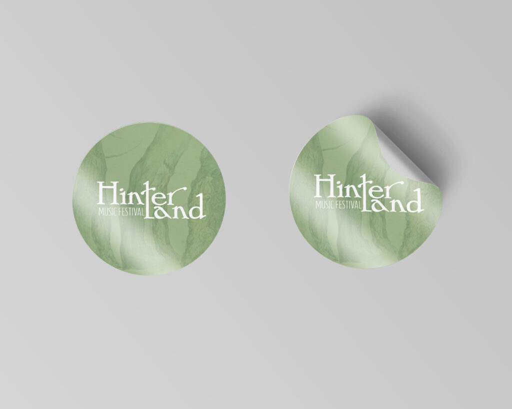
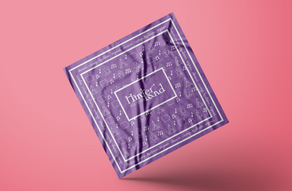
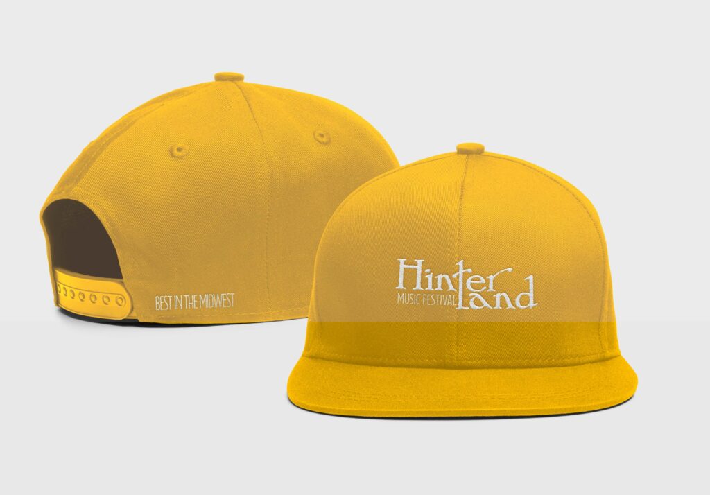
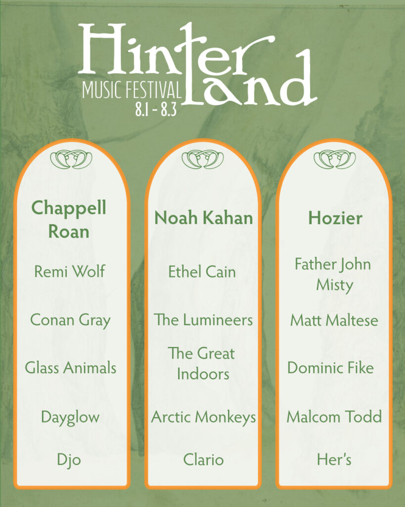
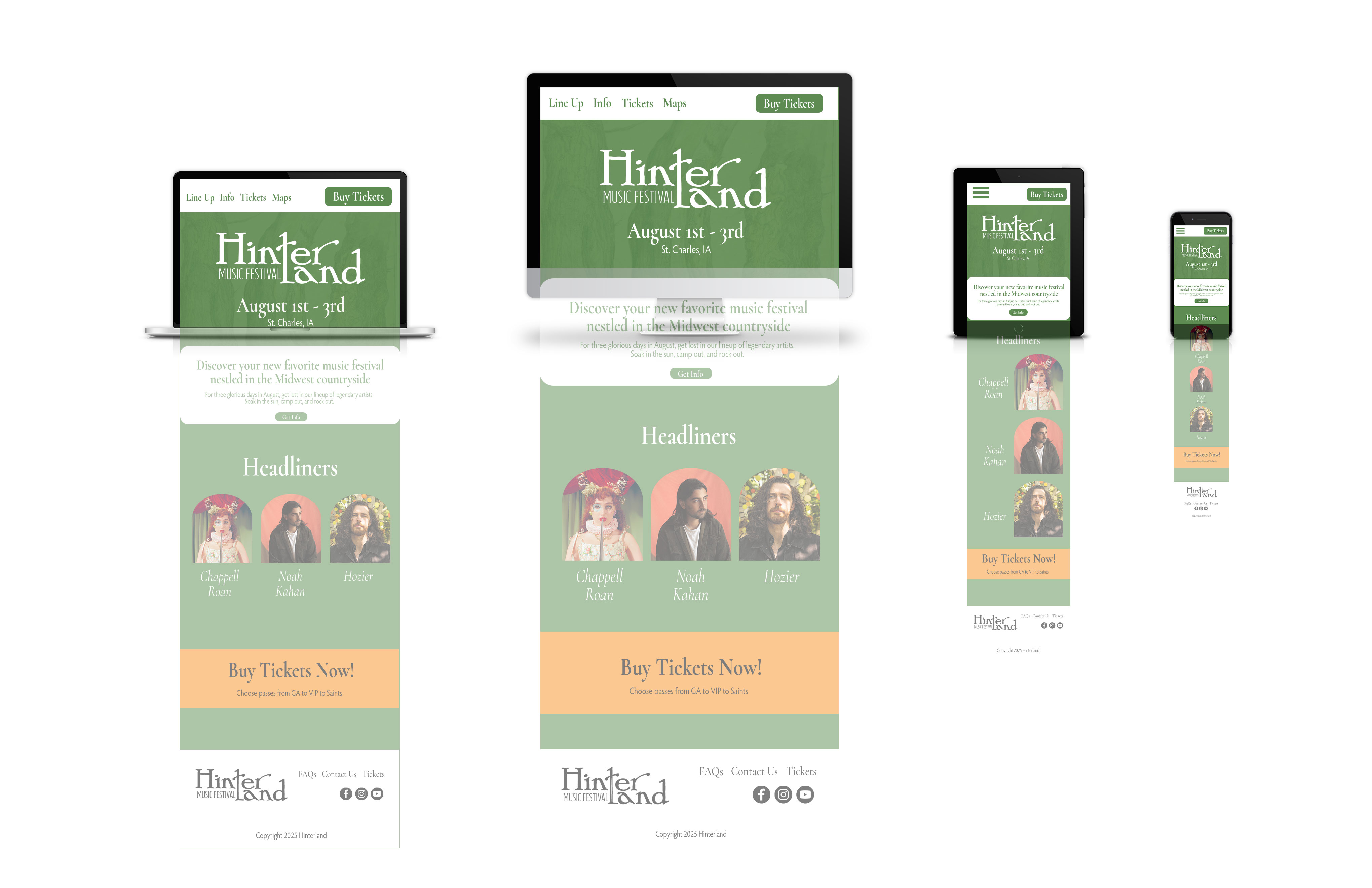
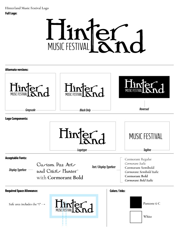
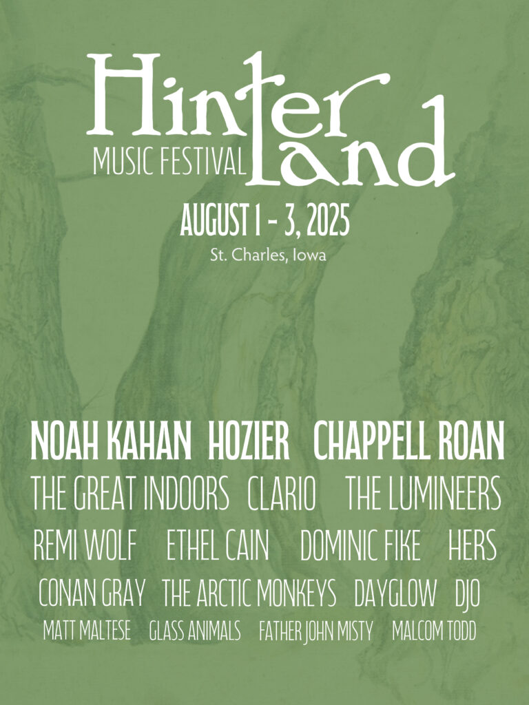
After what seems like actual AGES, I’m almost done with my ten-piece campaign for Layout 3. I’ve finished I only have the festival map left! Thank goodness. Here are some snippets of my finished products.
After all of the advocacy work I’ve done for the library, I was hopeful that I was done. However, with the shutdown of the Institute of Library and Museum Services (ILMS), I am far from it. A lot of South Dakotans (myself included) made numerous calls to our SD legislators in hopes of restoring the…
Hey yall, I’m back! Before jumping into the software I decided to look for a tutorial. I found this one and it was pretty straightforward. If you’re looking for a tutorial on how to make a zine by hand check out this video from brattyxbre.
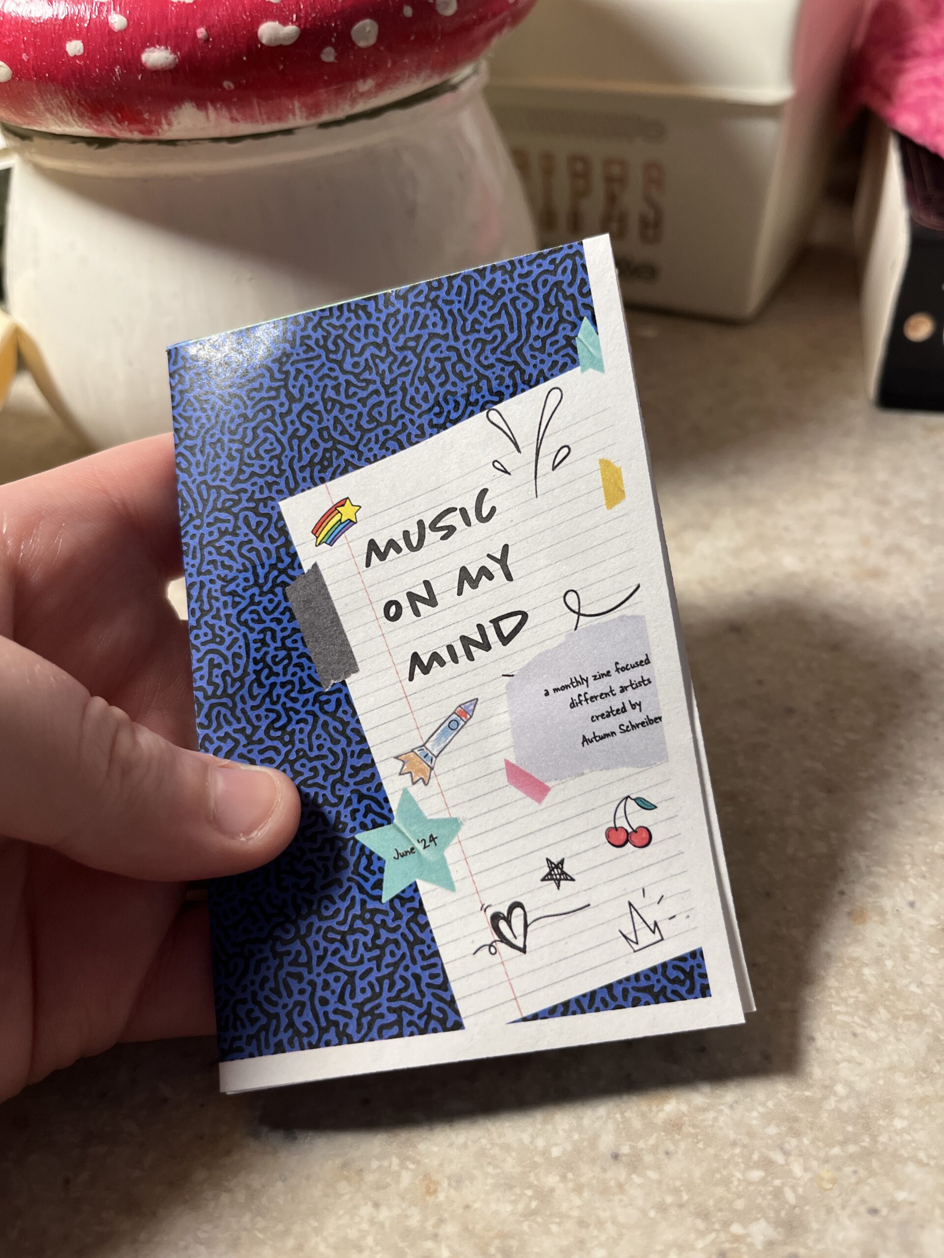
So first up is finding inspiration. Right now I’ve been really into musicians Chapell Roan and Ethel Cain. I’d be a shell of myself without Spotify. My zine will be called music on my mind to reflect my current song infatuations.
Now that I have my topic, I split my pages up.
Cover
Intro Page
Artist
Artist
Artist
Artist
Artist
Back
Here’s the rough sketched out page design layout!
Designing
The hardest part is next. I followed this tutorial to figure out my layout in the software. From there I found corresponding fonts and scrapbook-like elements. The colors, elements, and fonts corresponded with the main picture and the vibe of the artist. I got most of my fonts and elements from Adobe Fonts and Adobe Stock Images.
The Final Product
Initially, I had the layout similar to the video tutorial. However I ran into issues figuring out how to print it. More on that below.
Printing
Printing is a different beast entirely. At first, I printed my facing pages as spreads. But I thought I’d be smart and print them doublesided to save on paper. However, my double sided pages didn’t face the same way and one side was up and the other was flipped. To save my remaining sanity I brought the pages into a 8.5″ x 11″ document (split into 8). This allowed me to save on paper and simply fold and cut to make a zine without needing binding. For some reason, I still ended up with a white border after printing. I used the school’s printers but will try UPS next time.
This is how I folded my mini zine!
Thoughts
If I were to do this again (hopefully soon!) I would change a couple of things.
Font Unity
I used a lot of fonts to try to adhere to the featured artist, but doing so made it hard to read and overall not uniform
Readability
I’d change the font size to be legible, it was hard to tell before printing
Printing Process
I ran into patchy ink printing so I’d find another way to print next time
Layout
Instead of doing multiple facing pages, I’d stick to a 8.5 x 11″ split into 8 sections. The simplified layout doesn’t make my head hurt as much and would save money on printing if I decide to sell/print multiple.
What would you make a zine about? Have you made one before? Let me know below 🙂