Tag: grunge

  • design legends you should know #4 David Carson

    design legends you should know #4 David Carson

    Rulebreaker, Father of Grunge Typography, prolific surfer. All things that aptly describe David Carson.

    Carson started out as a high school teacher in Oregon, where he caught wind of a graphic design summer program at University of Arizona. Soon after he was off to Switzerland to another summer program under the instruction of instructor Hans-Rudolf Lutz. He began working at various magazines such as, Transworld Skateboarding, Beach Culture, and Surfer. In the early 90s, he landed at an alternative music magazine, Ray Gun, and really developed his style. Working at Ray Gun in the peak grunge era, Carson was able to lean into it and make it his own. After three years, Carson left Ray Gun in pursuit of his own design business.

    What makes David Carson so unique is his fresh perspective on design. He tosses out the traditional design rules and forges his own. This take on design is what gives him his edge and personality. That’s essentially his brand.

    Some of his work

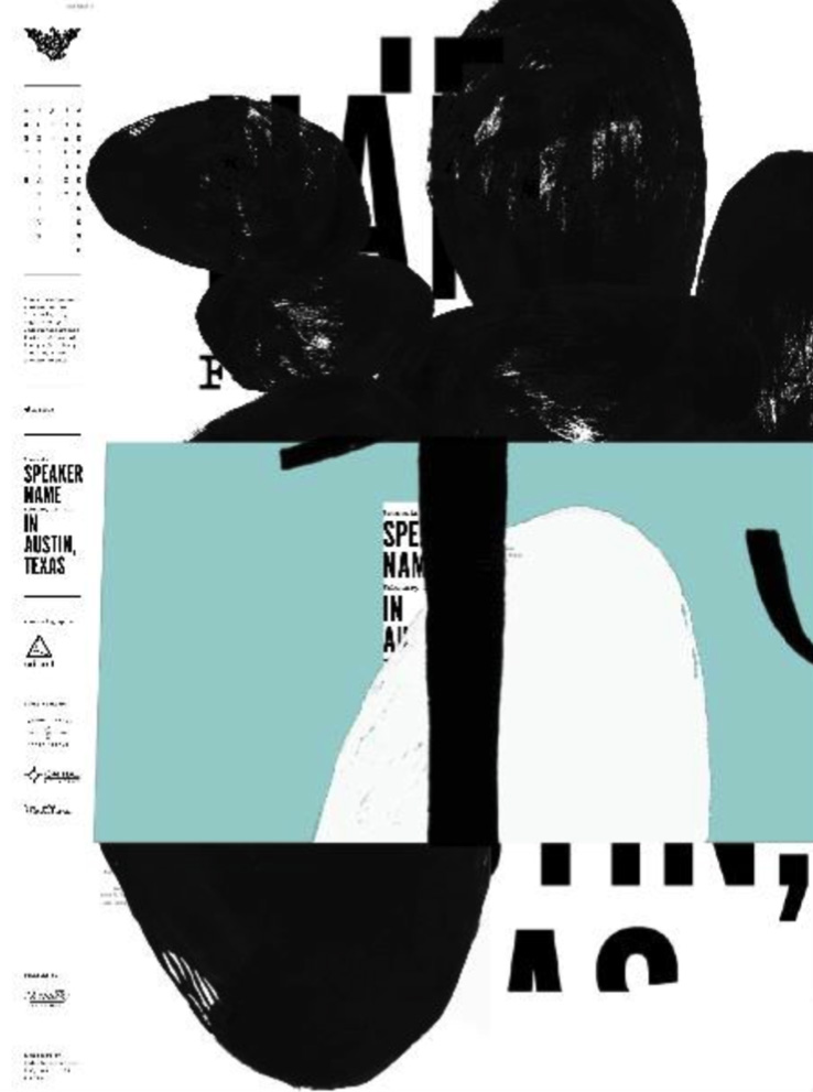
    poster for his 2014 AIGA lecture (not my pic)
    dvd navigation design for Nine Inch Nails (not my pic)
    obama election design from 2009 (not my pic)

    A really great interview article to better understand Carson and his philosophies: click here!

    Sources
  • trying out t-shirt design

    This summer has flown by so fast! One thing I like to do every summer is some sort of craft. So I dug out my fabric paint and made some sick custom t-shirts. There’s something cool about bringing a sketched out design to life and then being able to wear it out and about.

    Here’s the sketch w/some of the shirt in the background

    My chosen playlist for this project: click here

    But yesterday I finished a sketch and thought it was decent enough to actually mock up in Adobe Illustrator. It reminded me of a similar project I did last semester at STC. The goal was to create a school club t-shirt that could potentially be sold in the bookstore. We considered graphic placement, fonts, and school colors.

    My goal with this design was to create my own fan merch that was simple and true to the artist. Instead of a actual picture I opted for a silhouette. I used bold contrasting fonts to convey the song lyrics complicated heavy message.

    I brought the sketch into illustrator and started tracing it. I liked my initial design, but it was a bit hard to read the bold font.

    After some feedback, I expanded the size of the halo to include the text and tried a solid color font.

    I like the reworked design (above) but I think the halo could be thinner. The contrast of thickness seems a bit off and the halo and the text seem to be competing for dominance.

    Here’s the initial mockup! I added the Ethel Cain logo to the back because some of her merch includes it. (example of her merch below)

    I’m gonna look for some more free tshirt psd mock ups, clean up the design and then share the final product with you!

    Thanks for reading! Let me know your thoughts and check out my posts below.