I’ve been chipping away at my final projects! Right now, I’m finalizing my last article spread. I really want to have it nearly finished so I can get feedback and turn in my magazine before class ends tomorrow.
Here are my different iterations:
I think I’m leaning towards the last one. Maybe I’ll change the top bar color.
I’m also working on my perfume label. It’s come a long way since my last update.
When I got some pointers from my teacher, it was clear that he wanted imagery instead of illustration. I might switch the colors from green to orange because it is an orange scent. Not too sure right now.
That’s all she wrote! (for now) Wishing all students an easy finals week.
In my New Media Class, we are making website mood boards for a fictitious client. The website is for Chef Jaqueline, who specializes in making cakes and baked goods for big events. I first started off with making up a moodboard template in Photoshop and then filling it in. There are various mood board templates online that you can find as well.
I love color and decided to hop onto color.adobe.com. They have all sorts of color palettes. I searched up terms like bakery, cookies, and cake to get some potential color options. I ended up going with a pink French bakery color palette.
For fonts, I wasn’t too sure. I looked at other local bakery sites for ideas. Most headline fonts were bold, readable, and sans serif.
I found a font I really liked for headlines, called New Kansas. I usually get my fonts from Adobe fonts. I went with a sans serif sub headline font, Elza. And then a simple serif font, Dolly Pro, for the body copy.
I also had to make sure my navbar colors were easily readable. I experimented with my different palette colors to find the best option. To make sure, I used this color checker website.
Ta Da! The finished mood board
Read more posts for design insights. Until next time 🙂
So this semester is all about making a magazine, quite literally, from scratch. We have to write the articles, conduct interviews, photograph interviewees and products, design our own advertisements– you get the idea.
I kinda dove in headfirst, working on assignments as they were given. Because of this slapstick approach, I haven’t really fully thought about the vibe of my magazine, colors, spreads, etc.
So over my weekend, I wanted to cement the foundation of my magazine. I took to Pinterest and made a mood board with spread design ideas. I went online and used this website to generate color palette ideas. For my fonts, I used Adobe Fonts and browsed for potential body copy fonts. Indesign was my chosen software.
Some spread ideas that I liked (above and below)
I wanted to keep the magazine minimal but with a sense of design with colors and layout.
The finished scrappy mood board
The mood board will make it easier for me to design future elements and spreads of my magazine, musings.
Welcome back ya’ll! Today I thought I’d walk you through my current challenge: creating a graphic design portfolio. I am by no means an expert, but with the power of the internet and my teachers, I think I can handle it.
Where to begin?
The most important part of your portfolio is the contents. You want to show off your best work, what you’re most proud of. So gather up your portfolio pieces and edit them as needed. I needed to edit some of my projects after getting feedback from other graphic designers. Do this and then we can start designing the portfolio.
Designing the portfolio
For some reason, this is the most daunting part. I’m opting to create my portfolio in Indesign, but there’s a lot of other options such as Adobe Express.
My itty bitty screenshot, I couldn’t figure out how to make it bigger 🙁
Navigate to New File –> Web tab –> and then look at some templates. You can use those or create your own!
I started with a business proposal template and began to customize it to my portfolio needs. I wanted to include sketches, process images, final product pictures and design explanations.
A rough idea of my portfolio layout!
And that’s it! Design your portfolio and then export it as a PDF, or an interactive PDF if you have links, etc.
It’s been awhile! I’ve really gotten engulfed in my internship. I started working full 40 hour weeks since the end of May. Here’s the rundown of my current projects: Yeah you read that right. It’s dog week at my internship and I definitely could use all the puppy love. (Pic for proof, otherwise it didn’t…
My internship has been so fun! It honestly doesn’t even feel like work. I’ve been working on a bunch of different projects. The chat bot has been ongoing for awhile now. Currently we have four strong designs that need to be voted on! I’m secretly rooting for the Sherman graphic (below). I’ve also been working…
I’m back! I graduated and headed straight to Hawaii. Literally. The morning after graduation I was on a plane to see my sister in Oahu. It was sooo much fun and the week went by so fast. Right now I’m diving headfirst into my internship, fulltime. I hope to update you guys on my summer.
Rulebreaker, Father of Grunge Typography, prolific surfer. All things that aptly describe David Carson.
Carson started out as a high school teacher in Oregon, where he caught wind of a graphic design summer program at University of Arizona. Soon after he was off to Switzerland to another summer program under the instruction of instructor Hans-Rudolf Lutz. He began working at various magazines such as, Transworld Skateboarding, Beach Culture, and Surfer. In the early 90s, he landed at an alternative music magazine, Ray Gun, and really developed his style. Working at Ray Gun in the peak grunge era, Carson was able to lean into it and make it his own. After three years, Carson left Ray Gun in pursuit of his own design business.
What makes David Carson so unique is his fresh perspective on design. He tosses out the traditional design rules and forges his own. This take on design is what gives him his edge and personality. That’s essentially his brand.
Some of his work
poster for his 2014 AIGA lecture (not my pic)dvd navigation design for Nine Inch Nails (not my pic)obama election design from 2009 (not my pic)
A really great interview article to better understand Carson and his philosophies: click here!
To follow trends or not to follow trends, that is the question!
And the consensus from designers is to avoid trends. The goal is to create timeless and iconic designs as years and decades pass. Think of Coca Cola or IBM. They can’t be defined as such an 80s or y2k design.
So what are the current design trends to be wary of?
According to Adobe, the design trends for 2024 are:
3D type and bubble text
Color clashing
Curve smoothing
70’s nostalgia
Vintage minimalism
Anti design
Abstract gradients
Texture
Geometry
Illustration and logo mascots
from just this screenshot of my design Instagram account, you can see examples of trendy design
Overall, nothing is original. But that doesn’t mean you need to follow trends, and also maybe dabble a bit. There’s no right or wrong answer, as long as trends aren’t holding you in a chokehold. Create and try things!
It’s been awhile! I’ve really gotten engulfed in my internship. I started working full 40 hour weeks since the end of May. Here’s the rundown of my current projects: Yeah you read that right. It’s dog week at my internship and I definitely could use all the puppy love. (Pic for proof, otherwise it didn’t…
My internship has been so fun! It honestly doesn’t even feel like work. I’ve been working on a bunch of different projects. The chat bot has been ongoing for awhile now. Currently we have four strong designs that need to be voted on! I’m secretly rooting for the Sherman graphic (below). I’ve also been working…
I’m back! I graduated and headed straight to Hawaii. Literally. The morning after graduation I was on a plane to see my sister in Oahu. It was sooo much fun and the week went by so fast. Right now I’m diving headfirst into my internship, fulltime. I hope to update you guys on my summer.
Born in 1914, in NY, Rand was an art director, writer, graphic designer, and design professor (teaching at Yale, Pratt, and Cooper University). He was renowned for his logo design at IBM, AIGA, UPS, ABC, and Steve Jobs’ start-up NeXT.
Merely a few of his logo designs, click here for more
He wrote a book in 1947, “Thoughts on Design”. It’s still used in classrooms to this day and lays out Rand’s ideas on what makes good design. But he didn’t stop at writing one book, he went on to write over eight more.
He was a fan of the Swiss style. It is “a minimalist design style, favoring a block layout, sans serif typefaces, and photographs.” (source) The overall purpose of Swiss style is to communicate an idea clearly and clean cut. You can see that a lot of Paul Rand’s work is no frills, it’s has its own style– yet it very simple.
Despite his death in 1996, his logos remain timeless– a true testament to his prolific design prowess.
In school they teach you about influential people, founding fathers, famous artist, etc. But in college, we haven’t discussed important graphic designers. So I’ve taken it upon myself to educate myself and ya’ll while I’m at it.
Today’s design star is Susan Kare
So who is Susan Kare, the “woman who gave the Macintosh a smile”?
Susan Kare is most known for her work at Apple. She got her start there in 1983 as a Macintosh Artist. Despite not knowing anything about computer graphics and typefaces, she educated herself at the local library and aced the interview.
At Apple, Kare was in charge of designing icons and typefaces for the Mac operating system. She worked with graph paper to design some of Apple’s most iconic icons such as the ticking bomb for system error, trash can, the pointed arrow cursor and more.
Because her icon designs were universal and friendly, they encouraged technology-illiterate users to try out computers.
Susan Kare’s icon designs, courtesy of kareprints.com
She also designed fonts, contributed to the Mac rollout campaign, and demonstrated the capabilities of the MacPaint application.
Kare went on to create her own design firm, Susan Kare LLP, in 1989. Her design skills were used at companies like Microsoft, Oracle, Facebook, and even Pinterest.
Trader Joe’s is a grocery store, and while there aren’t any in SD it’s still one of my favorite grocery stores. It has good prices (perfect for a broke college student like me) and unique products with fun packaging.
I only visit TJ’s occasionally when I visit family and I’m always down to try new things. The neat packaging always draws my eye.
The last time I went, I saw the bright graphics for the Strawberries and Creme Pancake mix and I just had to get it. The vibrant colors and cute strawberries really made an impact. They just had a fun vibe that other boring pancake mix boxes just couldn’t live up to.
Disclaimer: all images in this post are not mine
Even after I made the (mediocre) pancakes, I was drawn to keep parts of the box. I’m crafty and like to make collages in my spare time, so I definitely cut and saved the little strawberries.
Hey yall, I’m back! Before jumping into the software I decided to look for a tutorial. I found this one and it was pretty straightforward. If you’re looking for a tutorial on how to make a zine by hand check out this video from brattyxbre.
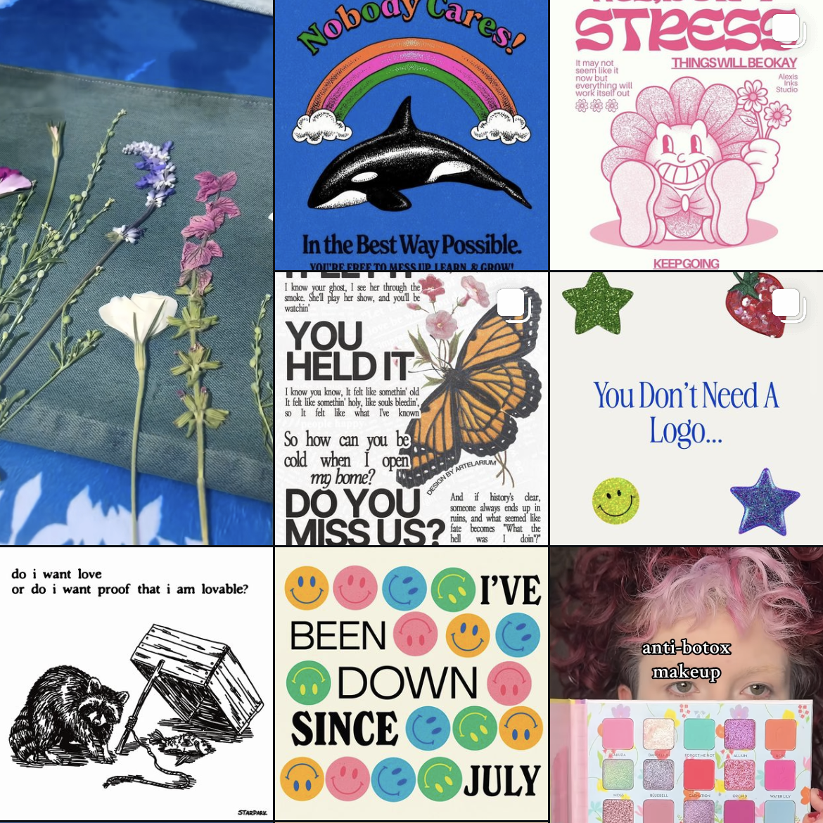
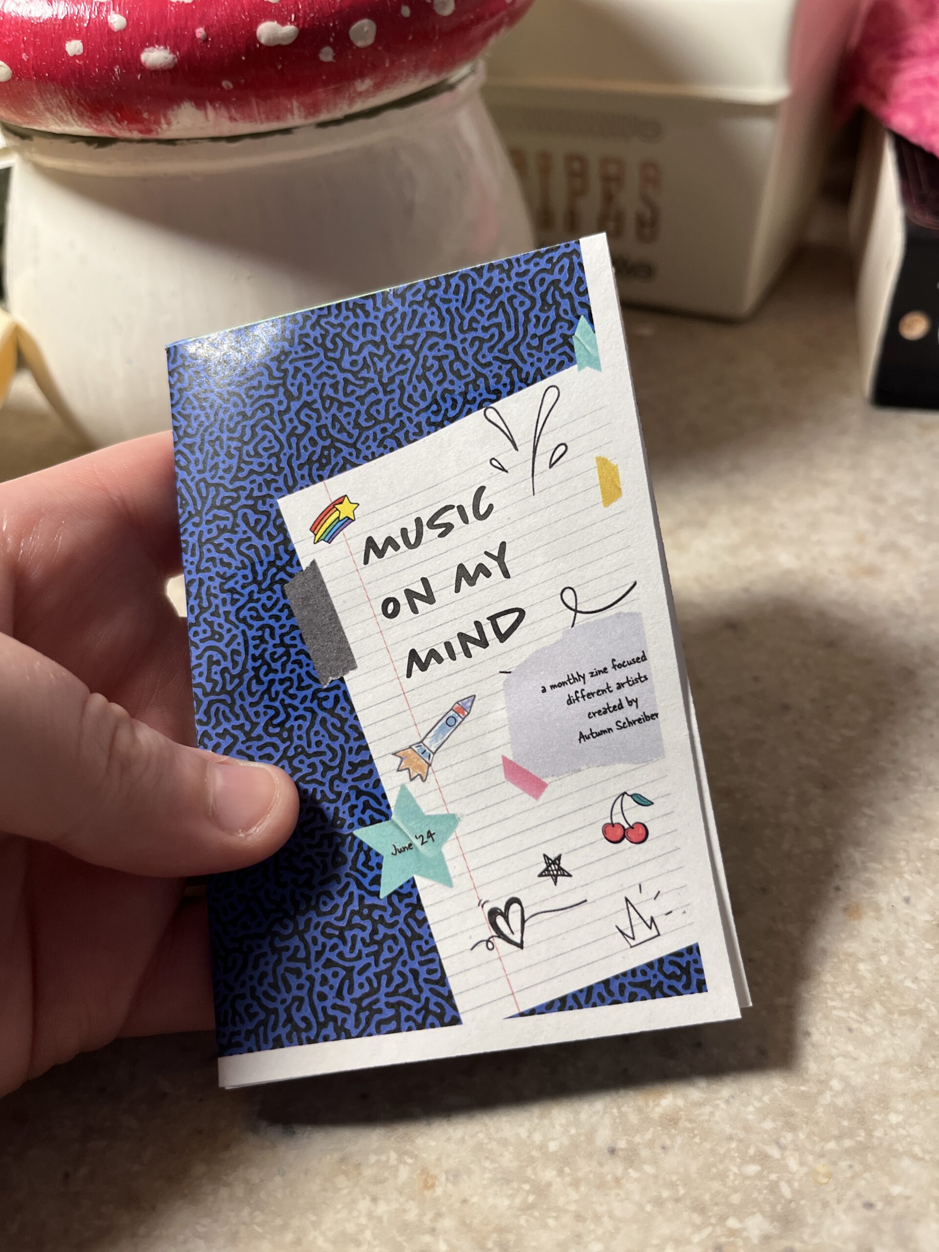
So first up is finding inspiration. Right now I’ve been really into musicians Chapell Roan and Ethel Cain. I’d be a shell of myself without Spotify. My zine will be called music on my mind to reflect my current song infatuations.
Now that I have my topic, I split my pages up.
Cover
Intro Page
Artist
Artist
Artist
Artist
Artist
Back
Here’s the rough sketched out page design layout!
Designing
The hardest part is next. I followed this tutorial to figure out my layout in the software. From there I found corresponding fonts and scrapbook-like elements. The colors, elements, and fonts corresponded with the main picture and the vibe of the artist. I got most of my fonts and elements from Adobe Fonts and Adobe Stock Images.
The Final Product
Initially, I had the layout similar to the video tutorial. However I ran into issues figuring out how to print it. More on that below.
Printing
Printing is a different beast entirely. At first, I printed my facing pages as spreads. But I thought I’d be smart and print them doublesided to save on paper. However, my double sided pages didn’t face the same way and one side was up and the other was flipped. To save my remaining sanity I brought the pages into a 8.5″ x 11″ document (split into 8). This allowed me to save on paper and simply fold and cut to make a zine without needing binding. For some reason, I still ended up with a white border after printing. I used the school’s printers but will try UPS next time.
This is how I folded my mini zine!
Thoughts
If I were to do this again (hopefully soon!) I would change a couple of things.
Font Unity
I used a lot of fonts to try to adhere to the featured artist, but doing so made it hard to read and overall not uniform
Readability
I’d change the font size to be legible, it was hard to tell before printing
Printing Process
I ran into patchy ink printing so I’d find another way to print next time
Layout
Instead of doing multiple facing pages, I’d stick to a 8.5 x 11″ split into 8 sections. The simplified layout doesn’t make my head hurt as much and would save money on printing if I decide to sell/print multiple.
What would you make a zine about? Have you made one before? Let me know below 🙂