I’ve been steadily working on my perfume label in class. Initially, I wanted the perfume to have the scent of bleeding heart flowers, but since the bottle is an amber color, I decided on an orange scent.
I’m still playing around with font combinations for the brand. But I am happy with the body copy font (The Seasons).


Then I wanted to include orange blossoms on the label for some floral imagery. I found a reference online and digitized the flower for a sketch/illustration feel. I then resized it to better fit the label.

I think I’m starting to get somewhere now. I need to play around with the borders (color, thickness, etc) as well as the color of the label itself. The brand font is better, but needs to be tampered with a bit. The orange blossom flowers need stems and perhaps leaves. This is far from its final form. Stay posted!!
From the blog
Stay up to date with the latest from our blog.
-
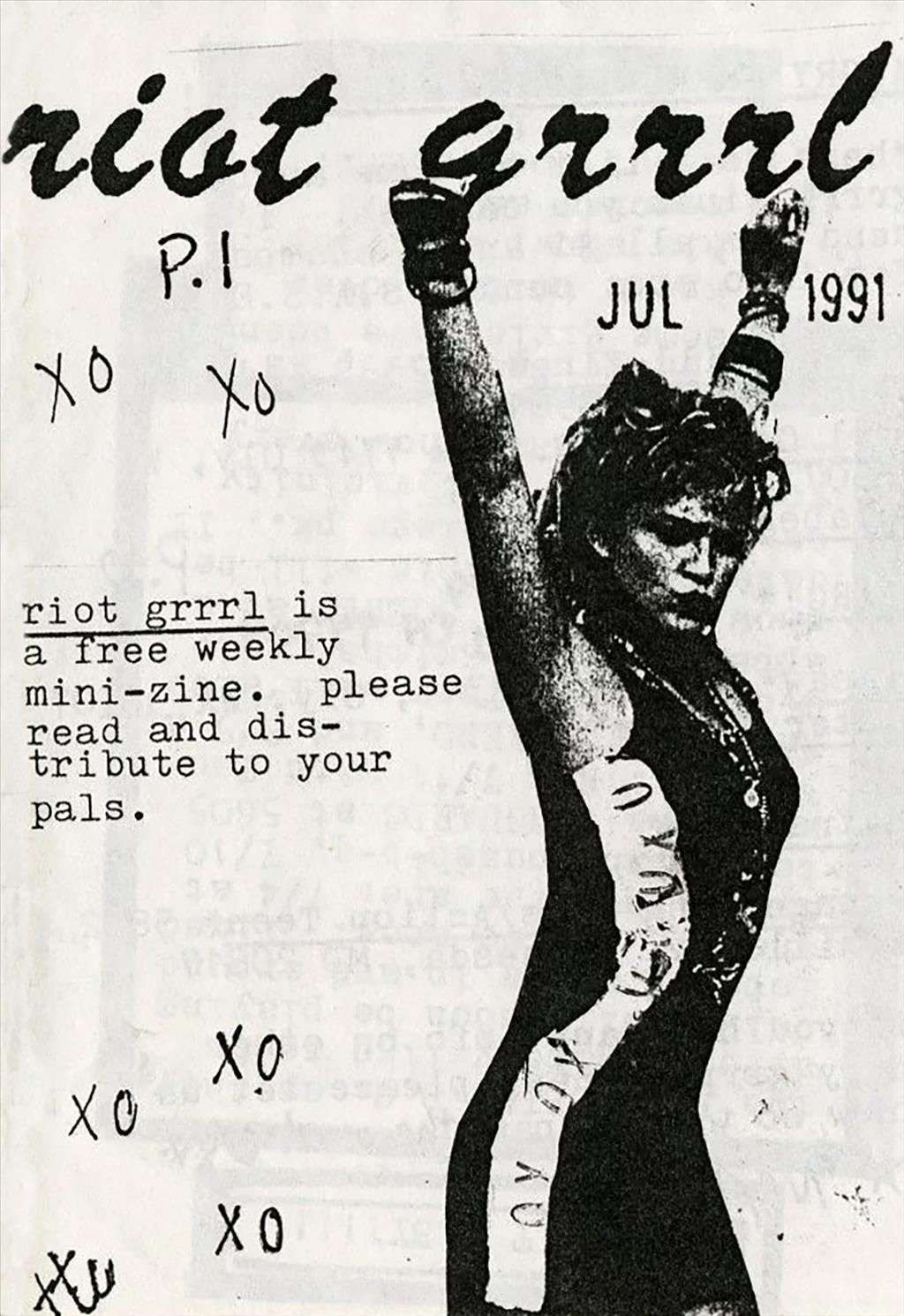
delving into magazines and zines
Today I started my morning with a video from one of my favorite Youtubers, Mina Le. She made a video essay detailing the rise and…
-
trying sticker design
In an effort to stay in Illustrator, I messed around with the idea of making stickers. Usually if I wanted to buy stickers, I’d scour…
-
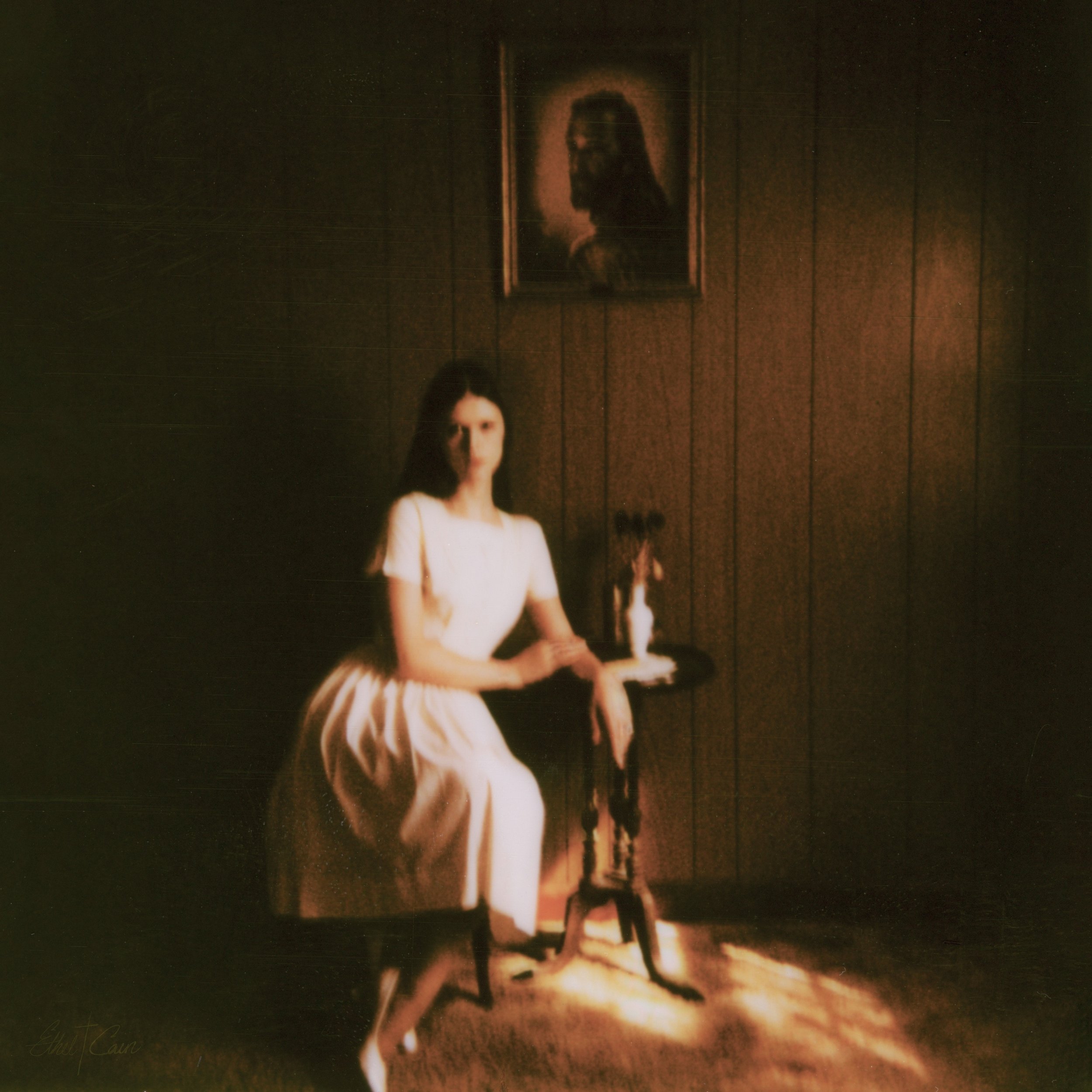
preacher’s daughter inspired design
Lately I’ve been listening to Ethel Cain’s album Preacher’s Daughter. The music takes you on a journey from the perspective of Ethel as she journeys…
-
staying in design software over the summer
Summer for me goes by super fast! Whether I’m passing the days working full time, visiting family, or going on trips it can be hard…