Tag: font

  • manipulating type in Illustrator

    manipulating type in Illustrator

    The college homework saga continues! We are currently designing the nameplate, or title, of our magazine. After scrolling through adobe fonts, I finally found my font: casserole. Which is such a fun name and just warms my Midwest heart.

    But picking a font was just the beginning. Now I have to expand my Illustrator skill set and figure out just how to manipulate type. I haven’t done a whole lot with typography so I consulted google and found these really helpful videos.

    I learned a lot about the pencil tool! I’ve become so comfortable with the pen tool, that I haven’t tried it. That ends today!

    Brainstorming

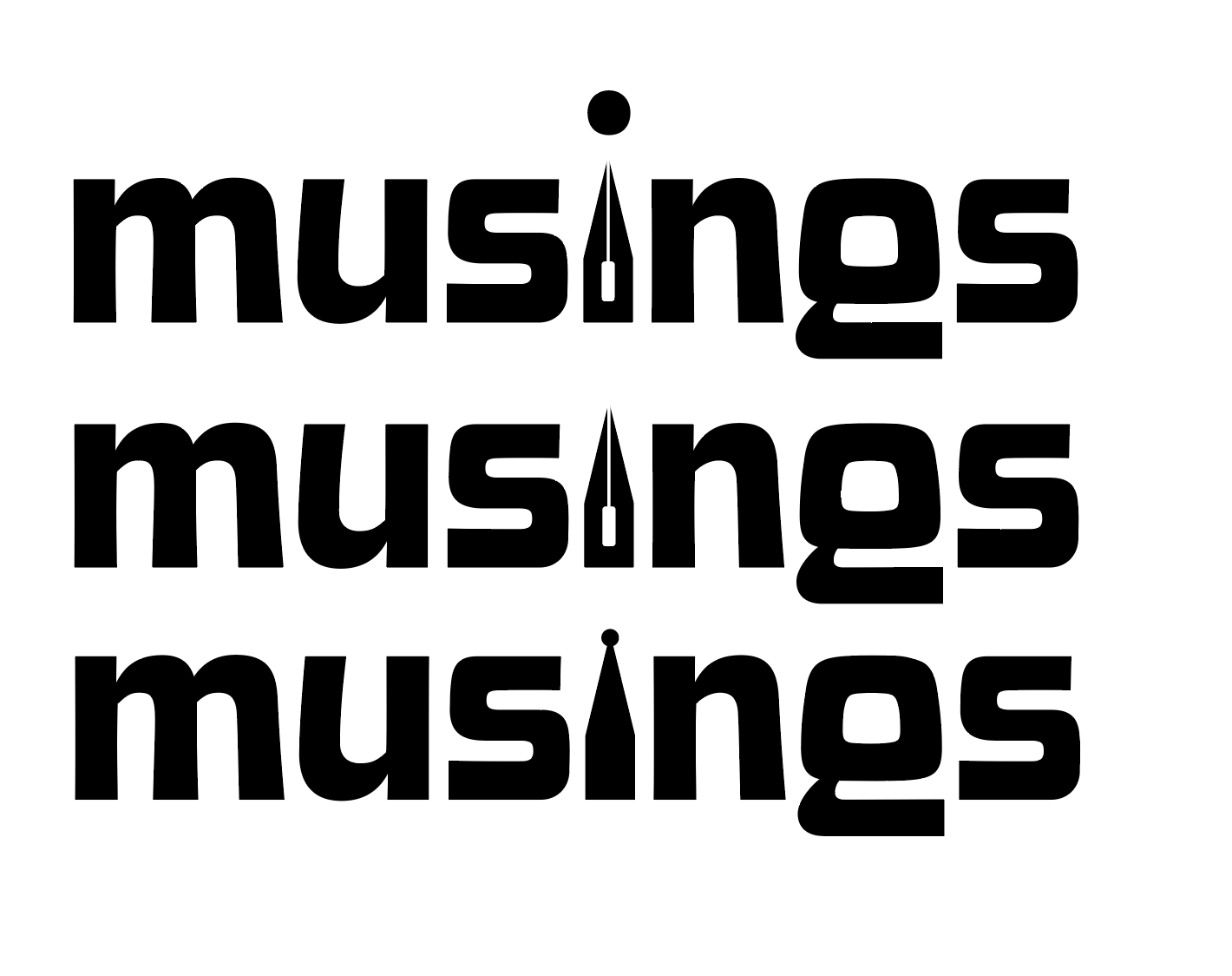
    My magazine title is musings. After thinking and surfing Pinterest, I wanted to try incorporating a quill nib into the title.

    some generic quill nibs (not my pic)

    I started sketching how I wanted the nib to replace the i in musings.

    some of my scribblings!
    some iterations

    I like the one in the middle. I don’t think I need a dot for the i. This week, I’m going to check in with my teacher and get some feedback. I couldn’t for the life of me figure out how to knock out the middle pieces of the quill either.

    That’s all for today folks! Did you learn anything new?

    • another zine finished!

      Almost a year ago, an old friend gave me some cool old magazines. It was so cool to flip through them and see old ads and stories. There was a 1925 needlework magazine that was battered and it had such neat illustrations, that I just had to turn it into a zine. I did feel…

    • getting my creative spark back

      After a wild year of school, I think it’s official. I have senioritis. I’m not sure if it’s the gloomy weather or the final month before graduation, but I’m loosing bits of motivation and creativity. I’ve been working on little projects here and there to keep myself creating outside of class. I think this has…

    • 10 piece campaign progress

      I’m still at a standstill with my poster. I think I need some time away from it so I can attack with a new perspective. Right now I’ve gotten the website mock up done (below) The website mock up took ages! I had to make sure my colors were accessible. I used https://contrast-grid.eightshapes.com/. Something that…

  • typography deep dive

    Class has started! And of course on day one, I already have an assigned presentation for the second week of school. Basically the class was split into groups and given design rules we have to learn and present.

    My two design principles are:

    • Type is only type when it’s friendly
    • Use two typeface families, maximum

    So I’d figure in an effort to prepare for my presentation, I’d share my thoughts and some typography research with yall.

    Type is only type when it’s friendly

    According to the book: Type is only type when it’s friendly begs designers to keep type expressive but legible. You want your font to have some personality, but more importantly, be easy to read. So make sure you choose a friendly font and color when working with type to ensure your message comes across clearly to your audience.

    Use two typeface families, maximum

    Use two typeface families, maximum is rather straightforward. Overall, you want your two fonts to work together, and adding additional fonts may mess with the flow of unity. When you use two fonts, make sure they have a broad family with different thicknesses, italics, etc. When choosing two typeface families make sure there is some contrast like sans serif vs. serif or thick vs. thin.

    Well, that about sums it all up. Are there any other typeface rules you follow? Let me know below.

    From the blog

    Stay up to date with the latest from our blog.

    • poster progress update #3

      Last time we left I had a rough wip poster. I resketched a guitar for the bottom right frame. Then I took it into illustrator,…

    • layout project progress: poster edition

      As I wrote in my last post, I am designing a 10 piece campaign for a music festival. I have finished the logo and stage…

    • fun packaging scavenger hunt

      I’ve been on the lookout for fun packaging. When I’m out running errands or to my favorite coffee shop, I’m looking. Below is what I’ve…