Tag: font

  • manipulating type in Illustrator

    manipulating type in Illustrator

    The college homework saga continues! We are currently designing the nameplate, or title, of our magazine. After scrolling through adobe fonts, I finally found my font: casserole. Which is such a fun name and just warms my Midwest heart.

    But picking a font was just the beginning. Now I have to expand my Illustrator skill set and figure out just how to manipulate type. I haven’t done a whole lot with typography so I consulted google and found these really helpful videos.

    I learned a lot about the pencil tool! I’ve become so comfortable with the pen tool, that I haven’t tried it. That ends today!

    Brainstorming

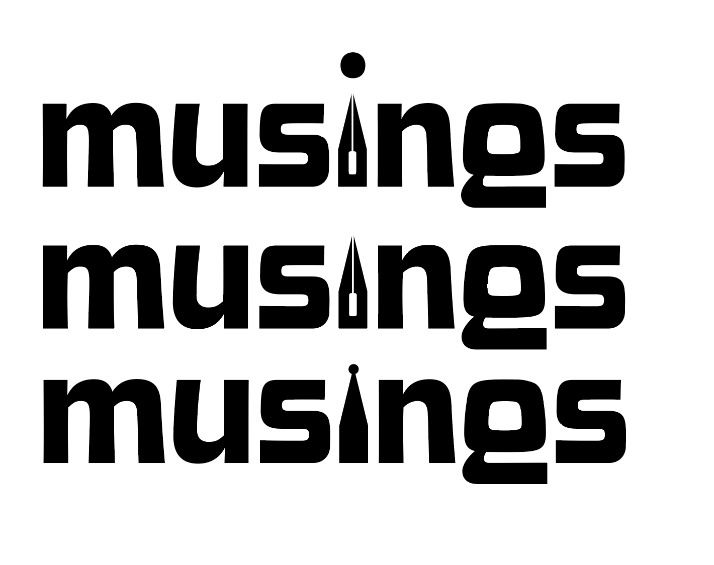
    My magazine title is musings. After thinking and surfing Pinterest, I wanted to try incorporating a quill nib into the title.

    some generic quill nibs (not my pic)

    I started sketching how I wanted the nib to replace the i in musings.

    some of my scribblings!
    some iterations

    I like the one in the middle. I don’t think I need a dot for the i. This week, I’m going to check in with my teacher and get some feedback. I couldn’t for the life of me figure out how to knock out the middle pieces of the quill either.

    That’s all for today folks! Did you learn anything new?

    • the ten piece poster final form

      After way too long, I’ve finally finished the ten-piece campaign poster. Deep down, I wanted to create more of an art-centered poster. But with all of my classes and working part-time, I’m left with minimal time. I opted for a simple and sleek poster design. I scrapped most of what I started with. Throughout a…

    • intern diaries #3

      I finally finished my first assigned ticket/project! It was a really simple task but still. I had to turn a bookmark file into an 8.5 x 11″ flyer. There were some bumps in the road. The bookmark functioned as a coupon for a free library bag, which would be odd for a flyer. I asked…

    • finishing up odds and ends

      With the clock ticking until graduation, I’ve got a lot of irons in the fire. This week has been crazy hectic and so far I’ve crossed some stuff off my to do list like: and believe it or not I still have a lot more to do 🙁 My growing to do list: I’m gonna…

  • typography deep dive

    Class has started! And of course on day one, I already have an assigned presentation for the second week of school. Basically the class was split into groups and given design rules we have to learn and present.

    My two design principles are:

    • Type is only type when it’s friendly
    • Use two typeface families, maximum

    So I’d figure in an effort to prepare for my presentation, I’d share my thoughts and some typography research with yall.

    Type is only type when it’s friendly

    According to the book: Type is only type when it’s friendly begs designers to keep type expressive but legible. You want your font to have some personality, but more importantly, be easy to read. So make sure you choose a friendly font and color when working with type to ensure your message comes across clearly to your audience.

    Use two typeface families, maximum

    Use two typeface families, maximum is rather straightforward. Overall, you want your two fonts to work together, and adding additional fonts may mess with the flow of unity. When you use two fonts, make sure they have a broad family with different thicknesses, italics, etc. When choosing two typeface families make sure there is some contrast like sans serif vs. serif or thick vs. thin.

    Well, that about sums it all up. Are there any other typeface rules you follow? Let me know below.

    From the blog

    Stay up to date with the latest from our blog.

    • intern diaries #3

      I finally finished my first assigned ticket/project! It was a really simple task but still. I had to turn a bookmark file into an 8.5…

    • finishing up odds and ends

      With the clock ticking until graduation, I’ve got a lot of irons in the fire. This week has been crazy hectic and so far I’ve…

    • the intern diaries #2

      Currently, I’m working on an ultra top-secret (not really) chatbot design. I’ve been given the chance to determine a chatbot’s graphic and overall branding. I…

    • new etching design: the process

      Thanks to a tour at JDS Industries, I am the new owner of a leatherette journal. I can etch into it with the school’s laser…