Tag: design

  • design legends you should know #1 Susan Kare

    In school they teach you about influential people, founding fathers, famous artist, etc. But in college, we haven’t discussed important graphic designers. So I’ve taken it upon myself to educate myself and ya’ll while I’m at it.

    Today’s design star is Susan Kare

    So who is Susan Kare, the “woman who gave the Macintosh a smile”?

    Susan Kare is most known for her work at Apple. She got her start there in 1983 as a Macintosh Artist. Despite not knowing anything about computer graphics and typefaces, she educated herself at the local library and aced the interview.

    At Apple, Kare was in charge of designing icons and typefaces for the Mac operating system. She worked with graph paper to design some of Apple’s most iconic icons such as the ticking bomb for system error, trash can, the pointed arrow cursor and more.

    Because her icon designs were universal and friendly, they encouraged technology-illiterate users to try out computers.

    Susan Kare’s icon designs, courtesy of kareprints.com

    She also designed fonts, contributed to the Mac rollout campaign, and demonstrated the capabilities of the MacPaint application.

    Kare went on to create her own design firm, Susan Kare LLP, in 1989. Her design skills were used at companies like Microsoft, Oracle, Facebook, and even Pinterest.

    source

    Have you heard of Susan Kare? Are there any graphic designers I should look into next? Let me know ๐Ÿ™‚

    From the blog

    Stay up to date with the latest from our blog.

    • finally making a dent in my to do list

      After a crazy week, I’ve managed to cross most of my things off my list! So far I’ve finished: It’s hard to believe that the…

    • almost done with my ten-piece campaign

      After what seems like actual AGES, I’m almost done with my ten-piece campaign for Layout 3. I’ve finished I only have the festival map left!…

    • the library hiatus is over

      After all of the advocacy work I’ve done for the library, I was hopeful that I was done. However, with the shutdown of the Institute…

    • the ten piece poster final form

      After way too long, I’ve finally finished the ten-piece campaign poster. Deep down, I wanted to create more of an art-centered poster. But with all…

  • typography deep dive

    Class has started! And of course on day one, I already have an assigned presentation for the second week of school. Basically the class was split into groups and given design rules we have to learn and present.

    My two design principles are:

    • Type is only type when it’s friendly
    • Use two typeface families, maximum

    So I’d figure in an effort to prepare for my presentation, I’d share my thoughts and some typography research with yall.

    Type is only type when it’s friendly

    According to the book: Type is only type when it’s friendly begs designers to keep type expressive but legible. You want your font to have some personality, but more importantly, be easy to read. So make sure you choose a friendly font and color when working with type to ensure your message comes across clearly to your audience.

    Use two typeface families, maximum

    Use two typeface families, maximum is rather straightforward. Overall, you want your two fonts to work together, and adding additional fonts may mess with the flow of unity. When you use two fonts, make sure they have a broad family with different thicknesses, italics, etc. When choosing two typeface families make sure there is some contrast like sans serif vs. serif or thick vs. thin.

    Well, that about sums it all up. Are there any other typeface rules you follow? Let me know below.

    From the blog

    Stay up to date with the latest from our blog.

    • finally making a dent in my to do list

      After a crazy week, I’ve managed to cross most of my things off my list! So far I’ve finished: It’s hard to believe that the…

    • almost done with my ten-piece campaign

      After what seems like actual AGES, I’m almost done with my ten-piece campaign for Layout 3. I’ve finished I only have the festival map left!…

    • the library hiatus is over

      After all of the advocacy work I’ve done for the library, I was hopeful that I was done. However, with the shutdown of the Institute…

    • the ten piece poster final form

      After way too long, I’ve finally finished the ten-piece campaign poster. Deep down, I wanted to create more of an art-centered poster. But with all…

  • exploring user experience design

    What is user experience (UX) design?

    First, lets tackle the meaning of user experience. According to Baymard Institute, user experience is “any interaction a user has with a product. The goal of UX is to meet the user’s needs and create easy, relevant, efficient experiences.”

    But that brings us back to our original question, what is user experience design?

    UX design is the process that designers use to create accessible, functional, and positive experiences for consumers.

    Although UX design is often synonymous with technology, apps, and products, it can be applied to many more things. In fact, even if you didn’t know the definition of user experience, you still have been impacted by it.

    For example, I’ve run into some frustrations shopping online. Some websites don’t have great filter options, and it’s hard to find exactly what I’m looking for. I’m less motivated to visit that site again due to poor user experience.

    So whether you’ve run into poor return experiences, technology issues, or even unclear instructions, you’ve experienced a lack of user-centered design.

    The father of UX design is often credited to Don Norman. He is “a psychologist and usability consultant who’s worked with Apple, HP, and theย Nielsen Norman Group according to Massachusetts Libraries. Click here to learn more!

    That’s all folks! What do you think about UX design?

    From the blog

    Stay up to date with the latest from our blog.

    • finally making a dent in my to do list

      After a crazy week, I’ve managed to cross most of my things off my list! So far I’ve finished: It’s hard to believe that the…

    • almost done with my ten-piece campaign

      After what seems like actual AGES, I’m almost done with my ten-piece campaign for Layout 3. I’ve finished I only have the festival map left!…

    • the library hiatus is over

      After all of the advocacy work I’ve done for the library, I was hopeful that I was done. However, with the shutdown of the Institute…

    • the ten piece poster final form

      After way too long, I’ve finally finished the ten-piece campaign poster. Deep down, I wanted to create more of an art-centered poster. But with all…

  • my love note to trader joe’s packaging

    Trader Joe’s is a grocery store, and while there aren’t any in SD it’s still one of my favorite grocery stores. It has good prices (perfect for a broke college student like me) and unique products with fun packaging.

    I only visit TJ’s occasionally when I visit family and I’m always down to try new things. The neat packaging always draws my eye.

    The last time I went, I saw the bright graphics for the Strawberries and Creme Pancake mix and I just had to get it. The vibrant colors and cute strawberries really made an impact. They just had a fun vibe that other boring pancake mix boxes just couldn’t live up to.

    Disclaimer: all images in this post are not mine

    Even after I made the (mediocre) pancakes, I was drawn to keep parts of the box. I’m crafty and like to make collages in my spare time, so I definitely cut and saved the little strawberries.

    I even found a brief article from the Trader Joe’s website about the value of well design products. Click here! Or check out another designer’s perspective on Trader Joe’s.

    I included some more examples of Trader Joe’s packaging! I couldn’t help myself, their designs make my heart happy.

    Even their paper bags look cool!

    That’s all folks! Read on for more design quips.

  • trying out t-shirt design

    This summer has flown by so fast! One thing I like to do every summer is some sort of craft. So I dug out my fabric paint and made some sick custom t-shirts. There’s something cool about bringing a sketched out design to life and then being able to wear it out and about.

    Here’s the sketch w/some of the shirt in the background

    My chosen playlist for this project: click here

    But yesterday I finished a sketch and thought it was decent enough to actually mock up in Adobe Illustrator. It reminded me of a similar project I did last semester at STC. The goal was to create a school club t-shirt that could potentially be sold in the bookstore. We considered graphic placement, fonts, and school colors.

    My goal with this design was to create my own fan merch that was simple and true to the artist. Instead of a actual picture I opted for a silhouette. I used bold contrasting fonts to convey the song lyrics complicated heavy message.

    I brought the sketch into illustrator and started tracing it. I liked my initial design, but it was a bit hard to read the bold font.

    After some feedback, I expanded the size of the halo to include the text and tried a solid color font.

    I like the reworked design (above) but I think the halo could be thinner. The contrast of thickness seems a bit off and the halo and the text seem to be competing for dominance.

    Here’s the initial mockup! I added the Ethel Cain logo to the back because some of her merch includes it. (example of her merch below)

    I’m gonna look for some more free tshirt psd mock ups, clean up the design and then share the final product with you!

    Thanks for reading! Let me know your thoughts and check out my posts below.

  • making a zine in InDesign

    making a zine in InDesign

    Hey yall, I’m back! Before jumping into the software I decided to look for a tutorial. I found this one and it was pretty straightforward. If you’re looking for a tutorial on how to make a zine by hand check out this video from brattyxbre.

    Getting Started

    Form a plan. Or don’t, but that’s what I’m doing.

    • Find a topic
    • Make a rough draft
    • Gather images/digital scrapbook stuff (paper textures, tape, etc)
    • Design
    • Print!

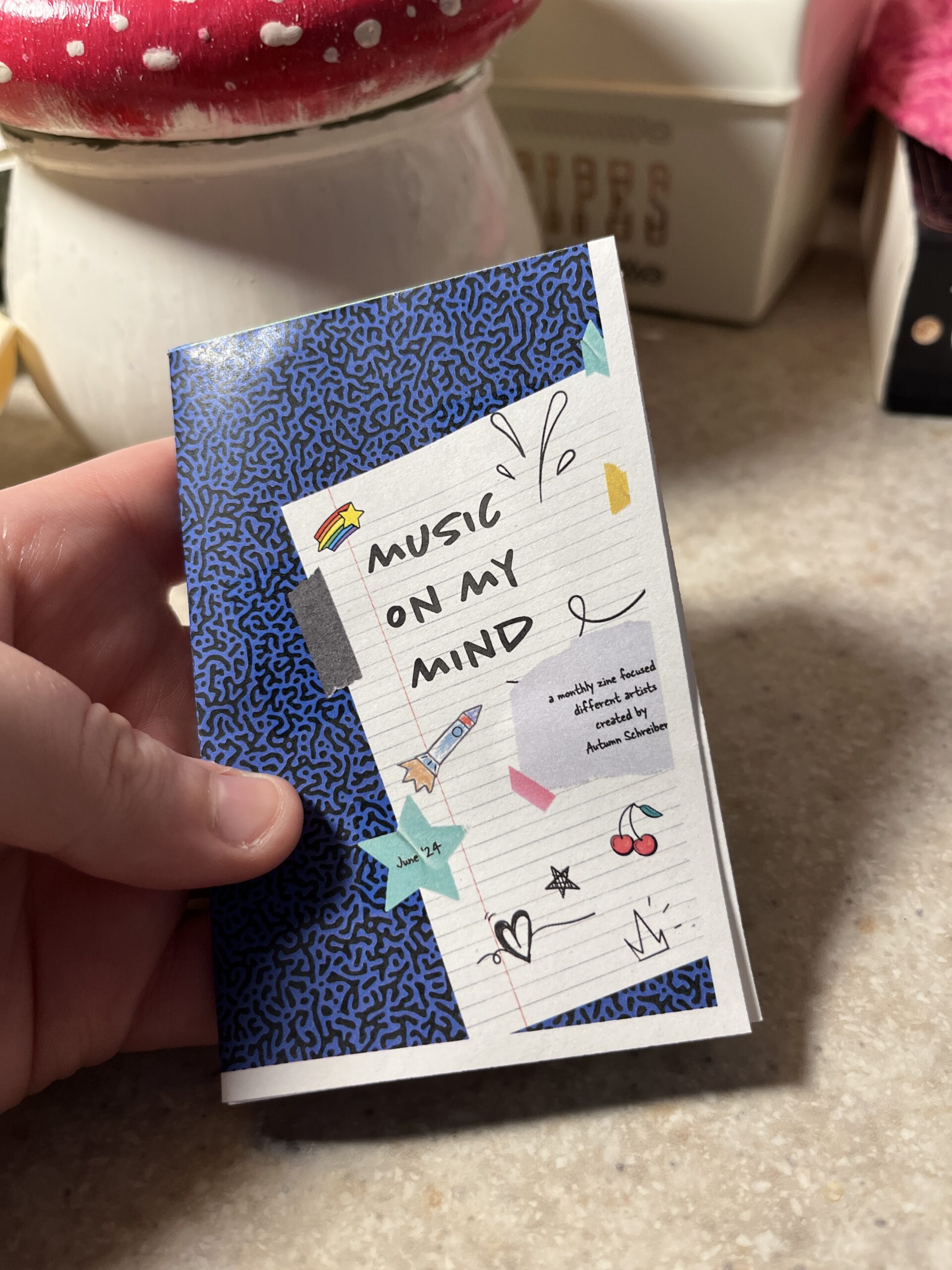
    So first up is finding inspiration. Right now I’ve been really into musicians Chapell Roan and Ethel Cain. I’d be a shell of myself without Spotify. My zine will be called music on my mind to reflect my current song infatuations.

    Now that I have my topic, I split my pages up.

    • Cover
    • Intro Page
    • Artist
    • Artist
    • Artist
    • Artist
    • Artist
    • Back
    Here’s the rough sketched out page design layout!

    Designing

    The hardest part is next. I followed this tutorial to figure out my layout in the software. From there I found corresponding fonts and scrapbook-like elements. The colors, elements, and fonts corresponded with the main picture and the vibe of the artist. I got most of my fonts and elements from Adobe Fonts and Adobe Stock Images.

    The Final Product

    Initially, I had the layout similar to the video tutorial. However I ran into issues figuring out how to print it. More on that below.

    Printing

    Printing is a different beast entirely. At first, I printed my facing pages as spreads. But I thought I’d be smart and print them doublesided to save on paper. However, my double sided pages didn’t face the same way and one side was up and the other was flipped. To save my remaining sanity I brought the pages into a 8.5″ x 11″ document (split into 8). This allowed me to save on paper and simply fold and cut to make a zine without needing binding. For some reason, I still ended up with a white border after printing. I used the school’s printers but will try UPS next time.

    This is how I folded my mini zine!

    Thoughts

    If I were to do this again (hopefully soon!) I would change a couple of things.

    • Font Unity
      • I used a lot of fonts to try to adhere to the featured artist, but doing so made it hard to read and overall not uniform
    • Readability
      • I’d change the font size to be legible, it was hard to tell before printing
    • Printing Process
      • I ran into patchy ink printing so I’d find another way to print next time
    • Layout
      • Instead of doing multiple facing pages, I’d stick to a 8.5 x 11″ split into 8 sections. The simplified layout doesn’t make my head hurt as much and would save money on printing if I decide to sell/print multiple.

    What would you make a zine about? Have you made one before? Let me know below ๐Ÿ™‚

  • delving into magazines and zines

    delving into magazines and zines

    Today I started my morning with a video from one of my favorite Youtubers, Mina Le. She made a video essay detailing the rise and fall of fashion magazines. It was a fun watch, especially because I grew up with magazines like American Girl, Highlights, and even Seventeen. Even magazines like People and Us Weekly hold a certain sense of nostalgia because I remember reading headlines while unloading groceries with my mom. But somewhere along the way magazines fell off. With the rise of the internet it makes sense. You didn’t have to rely on magazines for gossip, national news, or trends when you had the internet at your fingertips.

    While some magazines survived the internet age, some went digital or died completely. Despite this, I really want to make my own. A magazine is a big undertaking, so I’m more drawn to zines.

    What is a zine?

    According to Purdue University a zine is a “small-batch, independently published work that circulates less than 1,000 copies”. Purdue also walks through zine history and a tutorial (click here).

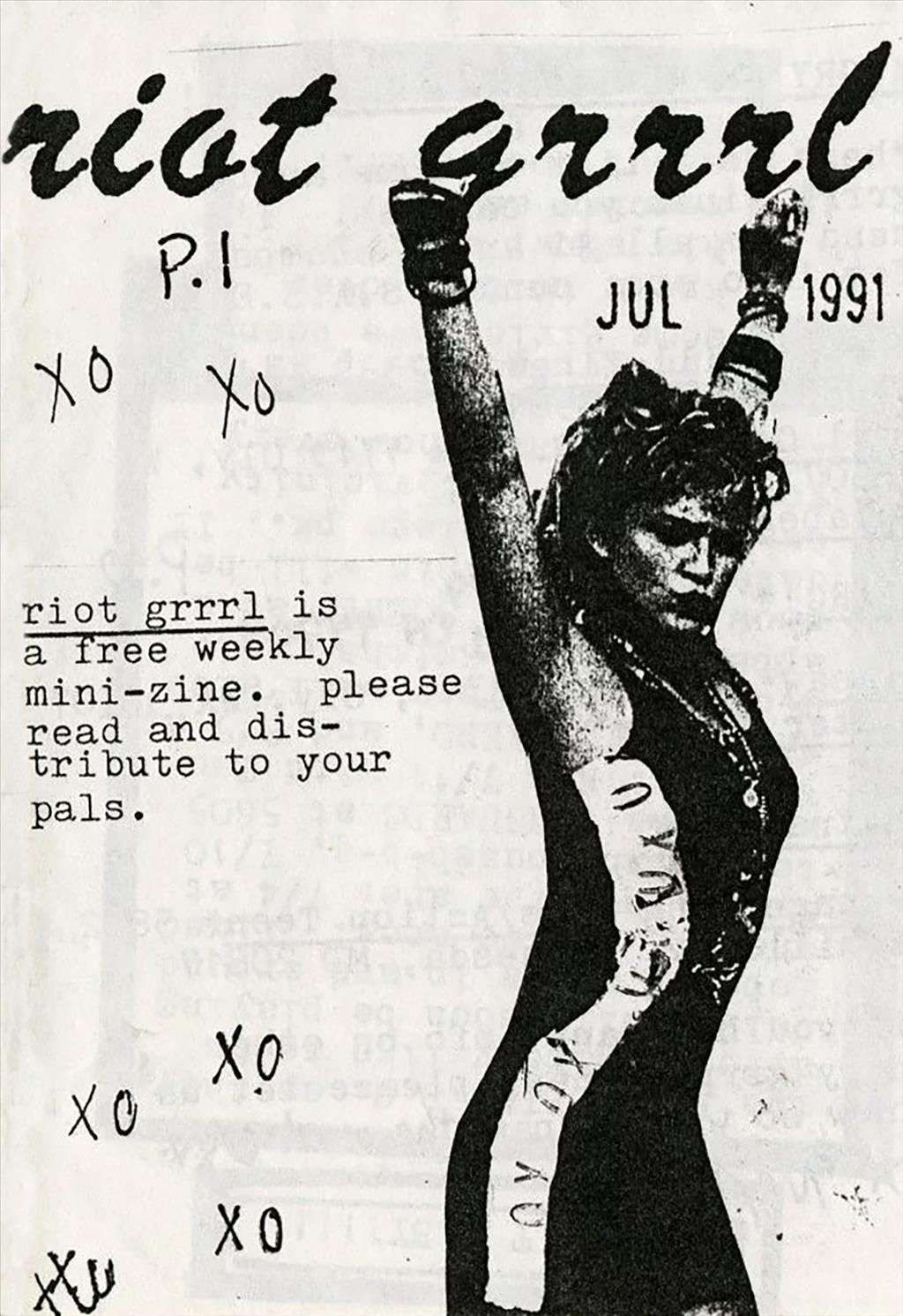
    Zines have a history of activism, science fiction, and punk culture stemming back from the 1930s. Although zines are known for their rebellious nature, the content can be anything and everything. Read on for some examples.

    Sniffin’ Glue is a punk fanzine from the 70s.
    Riot Grrrl is a punk driven feminist zine that started in the 90s

    When creating a zine (or magazine) it can be done digitally or created by hand. I tend to gravitate towards making my zines by hand because it comes naturally to me. I’m still learning and improving my Adobe skills, but I’m not as adept as I’d like to be. I’ve decided to go about it with Adobe InDesign to stay in the software.

    However, creating a zine by hand can be just as much fun as doing it digitally. You can draw, glue, and glitter to your hearts content! After finishing your master copy zine, most people scan the pages to print and assemble additional zines.

    Next week I’ll detail my zine process, but until then…

    Rock on and read my latest posts below!

  • trying sticker design

    In an effort to stay in Illustrator, I messed around with the idea of making stickers. Usually if I wanted to buy stickers, I’d scour Etsy or Redbubble. But sometimes the stickers I want aren’t there, hence me trying this out. For some reason, I decided to build off of my tattoo idea from this previous post.

    Gathering Resources

    I started looking up youtube videos and came across two semi helpful ones. (video 1 and video 2)

    After getting some insight on how to merge shapes, etc. in Illustrator I dug out my original sketch.

    Designing

    Then I started designing, keeping the lyric in mind as well as typical interstate signage references. I wanted to keep my sign looking accurate as possible. I discovered that the font (Highway Gothic) was created by the United States Federal Highway Administration for all road signage.

    Here’s my first draft, not too shabby. But not the right font.

    I really wanted the sticker to feel more fun than just a white and green sign. I think adding the additional lyric “I can’t leave it be” in graffiti type font helps elevate it, adding variety.

    Currently I’m rocking with either of these two designs. I think I like the sticker without the extra rectangle at the top right. I can’t decide on the graffiti font, but the texture of the bottom one seems to catch my eye. I like the idea of the state number crest, but it might be too much. Let me know your thoughts!

  • preacher’s daughter inspired design

    preacher’s daughter inspired design

    Lately I’ve been listening to Ethel Cain’s album Preacher’s Daughter. The music takes you on a journey from the perspective of Ethel as she journeys west in search of love and a life of her own. It’s a haunting concept album that keeps on drawing me in.

    I’ve been thinking about drawing inspiration from the songs and themes of the overall project into my design work. A few possible design ideas I’ve had are tattoo designs or a poster design. One potential poster design idea is a missing person poster. (Later on during the album, the character Ethel Cain goes missing) I like to lean towards poster design because it keeps me in the software outside of class while also bridging my passion for music.

    When it comes to tattoo designs, initially I wanted to design something from the lyric:

    And you said, “Hey, do you wanna see the West with me? ‘Cause love’s out there and I can’t leave it be

    Thoroughfare by Ethel Cain
    The circled doodle is my first draft of a potential tattoo/sticker design.

    To me this piece of the song makes me think of young love and roadtrips, the kind that are highlighted in a indie coming of age movie. My initial thought is to make a tattoo in the shape of a exit sign but instead of a road/city name it reads: LOVE’S OUT THERE with a arrow that says West. Upon sketching it, the design seemed blocky and maybe more suited to a sticker design.

    From the blog

    Stay up to date with the latest from our blog.

    • finally making a dent in my to do list

      After a crazy week, I’ve managed to cross most of my things off my list! So far I’ve finished: It’s hard to believe that the…

    • almost done with my ten-piece campaign

      After what seems like actual AGES, I’m almost done with my ten-piece campaign for Layout 3. I’ve finished I only have the festival map left!…

    • the library hiatus is over

      After all of the advocacy work I’ve done for the library, I was hopeful that I was done. However, with the shutdown of the Institute…

    • the ten piece poster final form

      After way too long, I’ve finally finished the ten-piece campaign poster. Deep down, I wanted to create more of an art-centered poster. But with all…