So this semester is all about making a magazine, quite literally, from scratch. We have to write the articles, conduct interviews, photograph interviewees and products, design our own advertisements– you get the idea.
I kinda dove in headfirst, working on assignments as they were given. Because of this slapstick approach, I haven’t really fully thought about the vibe of my magazine, colors, spreads, etc.
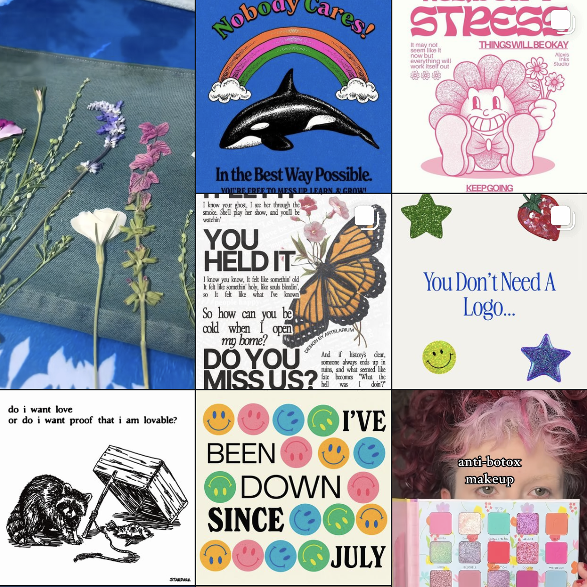
So over my weekend, I wanted to cement the foundation of my magazine. I took to Pinterest and made a mood board with spread design ideas. I went online and used this website to generate color palette ideas. For my fonts, I used Adobe Fonts and browsed for potential body copy fonts. Indesign was my chosen software.

Some spread ideas that I liked (above and below)

I wanted to keep the magazine minimal but with a sense of design with colors and layout.

The mood board will make it easier for me to design future elements and spreads of my magazine, musings.
From the blog
Stay up to date with the latest from our blog.
-
winter break update #1
Winter break is in full swing! I’ve been meaning to blog, but I’ve been sooo busy. Between working, I went to see my family in…
-
ways to unwind without a screen
I don’t know about you guys, but after staring at a screen for four hours, I need a little break. So, I decided to compile…
-
the final countdown: aka semester final projects
I’ve been chipping away at my final projects! Right now, I’m finalizing my last article spread. I really want to have it nearly finished so…
-
perfume label progress
I’ve been steadily working on my perfume label in class. Initially, I wanted the perfume to have the scent of bleeding heart flowers, but since…