Chip Kidd is a book jacket designer, associate art director for Alfred A. Knopf, certified comic nerd, freelancer, and novelist.
Kidd’s Career
Kidd got his start in the design world with a graphic design degree at Penn State in 1986. From there he moved to New York, and became a junior assistant in the Alfred A. Knopf publishing art department. He worked his way up the company ladder, becoming the Associate Art Director in 2013. Kidd has created book covers for David Sedaris, Neil Gaiman, Cormac McCarthy and many more authors.
In 2001, Kidd published his first novel, The Cheese Monkeys. He wrote a sequel, The Learners. He has helped write and design other books, as well as writing his own children’s graphic design guide, A Kidd’s Guide to Graphic Design.
In 2014, he was awarded an AIGA medal. He continues to work at Alfred A. Knopf and has also given a Ted Talk on design philosophy.
So this semester is all about making a magazine, quite literally, from scratch. We have to write the articles, conduct interviews, photograph interviewees and products, design our own advertisements– you get the idea.
I kinda dove in headfirst, working on assignments as they were given. Because of this slapstick approach, I haven’t really fully thought about the vibe of my magazine, colors, spreads, etc.
So over my weekend, I wanted to cement the foundation of my magazine. I took to Pinterest and made a mood board with spread design ideas. I went online and used this website to generate color palette ideas. For my fonts, I used Adobe Fonts and browsed for potential body copy fonts. Indesign was my chosen software.
Some spread ideas that I liked (above and below)
I wanted to keep the magazine minimal but with a sense of design with colors and layout.
The finished scrappy mood board
The mood board will make it easier for me to design future elements and spreads of my magazine, musings.
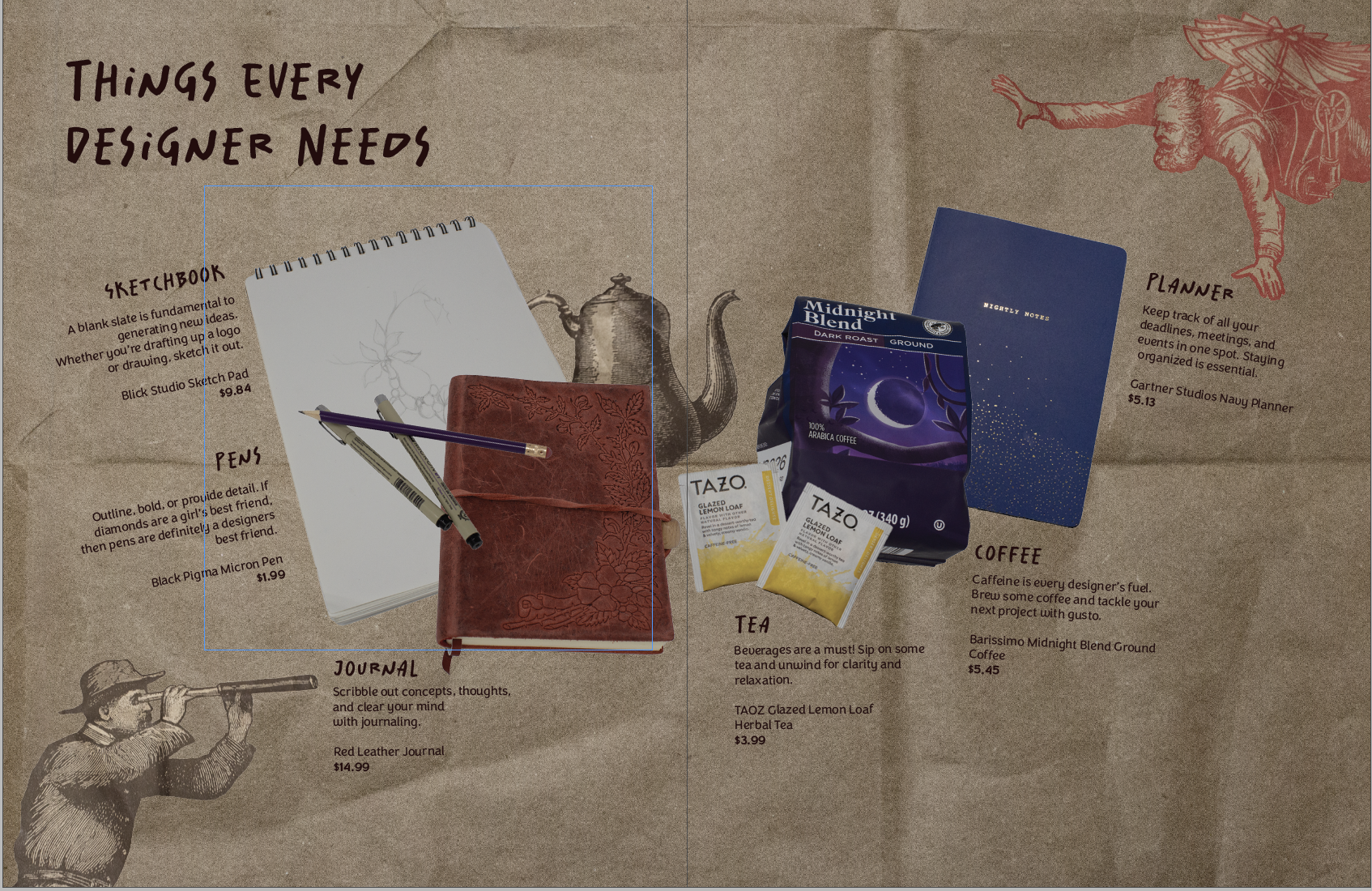
Making my first product spread was a rollercoaster! It challenged me to beef up my photography skills and problem-solve. My magazine is all design-centered. So…
Welcome back ya’ll! Today I thought I’d walk you through my current challenge: creating a graphic design portfolio. I am by no means an expert, but with the power of the internet and my teachers, I think I can handle it.
Where to begin?
The most important part of your portfolio is the contents. You want to show off your best work, what you’re most proud of. So gather up your portfolio pieces and edit them as needed. I needed to edit some of my projects after getting feedback from other graphic designers. Do this and then we can start designing the portfolio.
Designing the portfolio
For some reason, this is the most daunting part. I’m opting to create my portfolio in Indesign, but there’s a lot of other options such as Adobe Express.
My itty bitty screenshot, I couldn’t figure out how to make it bigger 🙁
Navigate to New File –> Web tab –> and then look at some templates. You can use those or create your own!
I started with a business proposal template and began to customize it to my portfolio needs. I wanted to include sketches, process images, final product pictures and design explanations.
A rough idea of my portfolio layout!
And that’s it! Design your portfolio and then export it as a PDF, or an interactive PDF if you have links, etc.
I’ve been wanting to make an informative social media post about contacting reps for my library awareness campaign. So, the only way I could give a lot of helpful information was to do it myself. The Process I didn’t want to go in completely blind so I found some articles. Here’s one on calling reps.…
Well team, figuring out how to find your legislators has been a hassle. It’s what I’m working on currently for my library awareness social media campaign. Right now I’m in the midst of finding out how to contact legislators about library funding. I’ll update yall on that later. Right now, I try to post every…
I’m alive I swear! I’ve been busy with work and catching up on adulting. The current library campaign has also been taking up a lot of my energy. (sdlibraryadvocates on Insta and FB if you wanna take a look!) I’ve been trying to create posts highlighting library resources and spreading awareness of the proposed budget…
Paula Scher is a painter, album covers, educator, layout artist and renowned graphic designer.
Her Work Through The Years
With a start at the Tyler School of Art, Scher graduated with a Bachelor in Fine Arts in 1970. She then became a layout artist at the children’s division at Random House. Switching gears, she worked at CBS and then Atlantic Records. Her album covers received four Grammy nominations.
In the 80’s she sought out freelance graphic design, before starting a firm in 1984 with Tyler Koppel. The firm dissolved during the recession and Scher went to work for the design firm, Pentagram, in 1991. Currently, she is the principal at Pentagram.
As well as working Pentagram, Scher taught at the School of Visual Arts, Tyler School of Art, Yale, and Cooper Union.
Iconic Work
What put Scher on the map, was her identity creation for the Public Theater in New York City. Through her unique, graffiti-inspired typography, Scher was able to inspire the graphic design world.
One of Paula Scher’s poster design for The Public TheaterScher’s rebranded Public Theater Logo
Other notable logo designs are Tiffany and Co., Citibank, Windows, and the Metropolitan Opera.
Album Covers
Album Ginseng Woman designed by Paula Scher and Andy EngelBoston’s album designed by Paula Scher and illustrated by Roger Huyssen
That’s really just a snippet of her expansive portfolio. Here’s a great book of her work! Preview it here.
Making my first product spread was a rollercoaster! It challenged me to beef up my photography skills and problem-solve. My magazine is all design-centered. So…
I’ve been asked to create some Facebook ads (for Amaryllis bulbs) and let me tell you, I have no idea where to start. Facebook isn’t something I interact with a whole lot, I’m more drawn to Instagram or Pinterest. However, I thought I’d look into Facebook ads and take ya’ll along for the ride.
So my main questions I need to figure out are as follows:
What Photoshop dimensions should I use?
What are the photo copyright rules for ads?
What do typical flower ads look like?
What makes an ad successful?
Which brings me to research!
Here are my findings:
Facebook dimensions vary by preferred ad layouts. However, my client will be posting the ads as Facebook posts. So I really need to figure out FB Photoshop post dimensions. I kept on running into dimensions for Facebook image/video post sizes. (Will report back with my final answer soon🫡)
When it comes to image copyright research, here is the situation. I’ve been tasked with creating amaryllis bulb ads. I want to be able to show customers the final amaryllis blooms, but the florist doesn’t have any of her own pictures with her current bulbs. Soo.. then I need to figure out the image situation. I found this website that brings up a few legal good points. My temporary solution is to use some of her old photos if possible.
General flower ads all display big, colorful arrangements. Then it has the basic ad elements such as a headline, call to action, etc. I’m kind of on my own because my client is advertising wax-dipped amaryllis bulbs. (Which is a bit too niche for Google)
Keeping your ad message clear and directed towards your audience is one way to create a successful ad. So my audience is primarily older women looking to buy flowers for themselves or others. My headline and visuals should align with my desired target market. Some more great tips are here.
Phew that was a lot. Hopefully, I can hit the ground running and drum up some great ideas. I’ll keep you posted! Until next time, keep designing.
It’s been awhile! I’ve really gotten engulfed in my internship. I started working full 40 hour weeks since the end of May. Here’s the rundown of my current projects: Yeah you read that right. It’s dog week at my internship and I definitely could use all the puppy love. (Pic for proof, otherwise it didn’t…
My internship has been so fun! It honestly doesn’t even feel like work. I’ve been working on a bunch of different projects. The chat bot has been ongoing for awhile now. Currently we have four strong designs that need to be voted on! I’m secretly rooting for the Sherman graphic (below). I’ve also been working…
I’m back! I graduated and headed straight to Hawaii. Literally. The morning after graduation I was on a plane to see my sister in Oahu. It was sooo much fun and the week went by so fast. Right now I’m diving headfirst into my internship, fulltime. I hope to update you guys on my summer.
After a crazy week, I’ve managed to cross most of my things off my list! So far I’ve finished: It’s hard to believe that the portfolio show is this week! And then graduation the week after. In the middle of the chaos, I still found time to work, dogsit, and make some shrinky-dink earrings. I’m…
After what seems like actual AGES, I’m almost done with my ten-piece campaign for Layout 3. I’ve finished I only have the festival map left! Thank goodness. Here are some snippets of my finished products.
After all of the advocacy work I’ve done for the library, I was hopeful that I was done. However, with the shutdown of the Institute of Library and Museum Services (ILMS), I am far from it. A lot of South Dakotans (myself included) made numerous calls to our SD legislators in hopes of restoring the…
After way too long, I’ve finally finished the ten-piece campaign poster. Deep down, I wanted to create more of an art-centered poster. But with all of my classes and working part-time, I’m left with minimal time. I opted for a simple and sleek poster design. I scrapped most of what I started with. Throughout a…
I finally finished my first assigned ticket/project! It was a really simple task but still. I had to turn a bookmark file into an 8.5 x 11″ flyer. There were some bumps in the road. The bookmark functioned as a coupon for a free library bag, which would be odd for a flyer. I asked…
With the clock ticking until graduation, I’ve got a lot of irons in the fire. This week has been crazy hectic and so far I’ve crossed some stuff off my to do list like: and believe it or not I still have a lot more to do 🙁 My growing to do list: I’m gonna…
Currently, I’m working on an ultra top-secret (not really) chatbot design. I’ve been given the chance to determine a chatbot’s graphic and overall branding. I started my process like any other project, with research. I wanted to get a feel for the chatbot graphic standard as well as fit into my criteria which are: I…
Design is all around us! It’s on labels, posters, papers, hand towels, you name it. So today, I thought I’d look at one of my favorite movies, Labyrinth, through the eyes of a designer.
Labyrinth is a dark 80s fantasy movie with a cast of puppets as well as humans. Because of its genre, the design choices are over the top to portray the whimsical nature of the film. The muted colors, torn/decaying fabrics, and textures, and creepy masquerade masks contribute to the macabre fairytale feel. However, the lavish lace, brick structures, and elaborate costumes cement the viewer in a fantasy world.
Some examples of the rather muted sets/world-building
The design choices are very intentional and support world-building and character/character growth. One great example is the ballroom dream scene. The main character, teenage Sarah, bites into a peach. This sends her into a dreamlike sleep, where she imagines entering a masquerade ball. Sarah’s big white dress and lack of a mask are symbols of her innocence and naivety as she navigates this more adult-centric scene. Sarah’s white dress and Jareth’s blue sequined suit suggest importance in contrast among the rest of the muted costumes. In this case, the design choices reflect character importance and growth as Sarah is caught between her childhood and impending adulthood.
As designers, our decisions must have a purpose. After all, our job is to convey a client’s message. So do your research and be able to explain your work and choices.
Making my first product spread was a rollercoaster! It challenged me to beef up my photography skills and problem-solve. My magazine is all design-centered. So…
Rulebreaker, Father of Grunge Typography, prolific surfer. All things that aptly describe David Carson.
Carson started out as a high school teacher in Oregon, where he caught wind of a graphic design summer program at University of Arizona. Soon after he was off to Switzerland to another summer program under the instruction of instructor Hans-Rudolf Lutz. He began working at various magazines such as, Transworld Skateboarding, Beach Culture, and Surfer. In the early 90s, he landed at an alternative music magazine, Ray Gun, and really developed his style. Working at Ray Gun in the peak grunge era, Carson was able to lean into it and make it his own. After three years, Carson left Ray Gun in pursuit of his own design business.
What makes David Carson so unique is his fresh perspective on design. He tosses out the traditional design rules and forges his own. This take on design is what gives him his edge and personality. That’s essentially his brand.
Some of his work
poster for his 2014 AIGA lecture (not my pic)dvd navigation design for Nine Inch Nails (not my pic)obama election design from 2009 (not my pic)
A really great interview article to better understand Carson and his philosophies: click here!
Another one of Privat’s works that advertises light fittings
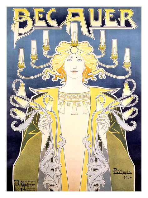
Let me take you way back to the 1890s, when minimalism is out and fanciful Art Nouveau is in. My first exposure to this style was seeing one of my mom’s favorite prints in her room, Absinthe Robette.
The iconic Absinthe Robette by Henri Privat-Livemont
What is Art Nouveau?
New art, or Art Nouveau was a popular art movement from around the 1890s to the start of WW1. It mimicked aspects of nature with its curving, free-flowing, organic feel. It encompassed paintings, furniture, architecture, patterns, and art. It was the precursor to the more modern movements, such as Art Deco, that focused on sleek lines and eliminated excessive decoration.
Henri Privat-Livemont
Henri was born in 1861, Schaerbeek, Brussels, Belgium. At age 12, he studied at École des Arts Decoratifs in Sint-Joost-ten-Node, Belgium under Louis Hendrickx. Then, he moved to Paris in the 1880s to work with the studios of Lemaire, Lavastre & Duvignaud to learn interior decorating. Henri was initially an interior decorator for very wealthy families. Although most famous for his iconic posters, it happened by chance. He won a local poster competition around 1889 and decided to lean more into them. With new economic demands, the need for poster advertisements increased and Privat-Livemont rode the wave. Some prominent works of his include the aforementioned Absinthe Robette and the 1897 Exposition Internationale (a World’s Fair held in Belgium) poster. He kept himself busy teaching ‘Ornament, Figure and Ornamental Composition’ at the Josephat School for Drawing and Crafts from 1891-1935. After the decline of poster art he kept interior decorating, oil painting, and photography.
Non-poster-related work
1 of 4 tile panels designed by Privat-Livemont for the Grande Maison de Blanc in Brussels, Belgiumstained glass window designed by Privat-Livemont and made by Raphaël Évaldre for the Hotel Saintenoy in Brussels, Belgium
For more info I highly suggest checking out this blog post! It goes more into depth on Privat-Livemont as well as his rival Alphonse Mucha.
Making my first product spread was a rollercoaster! It challenged me to beef up my photography skills and problem-solve. My magazine is all design-centered. So…
I was able to go to the SD AAF (American Advertising Federation) student day! It was such a great opportunity and I thought I’d share what I learned with you guys.
Some recurring pieces of advice that kept coming up during different panels were:
Keep learning
Graphic design is a vastly evolving practice. You need to learn relevant skills and keep up with new software to survive in this industry
Check out free online classes, local conferences, and webinars!
Just start!
Whether it’s a project, application, or class, just start. You can’t figure out your strengths if you won’t try things.
Ask questions
Questions are great for clarifying things or learning more about a certain topic. You’ll never know if you stay silent. So speak up and stay curious.
Most agencies/designers/professionals are willing to help students
Industry professionals shared that they are open to job shadowing, portfolio reviews, and questions. The worst people can say is no, so go for it! What do you have to lose?
Explain
Communication is key in this field. You need to be able to explain design processes and reasoning.
Overall, I learned so much at this event. Hands down the best $35 I’ve ever spent. I was able to network, learn about different parts of the design and marketing industry, and get a second portfolio review opinion, headshots (and lunch!).
Making my first product spread was a rollercoaster! It challenged me to beef up my photography skills and problem-solve. My magazine is all design-centered. So…
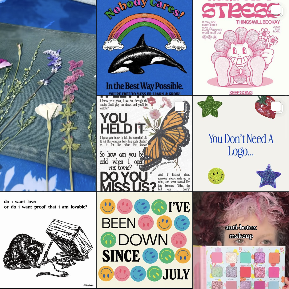
To follow trends or not to follow trends, that is the question!
And the consensus from designers is to avoid trends. The goal is to create timeless and iconic designs as years and decades pass. Think of Coca Cola or IBM. They can’t be defined as such an 80s or y2k design.
So what are the current design trends to be wary of?
According to Adobe, the design trends for 2024 are:
3D type and bubble text
Color clashing
Curve smoothing
70’s nostalgia
Vintage minimalism
Anti design
Abstract gradients
Texture
Geometry
Illustration and logo mascots
from just this screenshot of my design Instagram account, you can see examples of trendy design
Overall, nothing is original. But that doesn’t mean you need to follow trends, and also maybe dabble a bit. There’s no right or wrong answer, as long as trends aren’t holding you in a chokehold. Create and try things!
I’ve been wanting to make an informative social media post about contacting reps for my library awareness campaign. So, the only way I could give a lot of helpful information was to do it myself. The Process I didn’t want to go in completely blind so I found some articles. Here’s one on calling reps.…
Well team, figuring out how to find your legislators has been a hassle. It’s what I’m working on currently for my library awareness social media campaign. Right now I’m in the midst of finding out how to contact legislators about library funding. I’ll update yall on that later. Right now, I try to post every…
I’m alive I swear! I’ve been busy with work and catching up on adulting. The current library campaign has also been taking up a lot of my energy. (sdlibraryadvocates on Insta and FB if you wanna take a look!) I’ve been trying to create posts highlighting library resources and spreading awareness of the proposed budget…