So this semester is all about making a magazine, quite literally, from scratch. We have to write the articles, conduct interviews, photograph interviewees and products, design our own advertisements– you get the idea.
I kinda dove in headfirst, working on assignments as they were given. Because of this slapstick approach, I haven’t really fully thought about the vibe of my magazine, colors, spreads, etc.
So over my weekend, I wanted to cement the foundation of my magazine. I took to Pinterest and made a mood board with spread design ideas. I went online and used this website to generate color palette ideas. For my fonts, I used Adobe Fonts and browsed for potential body copy fonts. Indesign was my chosen software.

Some spread ideas that I liked (above and below)

I wanted to keep the magazine minimal but with a sense of design with colors and layout.

The mood board will make it easier for me to design future elements and spreads of my magazine, musings.
From the blog
Stay up to date with the latest from our blog.
-
delving into magazines and zines
Today I started my morning with a video from one of my favorite Youtubers, Mina Le. She made a video essay detailing the rise and…
-
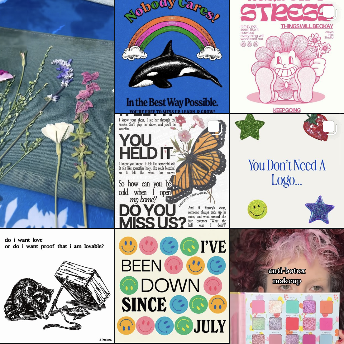
trying sticker design
In an effort to stay in Illustrator, I messed around with the idea of making stickers. Usually if I wanted to buy stickers, I’d scour…
-
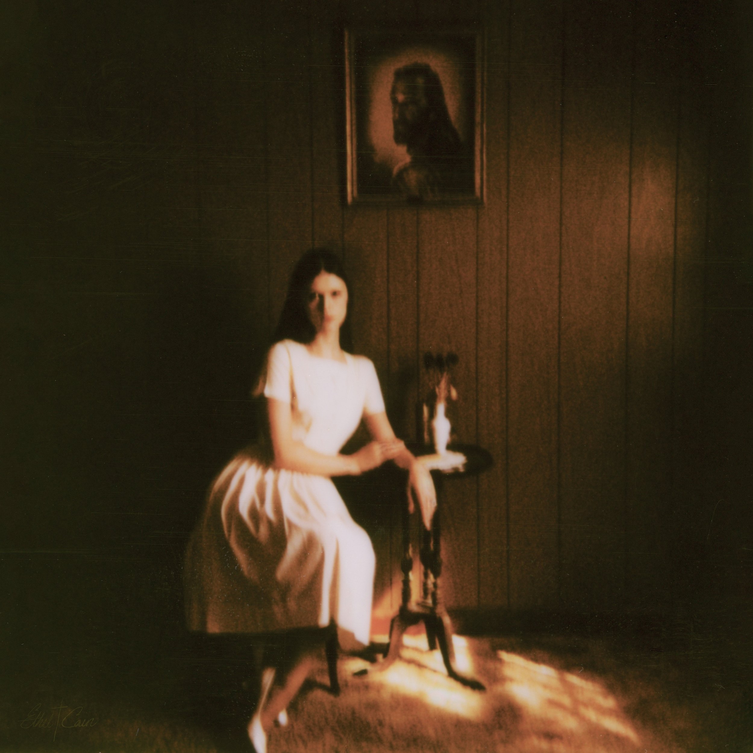
preacher’s daughter inspired design
Lately I’ve been listening to Ethel Cain’s album Preacher’s Daughter. The music takes you on a journey from the perspective of Ethel as she journeys…
-
staying in design software over the summer
Summer for me goes by super fast! Whether I’m passing the days working full time, visiting family, or going on trips it can be hard…