So this semester is all about making a magazine, quite literally, from scratch. We have to write the articles, conduct interviews, photograph interviewees and products, design our own advertisements– you get the idea.
I kinda dove in headfirst, working on assignments as they were given. Because of this slapstick approach, I haven’t really fully thought about the vibe of my magazine, colors, spreads, etc.
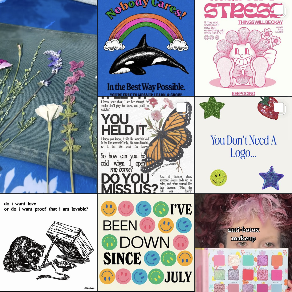
So over my weekend, I wanted to cement the foundation of my magazine. I took to Pinterest and made a mood board with spread design ideas. I went online and used this website to generate color palette ideas. For my fonts, I used Adobe Fonts and browsed for potential body copy fonts. Indesign was my chosen software.

Some spread ideas that I liked (above and below)

I wanted to keep the magazine minimal but with a sense of design with colors and layout.

The mood board will make it easier for me to design future elements and spreads of my magazine, musings.
From the blog
Stay up to date with the latest from our blog.
-
design legends you should know #2 Paul Rand
Paul Rand, who the heck was he? In short, a legend. Born in 1914, in NY, Rand was an art director, writer, graphic designer, and…
-
typography deep dive
Class has started! And of course on day one, I already have an assigned presentation for the second week of school. Basically the class was…
-
exploring user experience design
What is user experience (UX) design? First, lets tackle the meaning of user experience. According to Baymard Institute, user experience is “any interaction a user…