Tag: adobe illustrator

  • new etching design: the process

    Thanks to a tour at JDS Industries, I am the new owner of a leatherette journal. I can etch into it with the school’s laser (like I did with the tree ornament).

    I just had a new assignment: a laser/engraving portfolio design piece. Some classmates are buying keychains, pens, etc. I am just rolling with the neat journal. I knew I wanted my design to be lyric-based. After listening to one of my favorite songs (Sunbleached Flies) I knew I had some verses to pick from.

    I ended up creating my file in Illustrator and going with an eye-catching cathedral window. Picking out fonts was really fun, I wanted the font to match the tone of the lyric. Script fonts are really fun to play around with and I’ve curated a collection of fun cursive fonts on Adobe Fonts.

    The final design 🙂

    With the complex window, I opted to keep the rest of the design simple. I can’t wait to fire up the laser and engrave my notebook. Stay tuned!

  • learning trapping part 1

    Lately in Layout 3, we’ve been learning about trapping. It’s a printing technique. I’ve learned how to design, but it’s nice knowing the print side as well.

    Here’s a great video that explains the basics.

    This articles talks about trapping and different methods.

    In class, we talked about different methods, and created our own samples in Illustrator.

    It’s a lot to understand and wrap my head around. In class, we didn’t go over everything yet. There’s still more!

  • engraving leatherette ornaments

    Today in my Production Lab class, we got to engrave tree shaped leatherette ornaments. It was a bit scary, but I think that’s because I didn’t want to mess with the engraver. I made up my designs below in Adobe Illustrator.

    The back design

    I ended up going with the second front design.

    My takeaways

    • When printing on this type of leather, bold letters show up better
    • If I would do this again, I would thicken the stroke of “Ethel Cain”
      • I had to do this on the fly and engrave the back twice because I could barely see the engraving the first time
    • It was a lot easier to use the engraver than I thought! Now I’m not as hesitant to use it.
  • revising past projects

    I’ll be the first to admit, I wish I could do all of my projects to 210% of my ability. But with multiple school projects, working twenty hours a week, and trying to adult, it gets to be a lot sometimes. Because of my busy school and work life, sometimes my projects aren’t to the caliber that I try to uphold. So with some extra time this week, I wanted to revise some past projects.

    Victim number one, I mean project number one, was my packaging design from last semester. I love the idea of it, but it just felt a little flat to me. The back seemed too plain.

    The original packaging design

    I made some minor adjustments, by increasing the size of the tagline above the rainbow, and keeping the rectangle motif. I think that helped it feel a bit more streamlined and professional feeling.

    slightly tweaked packaging design
    new logo type w/tweaked packaging design

    I wanted to play around with the logo design as well. It just felt a bit rushed. In the future, I’ll take my revised versions to my teacher to get some feedback. The new logo design is growing on me. What do you think?

    Hopefully I’ll post some more revised projects. Until then!

  • perfume label progress

    I’ve been steadily working on my perfume label in class. Initially, I wanted the perfume to have the scent of bleeding heart flowers, but since the bottle is an amber color, I decided on an orange scent.

    I’m still playing around with font combinations for the brand. But I am happy with the body copy font (The Seasons).

    The brand font in this early stage was Gautreaux
    Here are my WIP font options… still not sold on any yet

    Then I wanted to include orange blossoms on the label for some floral imagery. I found a reference online and digitized the flower for a sketch/illustration feel. I then resized it to better fit the label.

    The current iteration of the perfume label, with a different brand font

    I think I’m starting to get somewhere now. I need to play around with the borders (color, thickness, etc) as well as the color of the label itself. The brand font is better, but needs to be tampered with a bit. The orange blossom flowers need stems and perhaps leaves. This is far from its final form. Stay posted!!

    From the blog

    Stay up to date with the latest from our blog.

    • learning trapping part 1

      Lately in Layout 3, we’ve been learning about trapping. It’s a printing technique. I’ve learned how to design, but it’s nice knowing the print side…

    • gettin it done (my portfolio show logo)

      Out of the plethora of projects I’ve been assigned, I’ve been making progress on my portfolio campaign. Right now I have a finalized logo (yay!)…

    • making mixed media animation (both ways)

      When you start mixed media animation, there are two ways to go about it. There’s a longer way, and a shorter way. The more arduous…

    • engraving leatherette ornaments

      Today in my Production Lab class, we got to engrave tree shaped leatherette ornaments. It was a bit scary, but I think that’s because I…

  • manipulating type in Illustrator

    manipulating type in Illustrator

    The college homework saga continues! We are currently designing the nameplate, or title, of our magazine. After scrolling through adobe fonts, I finally found my font: casserole. Which is such a fun name and just warms my Midwest heart.

    But picking a font was just the beginning. Now I have to expand my Illustrator skill set and figure out just how to manipulate type. I haven’t done a whole lot with typography so I consulted google and found these really helpful videos.

    I learned a lot about the pencil tool! I’ve become so comfortable with the pen tool, that I haven’t tried it. That ends today!

    Brainstorming

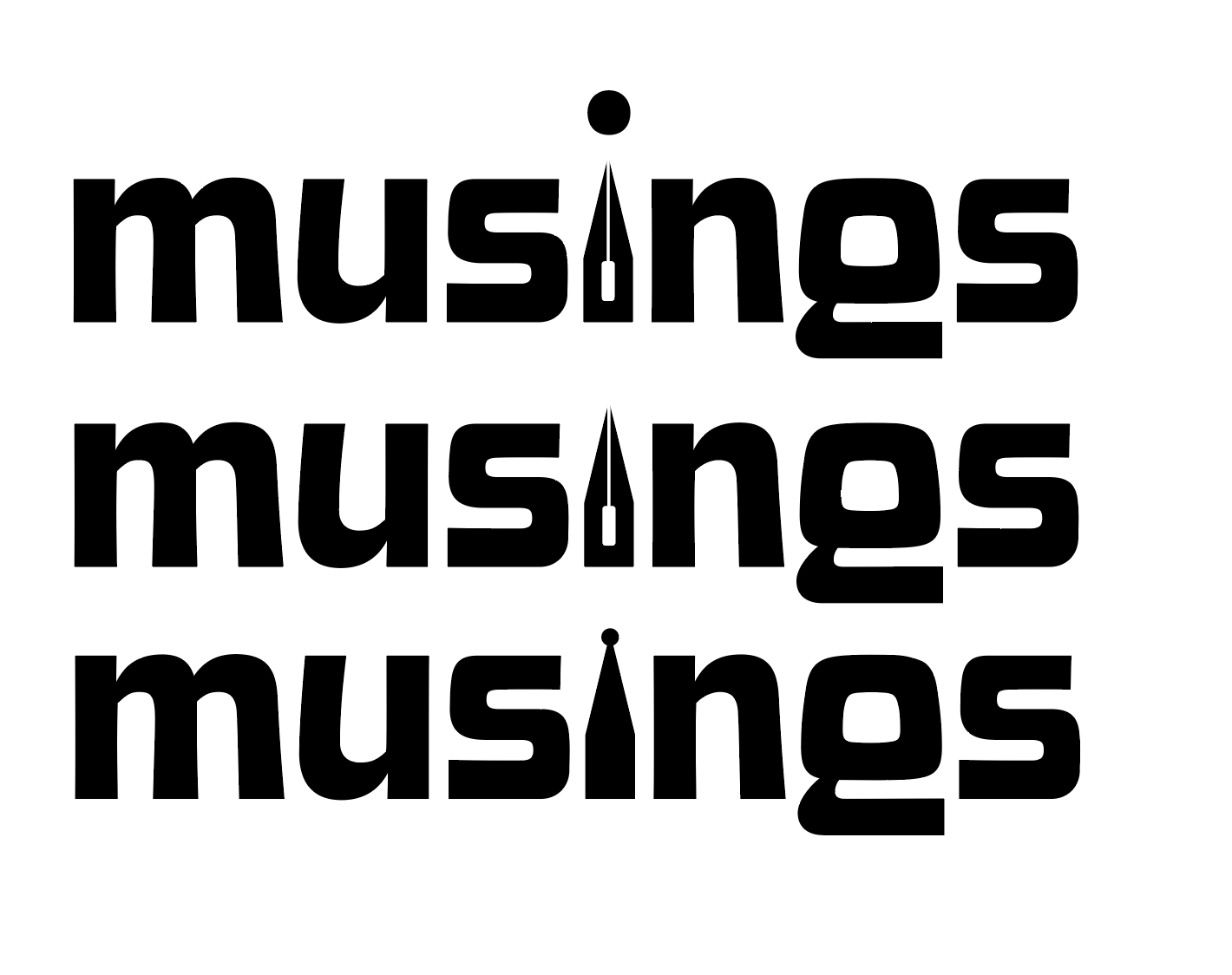
    My magazine title is musings. After thinking and surfing Pinterest, I wanted to try incorporating a quill nib into the title.

    some generic quill nibs (not my pic)

    I started sketching how I wanted the nib to replace the i in musings.

    some of my scribblings!
    some iterations

    I like the one in the middle. I don’t think I need a dot for the i. This week, I’m going to check in with my teacher and get some feedback. I couldn’t for the life of me figure out how to knock out the middle pieces of the quill either.

    That’s all for today folks! Did you learn anything new?

    • poster progress update #3

      Last time we left I had a rough wip poster. I resketched a guitar for the bottom right frame. Then I took it into illustrator, image traced the guitar, etc. I liked the idea of it, but it just seemed off. The idea didn’t really look like what I had envisioned. I really like the…

    • layout project progress: poster edition

      As I wrote in my last post, I am designing a 10 piece campaign for a music festival. I have finished the logo and stage banner. The current work in progress is the poster. I wanted the poster to be artsy, and be able to be hung on a wall. There’s the easy route of…