I finally finished my first assigned ticket/project! It was a really simple task but still. I had to turn a bookmark file into an 8.5 x 11″ flyer. There were some bumps in the road. The bookmark functioned as a coupon for a free library bag, which would be odd for a flyer. I asked about that and then scrapped the coupon paragraph. Turning a bookmark into a flyer also made it interesting when trying to place images.
I learned how communication between a client and a designer goes. It was good practice! Another graphic designer was also able to look over my file. I’m still learning what versions of logos to use and where everything is on the I drive. I’ve never used the Share for Review feature in Adobe. It’s pretty handy and I think I’ll remember that for future projects.
Now I’ve got the hang of things (a little bit at least). I can’t wait to update yall on what I work on next 🙂
Currently, I’m working on an ultra top-secret (not really) chatbot design. I’ve been given the chance to determine a chatbot’s graphic and overall branding.
I started my process like any other project, with research. I wanted to get a feel for the chatbot graphic standard as well as fit into my criteria which are:
five individual graphics
graphics should use brand colors
graphics shouldn’t be too robotic or too human-like
I spent a good amount of time drafting up potential graphics. When designing, I knew my graphic was going to be very small on a screen. I got a lot of good feedback from my manager and the lead graphic designer.
my graphics needed more personality
scale isn’t an issue, so add more detail
play around with different color combos
make all-white versions of logos to determine their flexibility
After the feedback, I went back and revised it. I am not an artist in the drawing sense, and I was a bit worried about my knack for digital art. But I played around and made edits. Hopefully, I’ll get another round of critiques soon.
Thanks to a tour at JDS Industries, I am the new owner of a leatherette journal. I can etch into it with the school’s laser (like I did with the tree ornament).
I just had a new assignment: a laser/engraving portfolio design piece. Some classmates are buying keychains, pens, etc. I am just rolling with the neat journal. I knew I wanted my design to be lyric-based. After listening to one of my favorite songs (Sunbleached Flies) I knew I had some verses to pick from.
I ended up creating my file in Illustrator and going with an eye-catching cathedral window. Picking out fonts was really fun, I wanted the font to match the tone of the lyric. Script fonts are really fun to play around with and I’ve curated a collection of fun cursive fonts on Adobe Fonts.
The final design 🙂
With the complex window, I opted to keep the rest of the design simple. I can’t wait to fire up the laser and engrave my notebook. Stay tuned!
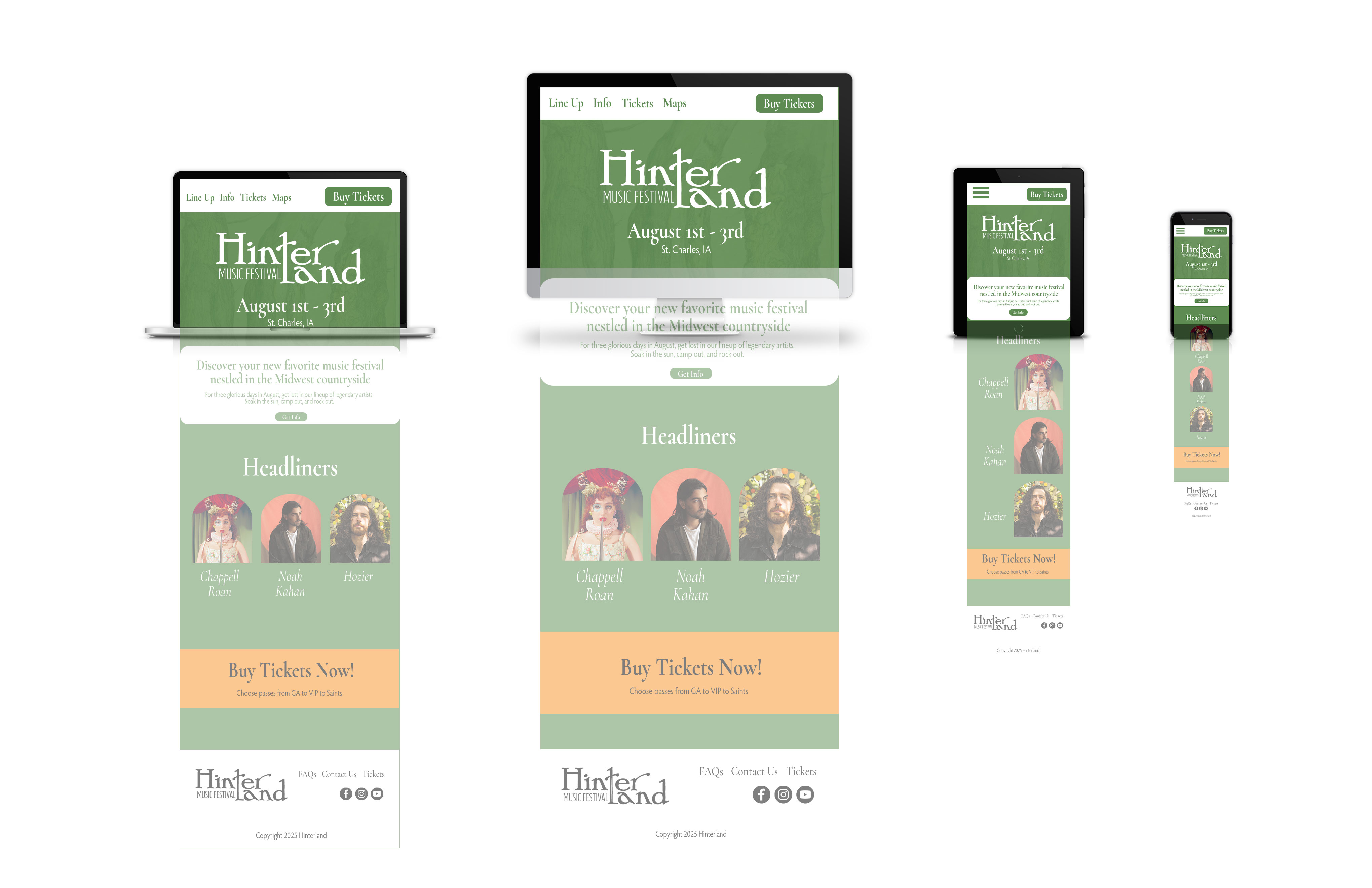
I’m still at a standstill with my poster. I think I need some time away from it so I can attack with a new perspective. Right now I’ve gotten the website mock up done (below)
The website mock up took ages! I had to make sure my colors were accessible. I used https://contrast-grid.eightshapes.com/. Something that challenged me was trying to place images into unorthodox shapes. To take my image to the arch shape, I had to turn the shape into a smart object and then place the image on top, before using a clipping mask. There has got to be an easier way lol.
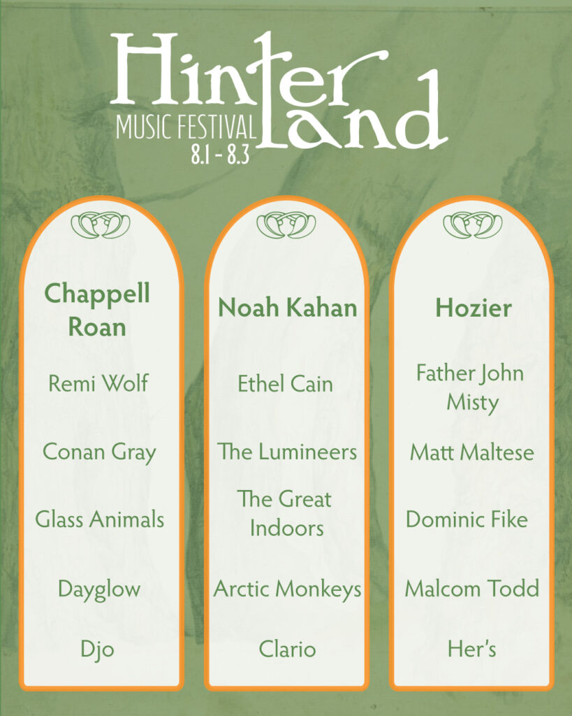
I also finished my social media lineup post. This is an imaginary campaign, so I made sure to include my dream lineup.
I tried to make sure the artists matched the same vibe of music. I also hopped on spotify and made a playlist modeled after my lineup. That helped me find flow and before I knew it I had two pieces done!
Last time we left I had a rough wip poster. I resketched a guitar for the bottom right frame. Then I took it into illustrator, image traced the guitar, etc.
I liked the idea of it, but it just seemed off. The idea didn’t really look like what I had envisioned. I really like the tree, so I pivoted.
I like the simple version better
I like the second version, it still needs a finalized font for the dates. I want to experiment with some colors. Part of me wants to add more elements to the poster but I’m drawn to the simplicity.
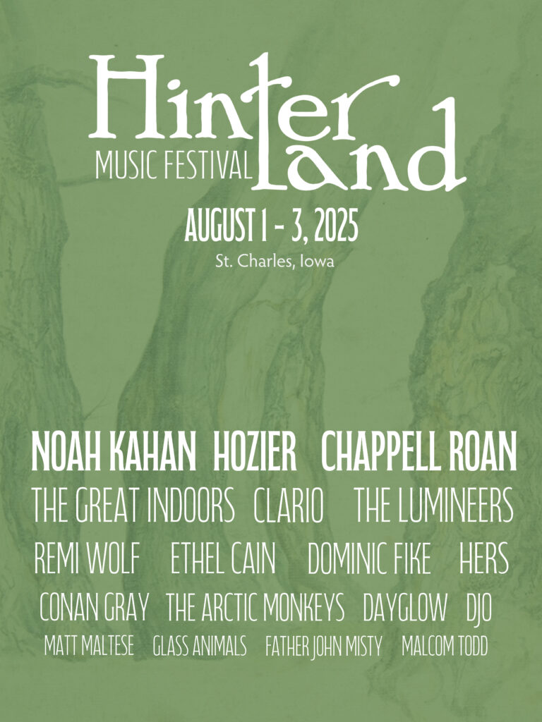
As I wrote in my last post, I am designing a 10 piece campaign for a music festival. I have finished the logo and stage banner. The current work in progress is the poster. I wanted the poster to be artsy, and be able to be hung on a wall. There’s the easy route of including all of the head liners, but I wanted a more fun approach.
I started with a bunch of small sketches. Nothing really stood out to me. I really wanted to capture the atmosphere of the festival. It’s set in a small Iowa town with mainly indie and alternative artists. The past festival themes have been kinda folksy and hippie ish, or trendy. I wanted to have a ren faire adjacent theme. Something that felt homey, backroads, fun, and comforting.
Initial poster ideas (as well as my dream lineup lol)More sketches!
After a bunch of sketching and scouring Pinterest, I came across a cool frame/medieval banner template.
After looking online for similar frames and borders, I had an idea. I wanted to include snapshots of the festival (the hinter tree, guitar, and a lineup) but in a framed way.
This was my more finalized ROUGH sketchThis is the current work in progress
Right now, I’m in the process of editing the sketched snapshots, and finalizing color combos. The tree sketch isn’t my own work, it’s from the public domain. I found it on public.works. That’s a really cool site for images in the public domain.
In Layout III we are doing a 10 piece campaign. Thank goodness for creative liberty and freedom in topic! I am doing a 10 piece campaign for Hinterland Music Festival.
Before I got into software I:
looked at previous Hinterland Festival themes
researched music festival logos
ex: Bonnaro, Coachella, Austin City Limits, etc.
created a Pinterest mood board
I think I will need a more organized mood board for future reference
sketched logo ideas
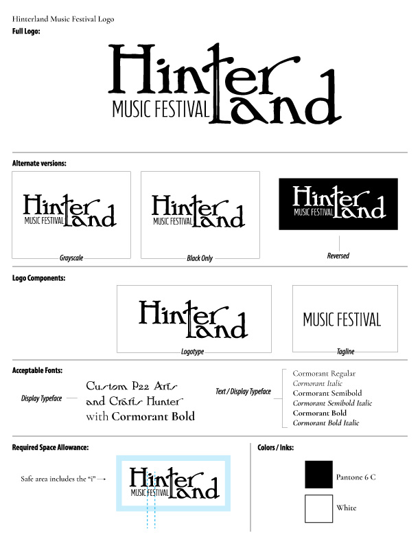
Right now I have a logo (yay!) only nine more pieces to go.
The logo in question
So now I need to design:
Festival map
VIP lanyard badge
Festival poster
Festival merch
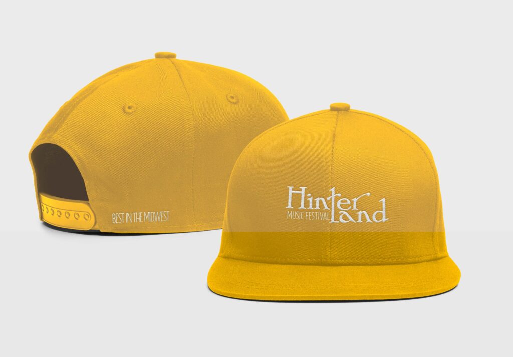
baseball cap
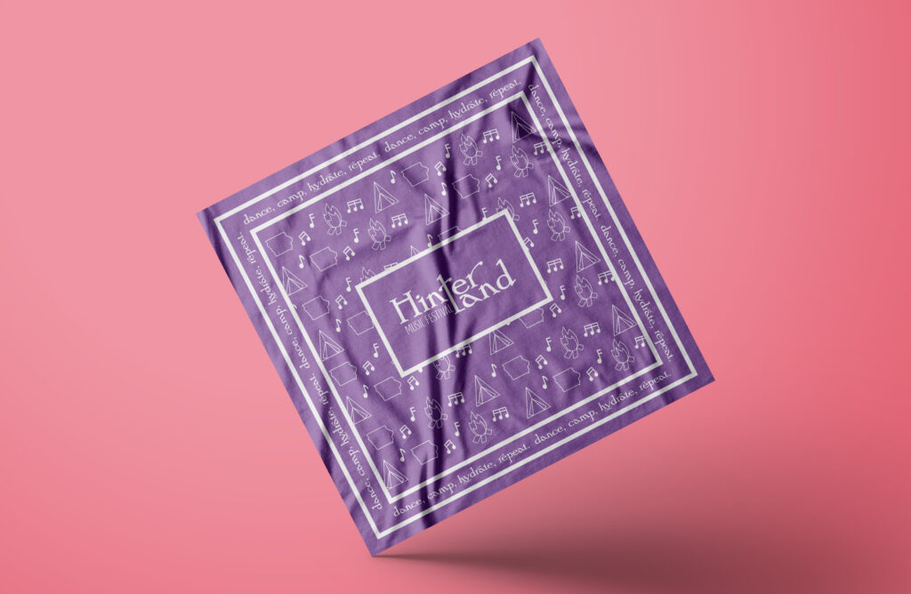
bandana
shirt
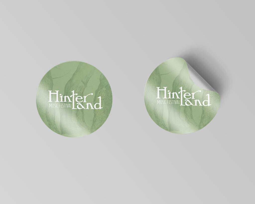
stickers (2)
Stage banner
Social media lineup post
Ads (2)
Festival wristband
I’ve made progress on a stage banner. I’ve kept it simple (there’s not much real estate on a long narrow banner). I used the same font because I was worried to use the logo and have a unreadable banner. (The logo has a width that would be difficult to scale and fill up a majority of the banner)
The banner (it looks small but it is BIG)The banner with a more defined “r”
I’m working on the poster next. I’ll update you soon!
Lately in Layout 3, we’ve been learning about trapping. It’s a printing technique. I’ve learned how to design, but it’s nice knowing the print side as well.
When you start mixed media animation, there are two ways to go about it. There’s a longer way, and a shorter way.
The more arduous way entails taking a video frame by frame, printing it out, adding the mixed media aspect, scanning it back in, and then lining up each frame in post. It’s very lengthy, but it’s more customizable than the shorter way.
The colored frames for the long mixed media animation pro
The easier way, is to take a video, import it in Photoshop as video frames to layers, make your edits in photoshop, and export, then arrange it in post.
I did both and have some videos and thoughts below!
The long process pros and cons
Pros
It was easier to customize the animations with crayons, markers, colored pencils, etc
More freedom
Cons
harder to line up scanned in images
took a long time to line up said scanned images (very frustrating)
The short process pros and cons
Pros
saved time
was easier to export (create frames, line up in post, etc)
Cons
not as much creative freedom
dependent on Photoshop brushes/photoshop manipulation for mixed media effect