I’ve been steadily working on my perfume label in class. Initially, I wanted the perfume to have the scent of bleeding heart flowers, but since the bottle is an amber color, I decided on an orange scent.
I’m still playing around with font combinations for the brand. But I am happy with the body copy font (The Seasons).


Then I wanted to include orange blossoms on the label for some floral imagery. I found a reference online and digitized the flower for a sketch/illustration feel. I then resized it to better fit the label.

I think I’m starting to get somewhere now. I need to play around with the borders (color, thickness, etc) as well as the color of the label itself. The brand font is better, but needs to be tampered with a bit. The orange blossom flowers need stems and perhaps leaves. This is far from its final form. Stay posted!!
From the blog
Stay up to date with the latest from our blog.
-
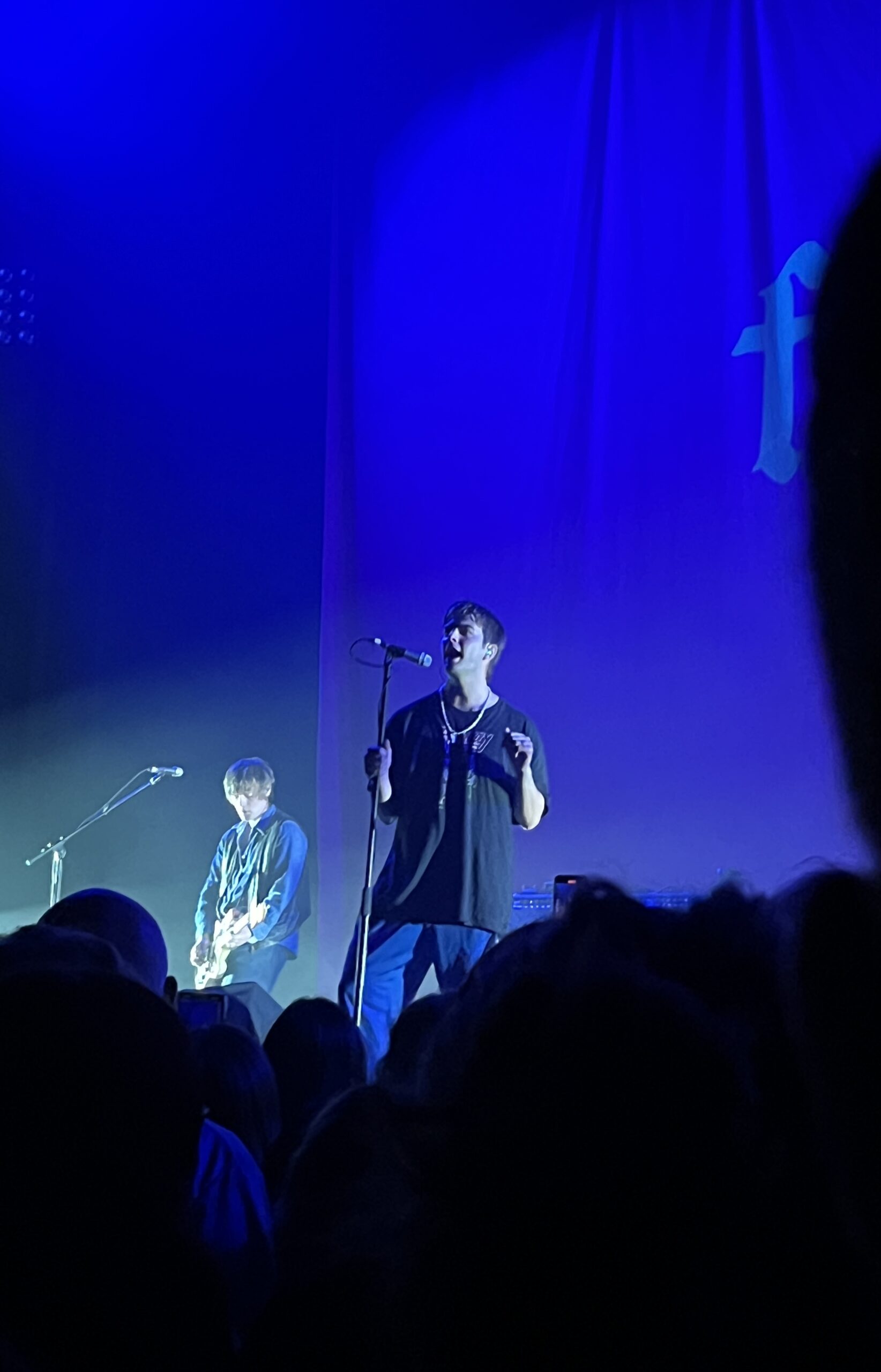
concert diaries #1
Hey guys! As I’m sure you’re all aware, I’m really into music. I like pop, musicals, indie, rock, jazz, and even a bit of country.…
-
my love note to trader joe’s packaging
Trader Joe’s is a grocery store, and while there aren’t any in SD it’s still one of my favorite grocery stores. It has good prices…
-
trying out t-shirt design
This summer has flown by so fast! One thing I like to do every summer is some sort of craft. So I dug out my…
-
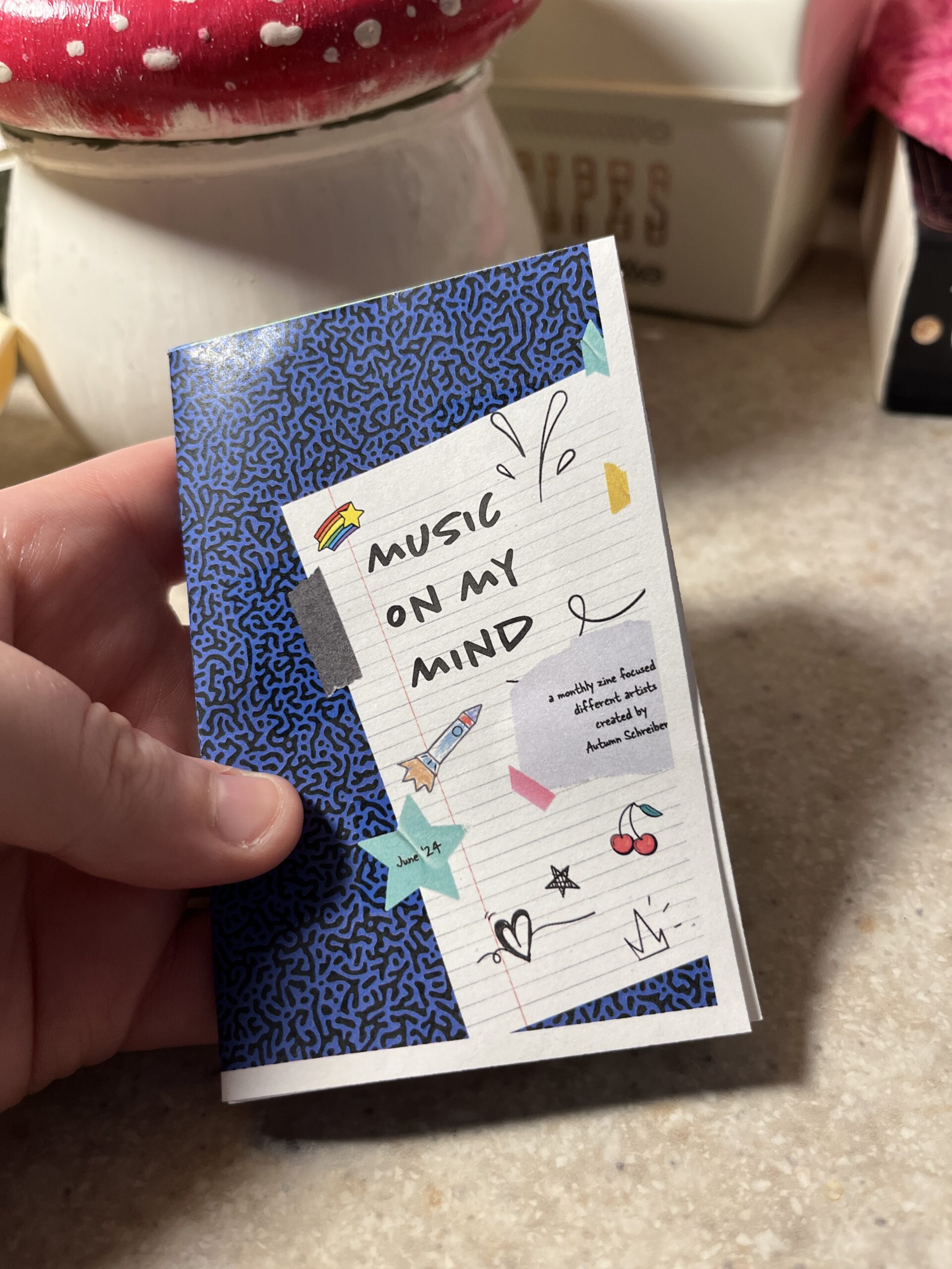
making a zine in InDesign
Hey yall, I’m back! Before jumping into the software I decided to look for a tutorial. I found this one and it was pretty straightforward.…