I’ve been steadily working on my perfume label in class. Initially, I wanted the perfume to have the scent of bleeding heart flowers, but since the bottle is an amber color, I decided on an orange scent.
I’m still playing around with font combinations for the brand. But I am happy with the body copy font (The Seasons).


Then I wanted to include orange blossoms on the label for some floral imagery. I found a reference online and digitized the flower for a sketch/illustration feel. I then resized it to better fit the label.

I think I’m starting to get somewhere now. I need to play around with the borders (color, thickness, etc) as well as the color of the label itself. The brand font is better, but needs to be tampered with a bit. The orange blossom flowers need stems and perhaps leaves. This is far from its final form. Stay posted!!
From the blog
Stay up to date with the latest from our blog.
-
what the heck is a lead in spread
Well folks I hit a brick wall. Even google couldn’t give me a clear answer when googling “what is a lead in magazine spread?” I’m…
-
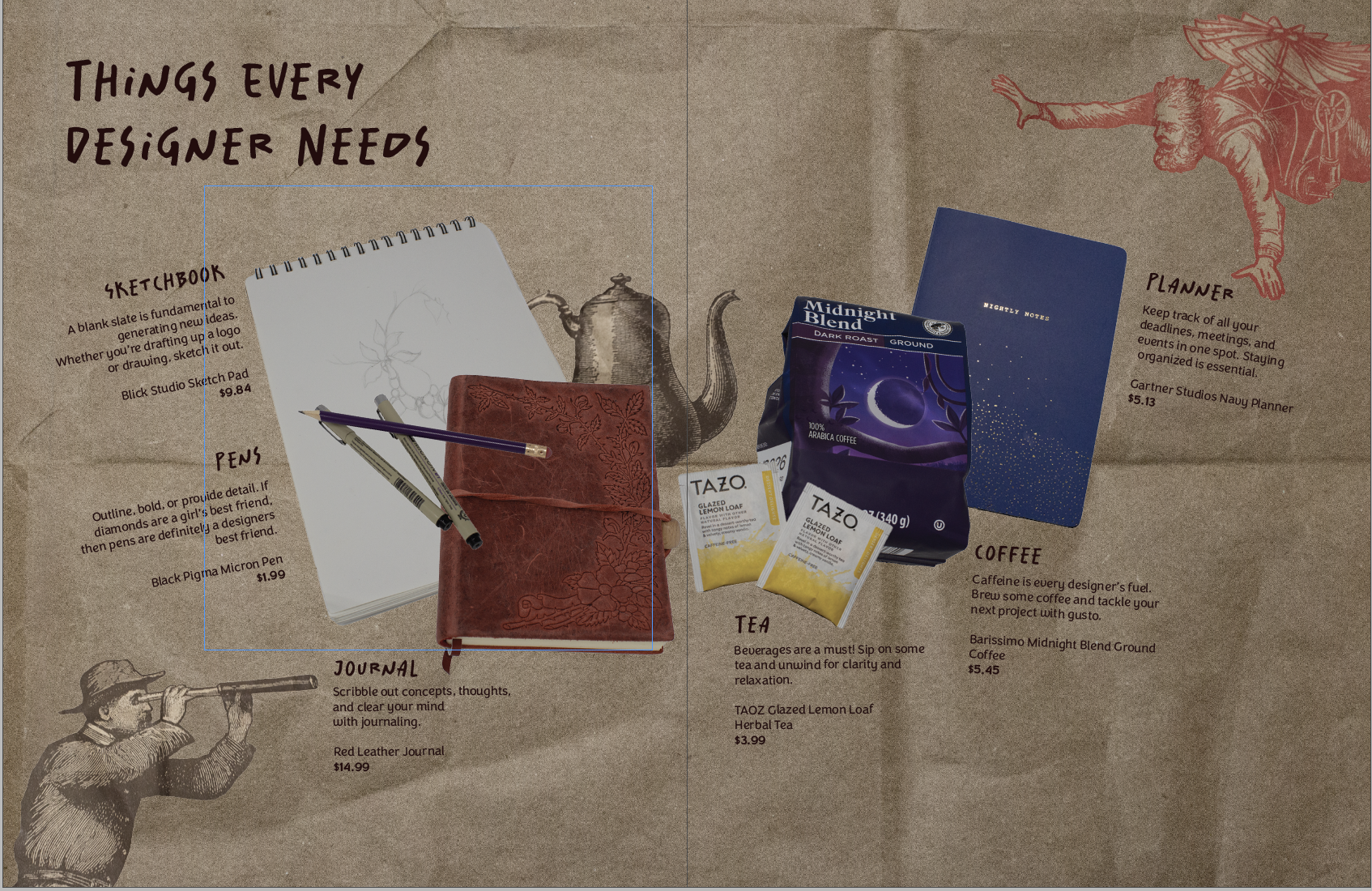
product spread adventures
Making my first product spread was a rollercoaster! It challenged me to beef up my photography skills and problem-solve. My magazine is all design-centered. So…
-
creating a perfume brand
This weeks new project was introduced and I’m soooo excited. We are making product labels! Everyone in class had to bring in a package with…
-

making more moodboards
In my New Media Class, we are making website mood boards for a fictitious client. The website is for Chef Jaqueline, who specializes in making…