Trader Joe’s is a grocery store, and while there aren’t any in SD it’s still one of my favorite grocery stores. It has good prices (perfect for a broke college student like me) and unique products with fun packaging.
I only visit TJ’s occasionally when I visit family and I’m always down to try new things. The neat packaging always draws my eye.
The last time I went, I saw the bright graphics for the Strawberries and Creme Pancake mix and I just had to get it. The vibrant colors and cute strawberries really made an impact. They just had a fun vibe that other boring pancake mix boxes just couldn’t live up to.
Disclaimer: all images in this post are not mine
Even after I made the (mediocre) pancakes, I was drawn to keep parts of the box. I’m crafty and like to make collages in my spare time, so I definitely cut and saved the little strawberries.
This summer has flown by so fast! One thing I like to do every summer is some sort of craft. So I dug out my fabric paint and made some sick custom t-shirts. There’s something cool about bringing a sketched out design to life and then being able to wear it out and about.
Here’s the sketch w/some of the shirt in the background
But yesterday I finished a sketch and thought it was decent enough to actually mock up in Adobe Illustrator. It reminded me of a similar project I did last semester at STC. The goal was to create a school club t-shirt that could potentially be sold in the bookstore. We considered graphic placement, fonts, and school colors.
My goal with this design was to create my own fan merch that was simple and true to the artist. Instead of a actual picture I opted for a silhouette. I used bold contrasting fonts to convey the song lyrics complicated heavy message.
I brought the sketch into illustrator and started tracing it. I liked my initial design, but it was a bit hard to read the bold font.
After some feedback, I expanded the size of the halo to include the text and tried a solid color font.
I like the reworked design (above) but I think the halo could be thinner. The contrast of thickness seems a bit off and the halo and the text seem to be competing for dominance.
Here’s the initial mockup! I added the Ethel Cain logo to the back because some of her merch includes it. (example of her merch below)
I’m gonna look for some more free tshirt psd mock ups, clean up the design and then share the final product with you!
Thanks for reading! Let me know your thoughts and check out my posts below.
Hey yall, I’m back! Before jumping into the software I decided to look for a tutorial. I found this one and it was pretty straightforward. If you’re looking for a tutorial on how to make a zine by hand check out this video from brattyxbre.
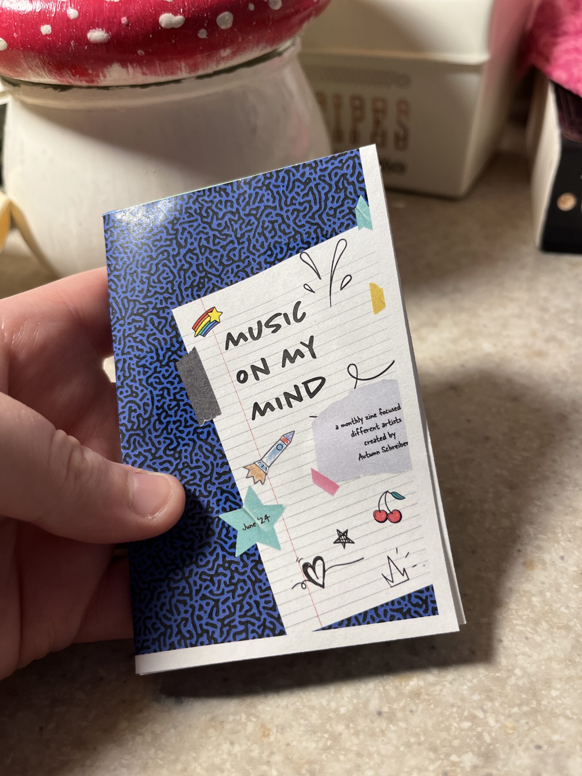
So first up is finding inspiration. Right now I’ve been really into musicians Chapell Roan and Ethel Cain. I’d be a shell of myself without Spotify. My zine will be called music on my mind to reflect my current song infatuations.
Now that I have my topic, I split my pages up.
Cover
Intro Page
Artist
Artist
Artist
Artist
Artist
Back
Here’s the rough sketched out page design layout!
Designing
The hardest part is next. I followed this tutorial to figure out my layout in the software. From there I found corresponding fonts and scrapbook-like elements. The colors, elements, and fonts corresponded with the main picture and the vibe of the artist. I got most of my fonts and elements from Adobe Fonts and Adobe Stock Images.
The Final Product
Initially, I had the layout similar to the video tutorial. However I ran into issues figuring out how to print it. More on that below.
Printing
Printing is a different beast entirely. At first, I printed my facing pages as spreads. But I thought I’d be smart and print them doublesided to save on paper. However, my double sided pages didn’t face the same way and one side was up and the other was flipped. To save my remaining sanity I brought the pages into a 8.5″ x 11″ document (split into 8). This allowed me to save on paper and simply fold and cut to make a zine without needing binding. For some reason, I still ended up with a white border after printing. I used the school’s printers but will try UPS next time.
This is how I folded my mini zine!
Thoughts
If I were to do this again (hopefully soon!) I would change a couple of things.
Font Unity
I used a lot of fonts to try to adhere to the featured artist, but doing so made it hard to read and overall not uniform
Readability
I’d change the font size to be legible, it was hard to tell before printing
Printing Process
I ran into patchy ink printing so I’d find another way to print next time
Layout
Instead of doing multiple facing pages, I’d stick to a 8.5 x 11″ split into 8 sections. The simplified layout doesn’t make my head hurt as much and would save money on printing if I decide to sell/print multiple.
What would you make a zine about? Have you made one before? Let me know below 🙂
In an effort to stay in Illustrator, I messed around with the idea of making stickers. Usually if I wanted to buy stickers, I’d scour Etsy or Redbubble. But sometimes the stickers I want aren’t there, hence me trying this out. For some reason, I decided to build off of my tattoo idea from this previous post.
Gathering Resources
I started looking up youtube videos and came across two semi helpful ones. (video 1 and video 2)
After getting some insight on how to merge shapes, etc. in Illustrator I dug out my original sketch.
Designing
Then I started designing, keeping the lyric in mind as well as typical interstate signage references. I wanted to keep my sign looking accurate as possible. I discovered that the font (Highway Gothic) was created by the United States Federal Highway Administration for all road signage.
Here’s my first draft, not too shabby. But not the right font.
I really wanted the sticker to feel more fun than just a white and green sign. I think adding the additional lyric “I can’t leave it be” in graffiti type font helps elevate it, adding variety.
Currently I’m rocking with either of these two designs. I think I like the sticker without the extra rectangle at the top right. I can’t decide on the graffiti font, but the texture of the bottom one seems to catch my eye. I like the idea of the state number crest, but it might be too much. Let me know your thoughts!
Summer for me goes by super fast! Whether I’m passing the days working full time, visiting family, or going on trips it can be hard to stay in the software. Read on to see some of my suggested summer projects.
Potential Summer Projects
Poster Design
One of my favorite things to do is to design posters! I like to make music posters (band tour posters, lyric poster, etc). You can even print them out at your local Fedex for cheap.
Here’s a band tour poster I made! I used Illustrator and tried layering text for a grunge feel.
Rebranding
Whether you have a brand in mind, or you want to make up a fictional one, creating a logo can be a lot of fun! Personally, I like the idea of creating a fictional fairy tavern and then designing the logo, Pinterest board, ad campaign, signage, etc.
Tattoo Design
I’ve gone over this a few times, so feel free to check out my last post! Or click here. But basically, the idea is to sketch out a potential tattoo (inspired by your favorite, books, or games!) Try sketching and then bring it into software to clean it up.
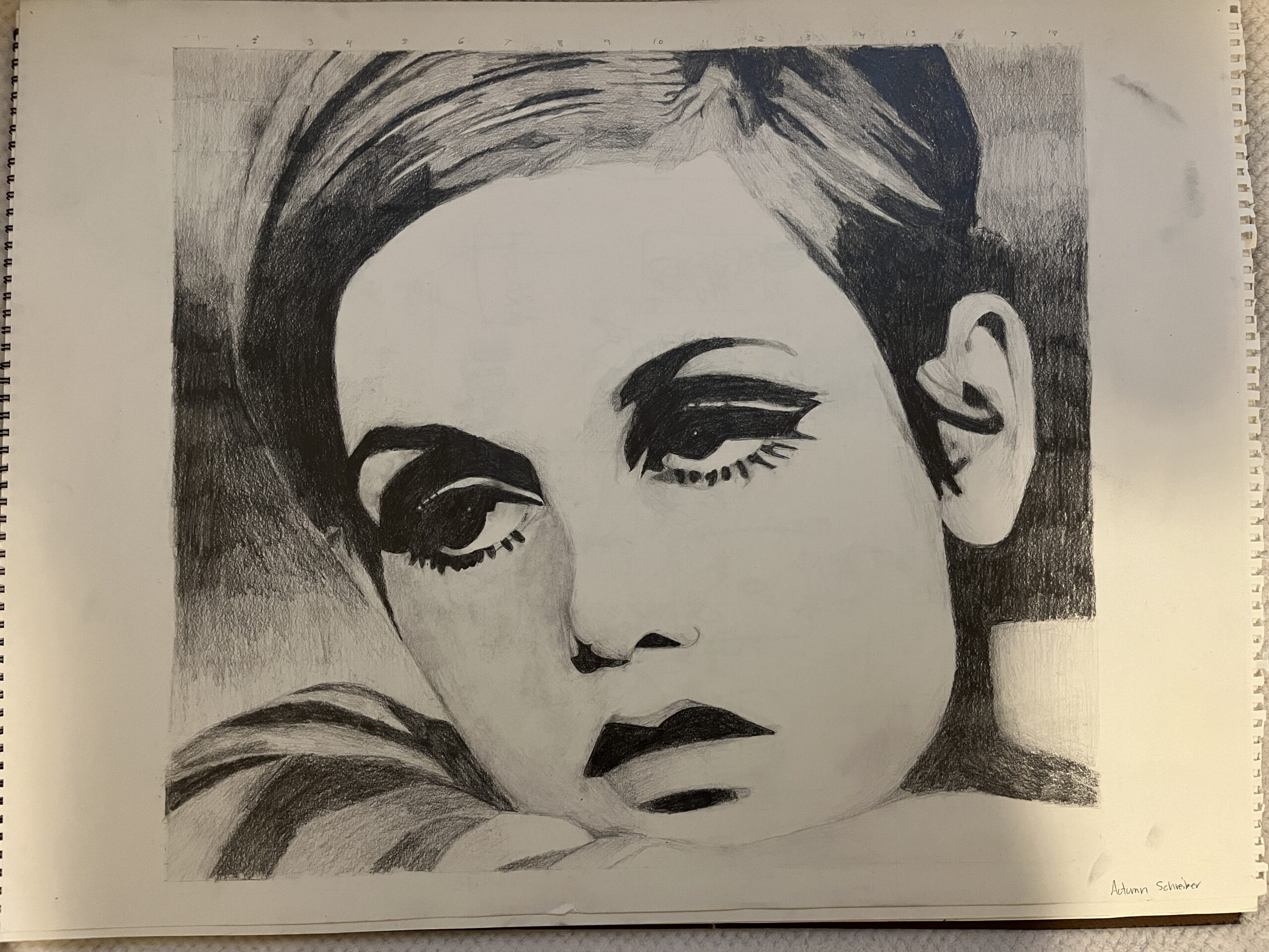
One thing about me is that I like tattoos! I only have one, but as soon as I have some money saved up I’m gonna get some fresh ink. I love music, so most of my ideas for tattoos come from meaningful song lyrics. My approach to designing tattoos always starts with a sketch. Sometimes my sister and I bounce ideas off of each other.
Here’s some rough sketches for a potential tattoo. My sister loves Matt Maltese’s song Oldest Trick in the Book, so I wanted to come up with something to reference that.
I’ve really only ever messed around with tattoo design and haven’t gotten anything of my own design inked.
Some cool resources I found for tattoo design are as follows: