So this semester is all about making a magazine, quite literally, from scratch. We have to write the articles, conduct interviews, photograph interviewees and products, design our own advertisements– you get the idea.
I kinda dove in headfirst, working on assignments as they were given. Because of this slapstick approach, I haven’t really fully thought about the vibe of my magazine, colors, spreads, etc.
So over my weekend, I wanted to cement the foundation of my magazine. I took to Pinterest and made a mood board with spread design ideas. I went online and used this website to generate color palette ideas. For my fonts, I used Adobe Fonts and browsed for potential body copy fonts. Indesign was my chosen software.
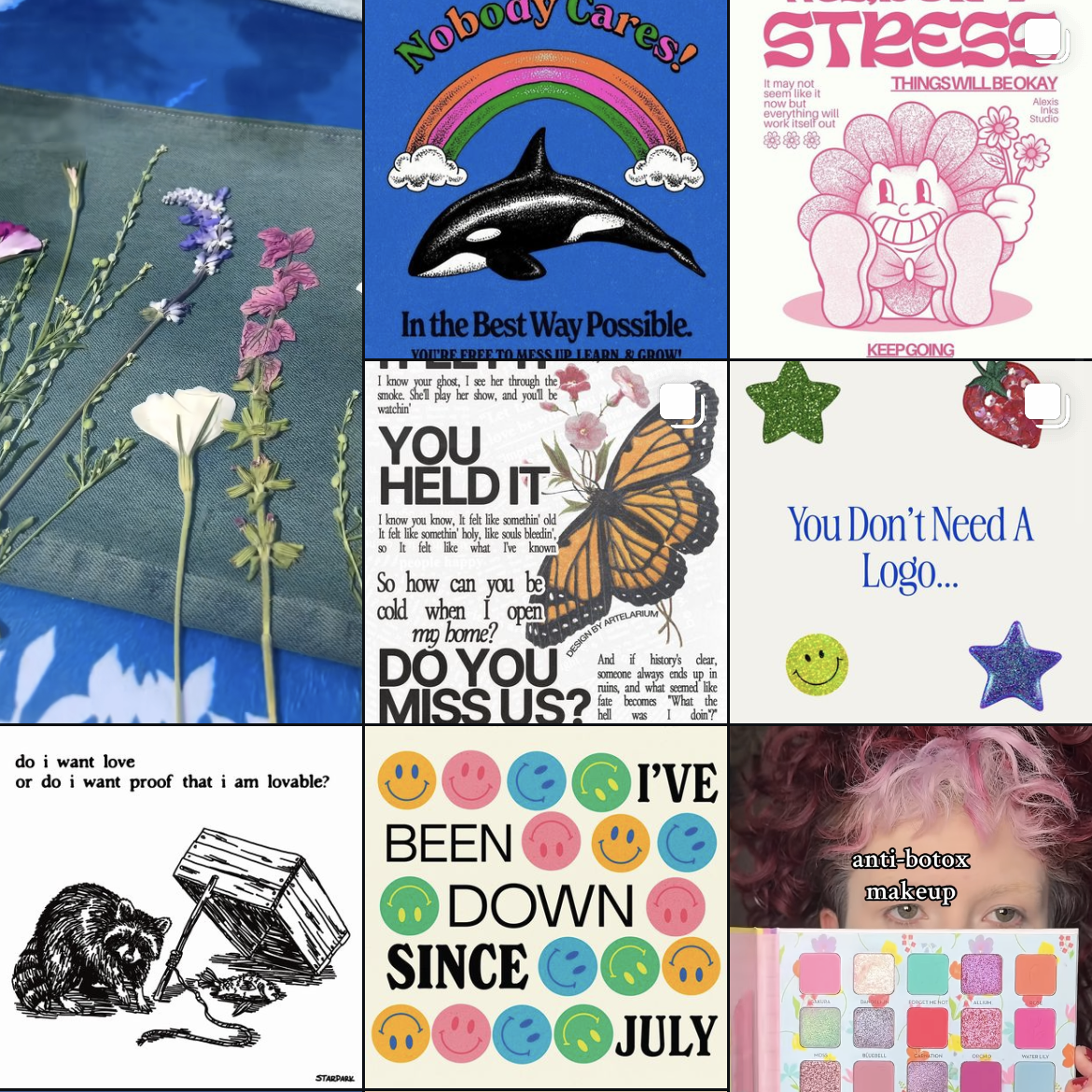
Some spread ideas that I liked (above and below)
I wanted to keep the magazine minimal but with a sense of design with colors and layout.
The finished scrappy mood board
The mood board will make it easier for me to design future elements and spreads of my magazine, musings.
Welcome back ya’ll! Today I thought I’d walk you through my current challenge: creating a graphic design portfolio. I am by no means an expert, but with the power of the internet and my teachers, I think I can handle it.
Where to begin?
The most important part of your portfolio is the contents. You want to show off your best work, what you’re most proud of. So gather up your portfolio pieces and edit them as needed. I needed to edit some of my projects after getting feedback from other graphic designers. Do this and then we can start designing the portfolio.
Designing the portfolio
For some reason, this is the most daunting part. I’m opting to create my portfolio in Indesign, but there’s a lot of other options such as Adobe Express.
My itty bitty screenshot, I couldn’t figure out how to make it bigger 🙁
Navigate to New File –> Web tab –> and then look at some templates. You can use those or create your own!
I started with a business proposal template and began to customize it to my portfolio needs. I wanted to include sketches, process images, final product pictures and design explanations.
A rough idea of my portfolio layout!
And that’s it! Design your portfolio and then export it as a PDF, or an interactive PDF if you have links, etc.
It’s been awhile! I’ve really gotten engulfed in my internship. I started working full 40 hour weeks since the end of May. Here’s the rundown of my current projects: Yeah you read that right. It’s dog week at my internship and I definitely could use all the puppy love. (Pic for proof, otherwise it didn’t…
My internship has been so fun! It honestly doesn’t even feel like work. I’ve been working on a bunch of different projects. The chat bot has been ongoing for awhile now. Currently we have four strong designs that need to be voted on! I’m secretly rooting for the Sherman graphic (below). I’ve also been working…
I’m back! I graduated and headed straight to Hawaii. Literally. The morning after graduation I was on a plane to see my sister in Oahu. It was sooo much fun and the week went by so fast. Right now I’m diving headfirst into my internship, fulltime. I hope to update you guys on my summer.
Design is all around us! It’s on labels, posters, papers, hand towels, you name it. So today, I thought I’d look at one of my favorite movies, Labyrinth, through the eyes of a designer.
Labyrinth is a dark 80s fantasy movie with a cast of puppets as well as humans. Because of its genre, the design choices are over the top to portray the whimsical nature of the film. The muted colors, torn/decaying fabrics, and textures, and creepy masquerade masks contribute to the macabre fairytale feel. However, the lavish lace, brick structures, and elaborate costumes cement the viewer in a fantasy world.
Some examples of the rather muted sets/world-building
The design choices are very intentional and support world-building and character/character growth. One great example is the ballroom dream scene. The main character, teenage Sarah, bites into a peach. This sends her into a dreamlike sleep, where she imagines entering a masquerade ball. Sarah’s big white dress and lack of a mask are symbols of her innocence and naivety as she navigates this more adult-centric scene. Sarah’s white dress and Jareth’s blue sequined suit suggest importance in contrast among the rest of the muted costumes. In this case, the design choices reflect character importance and growth as Sarah is caught between her childhood and impending adulthood.
As designers, our decisions must have a purpose. After all, our job is to convey a client’s message. So do your research and be able to explain your work and choices.
I was able to go to the SD AAF (American Advertising Federation) student day! It was such a great opportunity and I thought I’d share what I learned with you guys.
Some recurring pieces of advice that kept coming up during different panels were:
Keep learning
Graphic design is a vastly evolving practice. You need to learn relevant skills and keep up with new software to survive in this industry
Check out free online classes, local conferences, and webinars!
Just start!
Whether it’s a project, application, or class, just start. You can’t figure out your strengths if you won’t try things.
Ask questions
Questions are great for clarifying things or learning more about a certain topic. You’ll never know if you stay silent. So speak up and stay curious.
Most agencies/designers/professionals are willing to help students
Industry professionals shared that they are open to job shadowing, portfolio reviews, and questions. The worst people can say is no, so go for it! What do you have to lose?
Explain
Communication is key in this field. You need to be able to explain design processes and reasoning.
Overall, I learned so much at this event. Hands down the best $35 I’ve ever spent. I was able to network, learn about different parts of the design and marketing industry, and get a second portfolio review opinion, headshots (and lunch!).
To follow trends or not to follow trends, that is the question!
And the consensus from designers is to avoid trends. The goal is to create timeless and iconic designs as years and decades pass. Think of Coca Cola or IBM. They can’t be defined as such an 80s or y2k design.
So what are the current design trends to be wary of?
According to Adobe, the design trends for 2024 are:
3D type and bubble text
Color clashing
Curve smoothing
70’s nostalgia
Vintage minimalism
Anti design
Abstract gradients
Texture
Geometry
Illustration and logo mascots
from just this screenshot of my design Instagram account, you can see examples of trendy design
Overall, nothing is original. But that doesn’t mean you need to follow trends, and also maybe dabble a bit. There’s no right or wrong answer, as long as trends aren’t holding you in a chokehold. Create and try things!
It’s been awhile! I’ve really gotten engulfed in my internship. I started working full 40 hour weeks since the end of May. Here’s the rundown of my current projects: Yeah you read that right. It’s dog week at my internship and I definitely could use all the puppy love. (Pic for proof, otherwise it didn’t…
My internship has been so fun! It honestly doesn’t even feel like work. I’ve been working on a bunch of different projects. The chat bot has been ongoing for awhile now. Currently we have four strong designs that need to be voted on! I’m secretly rooting for the Sherman graphic (below). I’ve also been working…
I’m back! I graduated and headed straight to Hawaii. Literally. The morning after graduation I was on a plane to see my sister in Oahu. It was sooo much fun and the week went by so fast. Right now I’m diving headfirst into my internship, fulltime. I hope to update you guys on my summer.
Hey ya’ll! It’s about time I got back to my roots– my arts and crafts roots. I thought I’d take you along my lil craft journey.
I’ve got two of my best friends birthdays coming up and I’d really like to make them some cute cards. Instead of choosing my go-to (handmade watercolor cards), I think I’m gonna try making Victorian puzzle purse letters. They look so intricate and I’m a sucker for any letter-making thing.
here’s an unfolded Victorian puzzle purse letter (not mine)here’s a folded-up Victorian puzzle purse (not mine)
A Victorian puzzle purse is basically an ornately folded letter! Kind of similar to origami.
I started my process by consulting google for some easy tutorials. I came across this one.
I got to work by using some old sketchbook paper, folding it accordingly, and then sketching out my designs. I wanted to keep the designs relevant to my friend. So I included little doodles of their favorite things and interests. I also wanted to make sure I had enough room for the actual message/letter.
The folding wasn’t hard, but getting the paper into the spiral/pinwheel took awhile. I watched this tutorial because it gave more direction on that part.
My finished Victorian puzzle letter!
The frontThe second layer (after opening it)The inside with doodles and the message (where the sticky note it)The back!
Have you guys made anything like this? Let me know!
In my Media Development class, we are mocking up and designing the interface of our own apps. This sounds pretty straightforward, but I’ve learned I need to know more about how to make proper surveys, determine my target market, add links to my social media stories, and create personas.
What I’ve learned:
I need to have a wider audience on social media.
If I want the best swath of information, I have to reach a lot of people. And as a person with a small personal following, that has made me get creative.
So some of my own suggestions for widening that survey scope is to post it to Facebook, Facebook groups, Instagram (stories and posts), Snapchat, Substack, Reddit, literally everything. Check out survey swap response websites, and text relatives who fall into the target market. Try it all, the worst they can say is no, or just not respond at all.
Ask the right questions!
Ask what is only relevant. People aren’t going to want to fill out any extra questions. Research what good questions to ask users. Articles like this are helpful.
Format your survey correctly
Run through your survey in preview mode if possible and see if friends can read through it. I sent my survey out into the wild and realized that where I had a short answer option, a multiple-choice format would’ve made it easier to analyze.
Get tech savy!
Learn how to post links onto all social media platforms. I had no idea how to post links on Instagram and Snapchat, but now I do.
That’s all I have for now! After I learn how to create personas, I’ll have more to update you on. What else should I cover? Let me know below.
Class has started! And of course on day one, I already have an assigned presentation for the second week of school. Basically the class was split into groups and given design rules we have to learn and present.
My two design principles are:
Type is only type when it’s friendly
Use two typeface families, maximum
So I’d figure in an effort to prepare for my presentation, I’d share my thoughts and some typography research with yall.
Type is only type when it’s friendly
According to the book: Type is only type when it’s friendly begs designers to keep type expressive but legible. You want your font to have some personality, but more importantly, be easy to read. So make sure you choose a friendly font and color when working with type to ensure your message comes across clearly to your audience.
Use two typeface families, maximum
Use two typeface families, maximum is rather straightforward. Overall, you want your two fonts to work together, and adding additional fonts may mess with the flow of unity. When you use two fonts, make sure they have a broad family with different thicknesses, italics, etc. When choosing two typeface families make sure there is some contrast like sans serif vs. serif or thick vs. thin.
Well, that about sums it all up. Are there any other typeface rules you follow? Let me know below.
First, lets tackle the meaning of user experience. According to Baymard Institute, user experience is “any interaction a user has with a product. The goal of UX is to meet the user’s needs and create easy, relevant, efficient experiences.”
But that brings us back to our original question, what is user experience design?
UX design is the process that designers use to create accessible, functional, and positive experiences for consumers.
Although UX design is often synonymous with technology, apps, and products, it can be applied to many more things. In fact, even if you didn’t know the definition of user experience, you still have been impacted by it.
For example, I’ve run into some frustrations shopping online. Some websites don’t have great filter options, and it’s hard to find exactly what I’m looking for. I’m less motivated to visit that site again due to poor user experience.
So whether you’ve run into poor return experiences, technology issues, or even unclear instructions, you’ve experienced a lack of user-centered design.
The father of UX design is often credited to Don Norman. He is “a psychologist and usability consultant who’s worked with Apple, HP, and the Nielsen Norman Group“ according to Massachusetts Libraries. Click here to learn more!
That’s all folks! What do you think about UX design?
Hey guys! As I’m sure you’re all aware, I’m really into music. I like pop, musicals, indie, rock, jazz, and even a bit of country. So I figured I’d walk you through some of the concerts I’ve been to and let you get to know me a bit better 🙂
My First Concert Ever May 2019
When I was 15 I went to my very first concert in Chicago. I was really into k-pop at the time and I was so psyched to see BTS (a very popular Korean boyband). I dragged my dad along with me and it was a really memorable trip. The concert, however, was out of this world and felt unreal. It was pretty windy and chilly. I remember BTS saying it felt like a winter concert! (If only they knew what winter really is like in the Midwest)
The Eras Tour June 2023
And yes, I made that mirror disco cowgirl hat. I’m crafty like that 😉
Surprise, surprise: I’m a bit of a Swiftie! While I’m not a super fan by any means, I still love Taylor Swift’s music and lyricism. I was able to use some of the money I had been saving up through high school to be able to experience the Eras Tour with my sister. It was so nostalgic for us, I remember getting her first CD and playing nonstop. The atmosphere was great and Taylor was soooo good. The backup dancers, the props, I just can’t say enough good things about it.
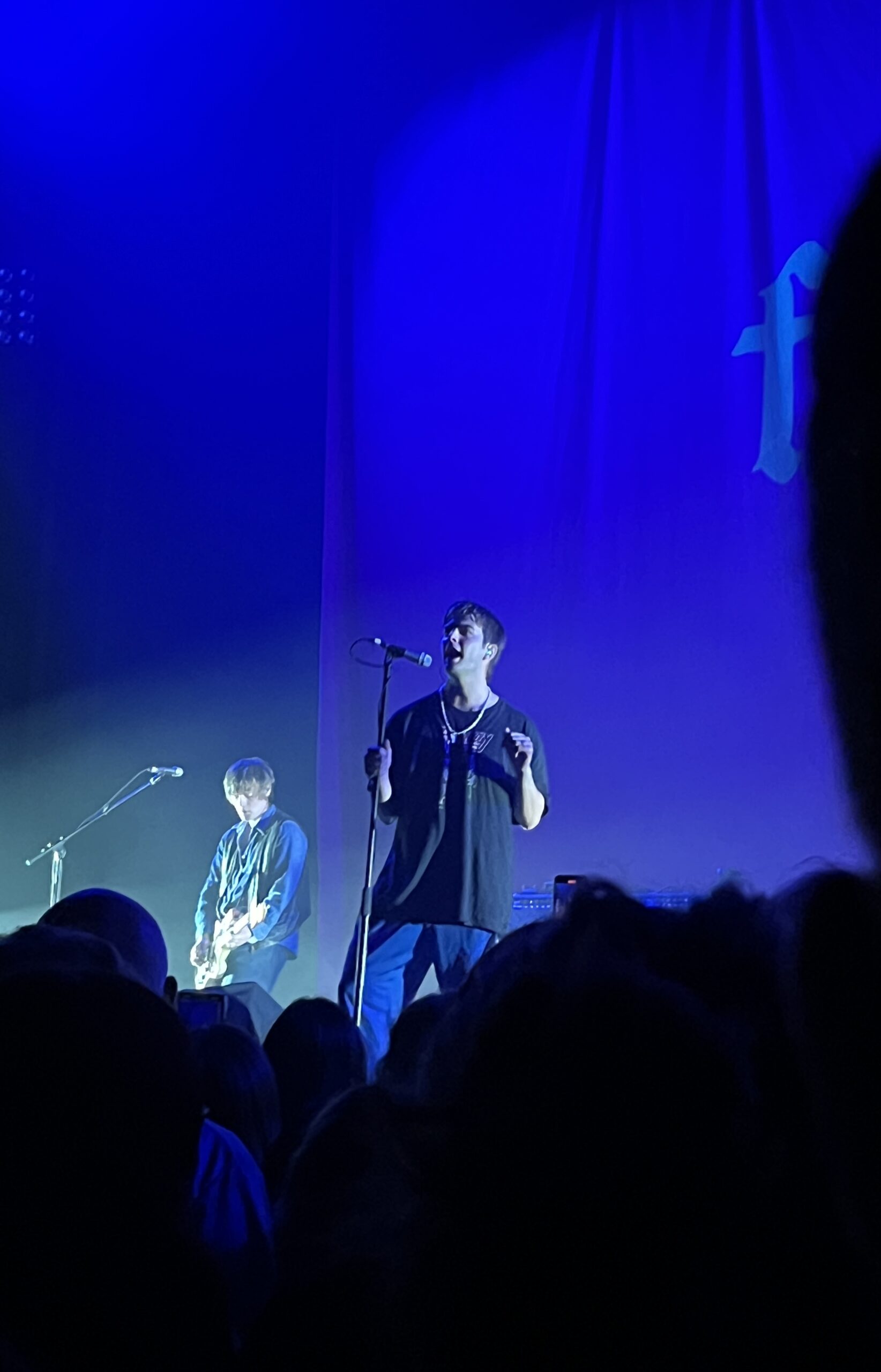
The Car Tour August 2023
This was a concert I decided to go to on a whim. My sister and I went to Minneapolis to see the Arctic Monkeys at the Armory. They’re a British rock band that’s been together since 2006. General admission was all standing, so we lined up hours before the doors opened to get a decent spot. It was so cool being that close to the band, and the opener was pretty good too! It was so fun being able to hear all of my favorite songs live.
TopHouse June 2024
TopHouse was a cool band that I was able to see for free in Sioux Falls! Every summer, Sioux Falls has free concerts at the Levitt. The band’s sound was very reminiscent of the Lumineers. It kinda had a bit of southern twang and was really cool to hear.
Hinterland Music Festival August 2024
Yep, it was that crowded. Only like 18,000 people
Most recently I was able to go to a music festival in Iowa for a day! This was a lot different than most concerts I’ve been to. It was neat to be able to see a line up of musicians that I liked. While the live music was incredible, it was really overcrowded and super hot. Despite the heat, I had so much fun and was finally able to see Chappell Roan and Ethel Cain live! They had such different vibes but the energy was electric and I’d bear the 96 degree heat all over again.
I do have a concert lined up next month, but we’ll see what happens.
Until then, see ya! Read more of my blog posts below.