Winter break is in full swing! I’ve been meaning to blog, but I’ve been sooo busy. Between working, I went to see my family in Minnesota and then caught up with some old friends.


What have ya’ll been up to? Happy Holidays!
Winter break is in full swing! I’ve been meaning to blog, but I’ve been sooo busy. Between working, I went to see my family in Minnesota and then caught up with some old friends.
What have ya’ll been up to? Happy Holidays!
I don’t know about you guys, but after staring at a screen for four hours, I need a little break. So, I decided to compile some things you can do to when you need to get away from the screen.
things to do other than staring at a screen
Additional Ideas:


For me, I’ll be finishing up craft projects I’ve abandoned. For example, I’ll be working on a firey plushie (tutorial here) and wrapping up some homemade Christmas gifts for friends.
What will ya’ll be working on? Happy Holidays!
I’ve been chipping away at my final projects! Right now, I’m finalizing my last article spread. I really want to have it nearly finished so I can get feedback and turn in my magazine before class ends tomorrow.
Here are my different iterations:


I think I’m leaning towards the last one. Maybe I’ll change the top bar color.
I’m also working on my perfume label. It’s come a long way since my last update.

When I got some pointers from my teacher, it was clear that he wanted imagery instead of illustration. I might switch the colors from green to orange because it is an orange scent. Not too sure right now.
That’s all she wrote! (for now) Wishing all students an easy finals week.
I’ve been steadily working on my perfume label in class. Initially, I wanted the perfume to have the scent of bleeding heart flowers, but since the bottle is an amber color, I decided on an orange scent.
I’m still playing around with font combinations for the brand. But I am happy with the body copy font (The Seasons).


Then I wanted to include orange blossoms on the label for some floral imagery. I found a reference online and digitized the flower for a sketch/illustration feel. I then resized it to better fit the label.

I think I’m starting to get somewhere now. I need to play around with the borders (color, thickness, etc) as well as the color of the label itself. The brand font is better, but needs to be tampered with a bit. The orange blossom flowers need stems and perhaps leaves. This is far from its final form. Stay posted!!
Stay up to date with the latest from our blog.
It’s been awhile! I’ve really gotten engulfed in my internship. I started working full 40 hour weeks since the end of May. Here’s the rundown…
My internship has been so fun! It honestly doesn’t even feel like work. I’ve been working on a bunch of different projects. The chat bot…
I’m back! I graduated and headed straight to Hawaii. Literally. The morning after graduation I was on a plane to see my sister in Oahu.…
After a crazy week, I’ve managed to cross most of my things off my list! So far I’ve finished: It’s hard to believe that the…
Jessica Walsh is a graphic designer, creative director, author, illustrator, design teacher, and founder of the design agency &Walsh.
Her Career
Walsh was born in Rhode Island in 1986. Before even stepping foot in college, she coded and designed websites at 11 years old. She got her BFA at Rhode Island School of Design in 2008. Shortly after, she was off to New York City to pursue design. Walsh interned at Pentagram under designer Paula Scher. Her career continued to explode. She was at Sagmeister Inc. for two years, before becoming a partner. After years of working at Sagmeister & Walsh, Walsh split and formed her own agency (&Walsh). Walsh also teaches typography and design at the School of Visual Arts in New York City. She’s worked with Jay Z, the New York Times, Adobe, and Levi’s to name a few.
Her Work


Sources
Well folks I hit a brick wall. Even google couldn’t give me a clear answer when googling “what is a lead in magazine spread?” I’m furiously researching this because I happen to have a lead in spread due tomorrow afternoon for class. I’ve scavenged the internet and found resources for how to write a lead in spread, but nothing on how to design one. I’ve looked at Linkedin Learning and haven’t found anything directly relating to lead in spreads.
My basic understanding of a lead in spread is that it is a spread that mainly has a large image across one page and a blurb of writing that teases the article.
Here are some Fast Company magazine lead in spreads below


So it seems the formula is simply
large image + banner+ title and introduction blurb= lead in spread
Here is my finished lead in spread

If anyone else has any resources or clarifying information, please let me know in the comments below!
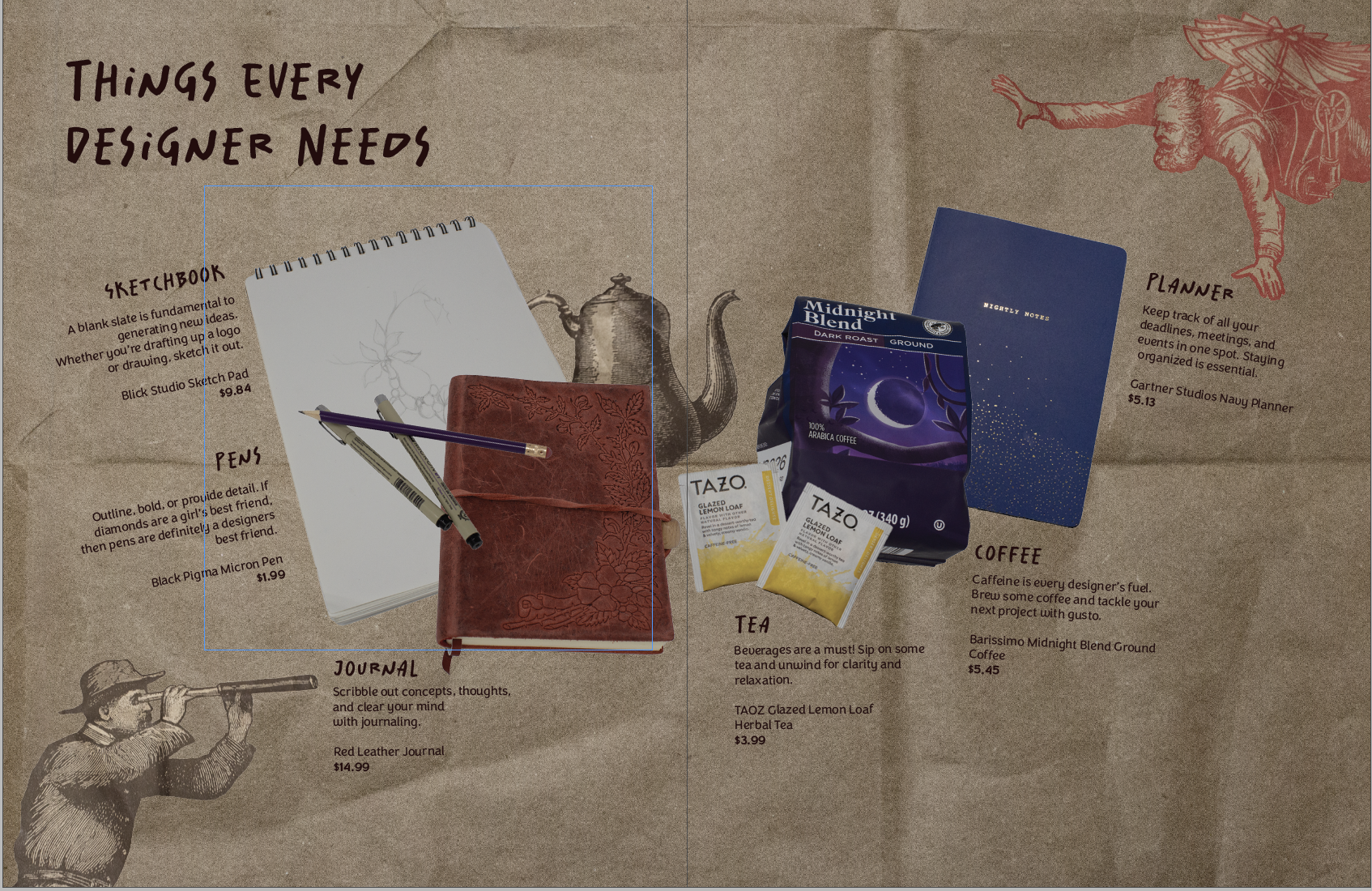
Making my first product spread was a rollercoaster! It challenged me to beef up my photography skills and problem-solve.
My magazine is all design-centered. So I wanted my product spread to align with that. I decided to make the theme of the spread: things designers need. (That way I could scavenge my apartment for things I already had)
The (Pinterest) Inspo


The Trials and Tribulations of The Product Spread
My intial thought was that I could take one picture with everything laid out in the lightbox. However, I had trouble getting a wide enough shot. It was also tricky to get enough height to take the picture.
So, I pivoted to taking individual pictures of my products. This way, I could place everything on the spread wherever I wanted it. I had a hard time taking a picture of a mug. When I placed it on its side, it rolled, and angling the camera was a bust. I ended up with six product pictures of tea, coffee, pens, a sketchbook, a planner, and a journal.
I took my pictures into Photoshop and got rid of the background, fixed the brightness, etc. Placement was difficult to pin down. I wanted the spread to resemble a semi-messy desk. But the finished spread had the products more centered and neat.
Honestly, at this point I wasn’t too happy with what I had. I didn’t consider all of the colors of my products. The colors didn’t really go together, so I ended up finding a different planner and teabags to reshoot.
Then I tackled the background. I wanted it to have some sort of texture. I found two different brown paper bags and some wrinkled wrapping paper. The wrapping paper ended up being the wrong color and a bit too wrinkly. But the brown paper bag worked out just right. I got inspired by a Trader Joe’s bag and took pictures of the illustrations. Then I removed the backgrounds in post and added them to my spread for some fun.
The Evolution of My Product Spread


That’s all she wrote! Comment your design roadblocks and how you overcame them.
This weeks new project was introduced and I’m soooo excited. We are making product labels! Everyone in class had to bring in a package with an inset label. I dug up a funky shaped body spray bottle. So my task is to make another label for the bottle. We get to make a brand, logo, and design!
Initial Thoughts
After brainstorming some names, I settled on Gibson Girl. I wanted a fun, frilly, romantic perfume/body spray. In order to stay somewhat true to the Gibson Girl image, I did some research.
Research
What is the Gibson Girl?

The Gibson Girl was coined the “New Woman” of the 1900. She was the American beauty standard of the 1890s-1910s. The “New Woman” was well-educated, physically fit, beautiful, romantic, and independent. However, they also pursued marriage. Despite this more modern and progressive view of the ideal woman, Gibson Girls were still portrayed in domestic spheres. The look of such a woman was defined by tall stature, slender but curvy, and chignon styled hair.
Artist Charles Dana Gibson coined the term “Gibson Girl” and his drawings encapsulated his ideas. His drawings were inspired by Evelyn Nesbit, Irene Langhorne, Mabel Normand, and Minnie Clark.
Sources
Pinterest and Moodboards
I created a board on Pinterest for some visuals. I pinned images of old perfume labels, florals, and all sorts of romantic notions. ( Click here)
That’s all folks! Once I figure out fonts and more solid mood boards, I will update ya’ll.
It’s been awhile! I’ve really gotten engulfed in my internship. I started working full 40 hour weeks since the end of May. Here’s the rundown of my current projects: Yeah you read that right. It’s dog week at my internship and I definitely could use all the puppy love. (Pic for proof, otherwise it didn’t…
My internship has been so fun! It honestly doesn’t even feel like work. I’ve been working on a bunch of different projects. The chat bot has been ongoing for awhile now. Currently we have four strong designs that need to be voted on! I’m secretly rooting for the Sherman graphic (below). I’ve also been working…
I’m back! I graduated and headed straight to Hawaii. Literally. The morning after graduation I was on a plane to see my sister in Oahu. It was sooo much fun and the week went by so fast. Right now I’m diving headfirst into my internship, fulltime. I hope to update you guys on my summer.

In my New Media Class, we are making website mood boards for a fictitious client. The website is for Chef Jaqueline, who specializes in making cakes and baked goods for big events. I first started off with making up a moodboard template in Photoshop and then filling it in. There are various mood board templates online that you can find as well.
I love color and decided to hop onto color.adobe.com. They have all sorts of color palettes. I searched up terms like bakery, cookies, and cake to get some potential color options. I ended up going with a pink French bakery color palette.

For fonts, I wasn’t too sure. I looked at other local bakery sites for ideas. Most headline fonts were bold, readable, and sans serif.
I found a font I really liked for headlines, called New Kansas. I usually get my fonts from Adobe fonts. I went with a sans serif sub headline font, Elza. And then a simple serif font, Dolly Pro, for the body copy.
I also had to make sure my navbar colors were easily readable. I experimented with my different palette colors to find the best option. To make sure, I used this color checker website.

Read more posts for design insights. Until next time 🙂
Stay up to date with the latest from our blog.
It’s been awhile! I’ve really gotten engulfed in my internship. I started working full 40 hour weeks since the end of May. Here’s the rundown…
My internship has been so fun! It honestly doesn’t even feel like work. I’ve been working on a bunch of different projects. The chat bot…
I’m back! I graduated and headed straight to Hawaii. Literally. The morning after graduation I was on a plane to see my sister in Oahu.…
After a crazy week, I’ve managed to cross most of my things off my list! So far I’ve finished: It’s hard to believe that the…
I’m not sure if anyone noticed, but the KitKat packaging looks different. I wasn’t sure if I was hallucinating or if it had actually changed. But when you put the new and old logos side by side you can start to see the changes.

Maybe I’m just a sucker for the original but the new version feels flat.
It seems as though I’m not the only one that noticed. There are plenty of articles online picking apart the rebranding.
The logic behind the rebrand, according to the branding agency Sterling Brands, is “activating the brand with the upbeat, kinetic energy of Kit Kat’s iconic ‘break.” The rebrand goal seems to aim at selling more product.
My Thoughts
The Pros
The Cons
For some more reading, check out Fast Company’s article on KitKat.
What do you guys think? Do you like the new logo?
It’s been awhile! I’ve really gotten engulfed in my internship. I started working full 40 hour weeks since the end of May. Here’s the rundown of my current projects: Yeah you read that right. It’s dog week at my internship and I definitely could use all the puppy love. (Pic for proof, otherwise it didn’t…
My internship has been so fun! It honestly doesn’t even feel like work. I’ve been working on a bunch of different projects. The chat bot has been ongoing for awhile now. Currently we have four strong designs that need to be voted on! I’m secretly rooting for the Sherman graphic (below). I’ve also been working…
I’m back! I graduated and headed straight to Hawaii. Literally. The morning after graduation I was on a plane to see my sister in Oahu. It was sooo much fun and the week went by so fast. Right now I’m diving headfirst into my internship, fulltime. I hope to update you guys on my summer.