It’s been awhile! I’ve really gotten engulfed in my internship. I started working full 40 hour weeks since the end of May.
Here’s the rundown of my current projects:
- Updating HR documents and keeping them in proper branding
- Finalizing chatbot color ways for the final vote
- Drafting retirement flyer templates
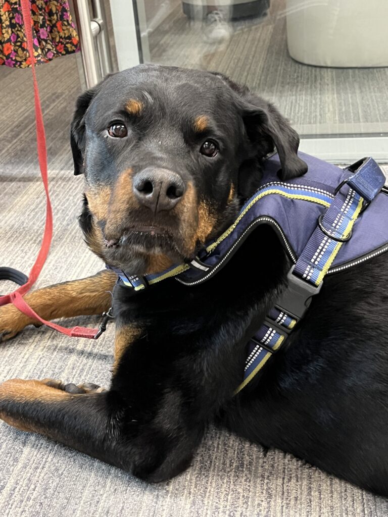
- Petting dogs because it’s DOG WEEK at work
Yeah you read that right. It’s dog week at my internship and I definitely could use all the puppy love. (Pic for proof, otherwise it didn’t happen)
In other intern news, I’ve gotten to meet the other interns at the City. We’ve done some name games, and more recently a team building activity after learning our CliftonStrengths. I’m really looking forward to getting to know everyone a bit more as well as growing my skillset.
There was another citywide intern event that I went to (even got featured on local news). It was refreshing to meet other interns outside my office! You best believe I was trying to get people’s LinkedIn handles lol. We did some speed networking and it was good practice (and the sandwiches were SO good).
I’ve also started job hunting. It is not for the weak. I am trying to stay positive and actively look for new opportunities. What else can a girl do?
Until next time!