Well folks I hit a brick wall. Even google couldn’t give me a clear answer when googling “what is a lead in magazine spread?” I’m furiously researching this because I happen to have a lead in spread due tomorrow afternoon for class. I’ve scavenged the internet and found resources for how to write a lead in spread, but nothing on how to design one. I’ve looked at Linkedin Learning and haven’t found anything directly relating to lead in spreads.
My basic understanding of a lead in spread is that it is a spread that mainly has a large image across one page and a blurb of writing that teases the article.
Here are some Fast Company magazine lead in spreads below
So it seems the formula is simply
large image + banner+ title and introduction blurb= lead in spread
Here is my finished lead in spread
If anyone else has any resources or clarifying information, please let me know in the comments below!
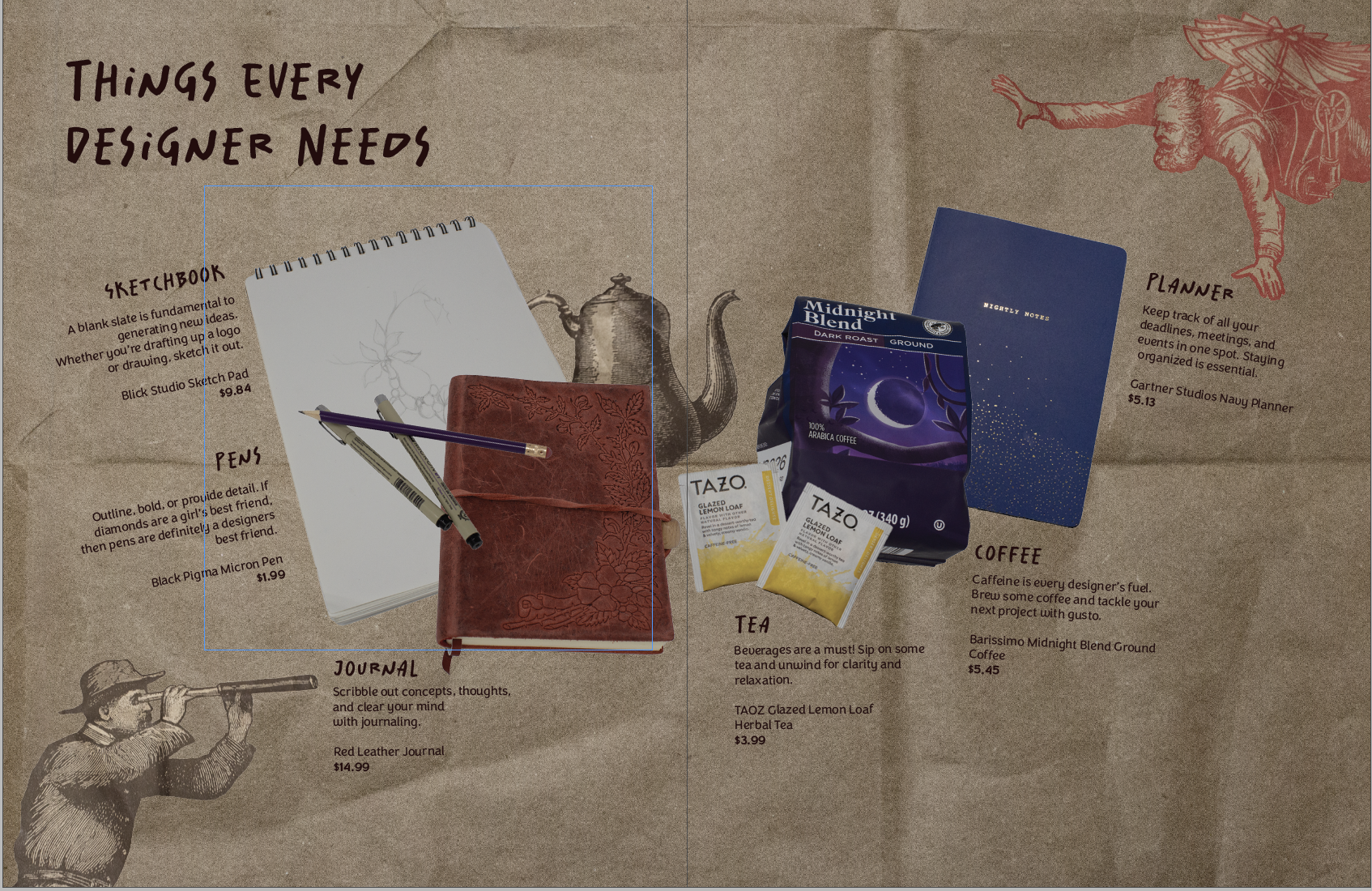
Making my first product spread was a rollercoaster! It challenged me to beef up my photography skills and problem-solve.
My magazine is all design-centered. So I wanted my product spread to align with that. I decided to make the theme of the spread: things designers need. (That way I could scavenge my apartment for things I already had)
The (Pinterest) Inspo
The Trials and Tribulations of The Product Spread
My intial thought was that I could take one picture with everything laid out in the lightbox. However, I had trouble getting a wide enough shot. It was also tricky to get enough height to take the picture.
So, I pivoted to taking individual pictures of my products. This way, I could place everything on the spread wherever I wanted it. I had a hard time taking a picture of a mug. When I placed it on its side, it rolled, and angling the camera was a bust. I ended up with six product pictures of tea, coffee, pens, a sketchbook, a planner, and a journal.
I took my pictures into Photoshop and got rid of the background, fixed the brightness, etc. Placement was difficult to pin down. I wanted the spread to resemble a semi-messy desk. But the finished spread had the products more centered and neat.
Honestly, at this point I wasn’t too happy with what I had. I didn’t consider all of the colors of my products. The colors didn’t really go together, so I ended up finding a different planner and teabags to reshoot.
Then I tackled the background. I wanted it to have some sort of texture. I found two different brown paper bags and some wrinkled wrapping paper. The wrapping paper ended up being the wrong color and a bit too wrinkly. But the brown paper bag worked out just right. I got inspired by a Trader Joe’s bag and took pictures of the illustrations. Then I removed the backgrounds in post and added them to my spread for some fun.
The Evolution of My Product Spread
The early iteration with the old planner and tea bagsAfter talking with my teacher, I moved some things aroundI moved the kettle behind to allow more space for the text (the final form)
That’s all she wrote! Comment your design roadblocks and how you overcame them.
So this semester is all about making a magazine, quite literally, from scratch. We have to write the articles, conduct interviews, photograph interviewees and products, design our own advertisements– you get the idea.
I kinda dove in headfirst, working on assignments as they were given. Because of this slapstick approach, I haven’t really fully thought about the vibe of my magazine, colors, spreads, etc.
So over my weekend, I wanted to cement the foundation of my magazine. I took to Pinterest and made a mood board with spread design ideas. I went online and used this website to generate color palette ideas. For my fonts, I used Adobe Fonts and browsed for potential body copy fonts. Indesign was my chosen software.
Some spread ideas that I liked (above and below)
I wanted to keep the magazine minimal but with a sense of design with colors and layout.
The finished scrappy mood board
The mood board will make it easier for me to design future elements and spreads of my magazine, musings.