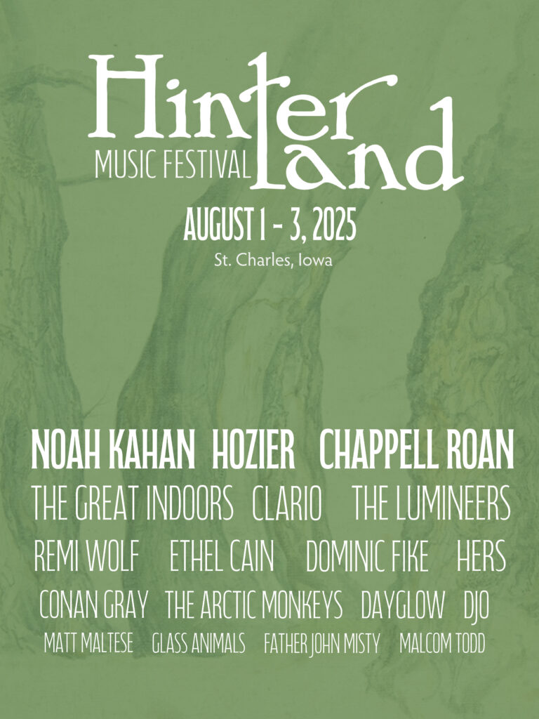
After way too long, I’ve finally finished the ten-piece campaign poster. Deep down, I wanted to create more of an art-centered poster. But with all of my classes and working part-time, I’m left with minimal time. I opted for a simple and sleek poster design. I scrapped most of what I started with. Throughout a lot of my ten-piece designs, I’ve used tree trunks. To keep continuity (and give myself some peace of mind), I decided to use that imagery for my design.
Before settling on my headliner font, it was really hard. I think the compressed font helped keep things crisp and in line. I played around with scale to indicate the more well-known artists.
It might not be the prettiest poster, but I’ve got a lot more things to prioritize. Time to do more homework!
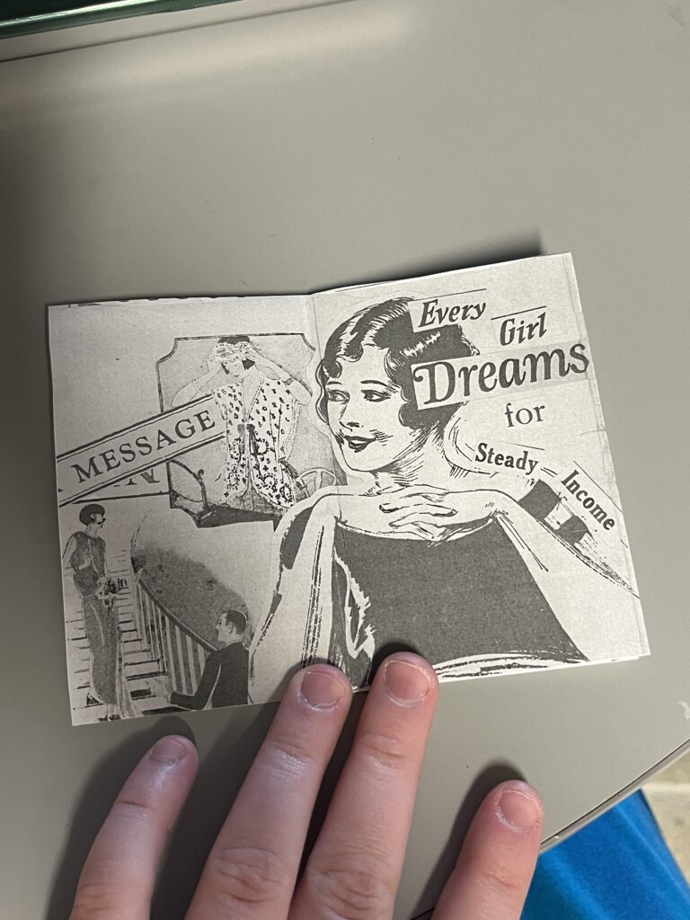
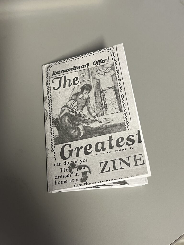
Almost a year ago, an old friend gave me some cool old magazines. It was so cool to flip through them and see old ads and stories. There was a 1925 needlework magazine that was battered and it had such neat illustrations, that I just had to turn it into a zine. I did feel bad about cutting into it but it was practically falling apart and it had been scribbled in. (I still feel a little guilty)
I went for the easiest and most basic zine method. Which is basically folding a letter size paper into 8 sections. For the zine, I used paper, the old magazine, elmers glue, and some dried forget me nots. The process took a long time. I wasn’t sure what direction I wanted to go. I started by cutting out my favorite illustrations and bigger words.
The original zine scan
This project took a long time and stayed halfway done buried in a sea of half-finished projects. But I finally finished it a week ago! Once I was done with the original, I scanned it and printed off copies. I like the grayscale look, but the original yellow would also be cool. I cut and folded the copies and wham bam I had multiple zines.
The printer did cut off some of the edges, but I’m not bothered. I’m so proud of it!
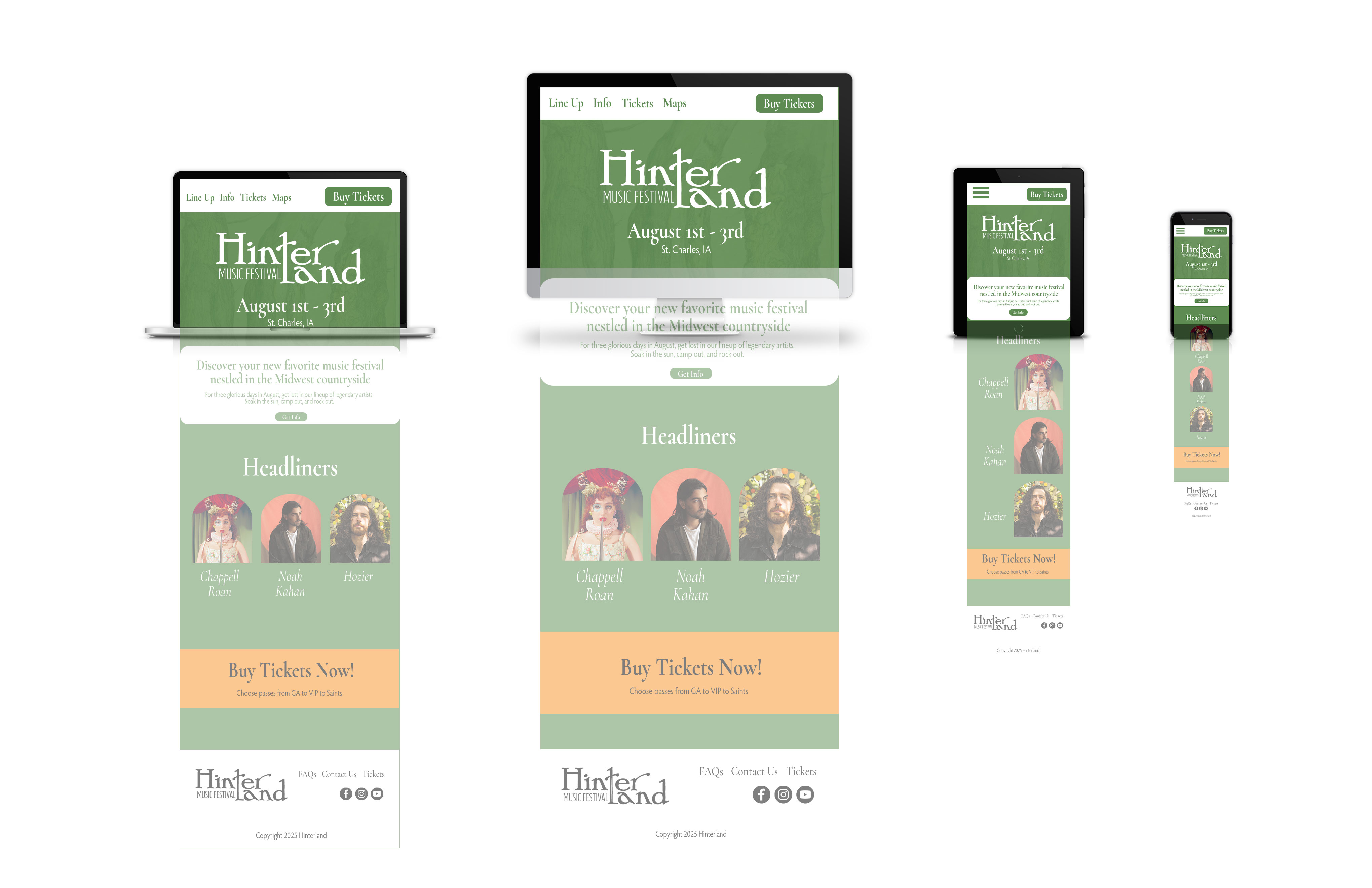
I’m still at a standstill with my poster. I think I need some time away from it so I can attack with a new perspective. Right now I’ve gotten the website mock up done (below)
The website mock up took ages! I had to make sure my colors were accessible. I used https://contrast-grid.eightshapes.com/. Something that challenged me was trying to place images into unorthodox shapes. To take my image to the arch shape, I had to turn the shape into a smart object and then place the image on top, before using a clipping mask. There has got to be an easier way lol.
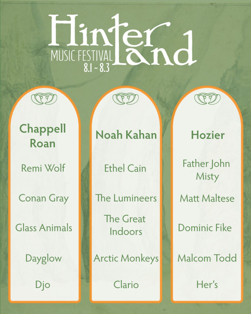
I also finished my social media lineup post. This is an imaginary campaign, so I made sure to include my dream lineup.
I tried to make sure the artists matched the same vibe of music. I also hopped on spotify and made a playlist modeled after my lineup. That helped me find flow and before I knew it I had two pieces done!
Last time we left I had a rough wip poster. I resketched a guitar for the bottom right frame. Then I took it into illustrator, image traced the guitar, etc.
I liked the idea of it, but it just seemed off. The idea didn’t really look like what I had envisioned. I really like the tree, so I pivoted.
I like the simple version better
I like the second version, it still needs a finalized font for the dates. I want to experiment with some colors. Part of me wants to add more elements to the poster but I’m drawn to the simplicity.
As I wrote in my last post, I am designing a 10 piece campaign for a music festival. I have finished the logo and stage banner. The current work in progress is the poster. I wanted the poster to be artsy, and be able to be hung on a wall. There’s the easy route of including all of the head liners, but I wanted a more fun approach.
I started with a bunch of small sketches. Nothing really stood out to me. I really wanted to capture the atmosphere of the festival. It’s set in a small Iowa town with mainly indie and alternative artists. The past festival themes have been kinda folksy and hippie ish, or trendy. I wanted to have a ren faire adjacent theme. Something that felt homey, backroads, fun, and comforting.
Initial poster ideas (as well as my dream lineup lol)More sketches!
After a bunch of sketching and scouring Pinterest, I came across a cool frame/medieval banner template.
After looking online for similar frames and borders, I had an idea. I wanted to include snapshots of the festival (the hinter tree, guitar, and a lineup) but in a framed way.
This was my more finalized ROUGH sketchThis is the current work in progress
Right now, I’m in the process of editing the sketched snapshots, and finalizing color combos. The tree sketch isn’t my own work, it’s from the public domain. I found it on public.works. That’s a really cool site for images in the public domain.
In Layout III we are doing a 10 piece campaign. Thank goodness for creative liberty and freedom in topic! I am doing a 10 piece campaign for Hinterland Music Festival.
Before I got into software I:
looked at previous Hinterland Festival themes
researched music festival logos
ex: Bonnaro, Coachella, Austin City Limits, etc.
created a Pinterest mood board
I think I will need a more organized mood board for future reference
sketched logo ideas
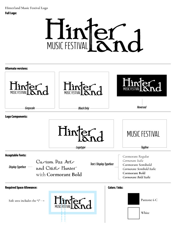
Right now I have a logo (yay!) only nine more pieces to go.
The logo in question
So now I need to design:
Festival map
VIP lanyard badge
Festival poster
Festival merch
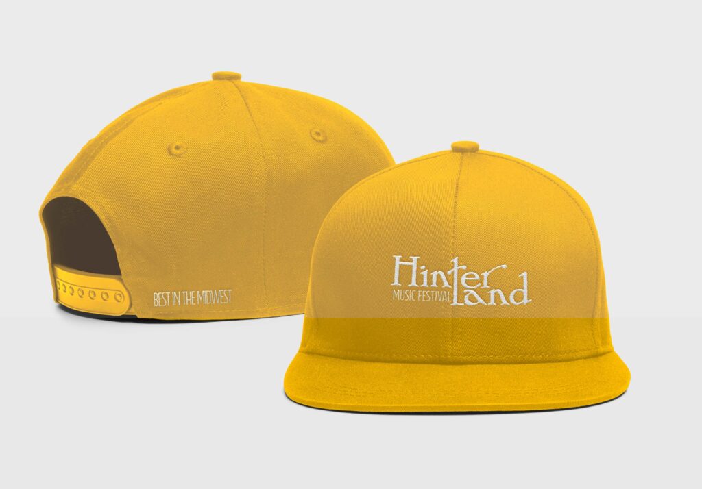
baseball cap
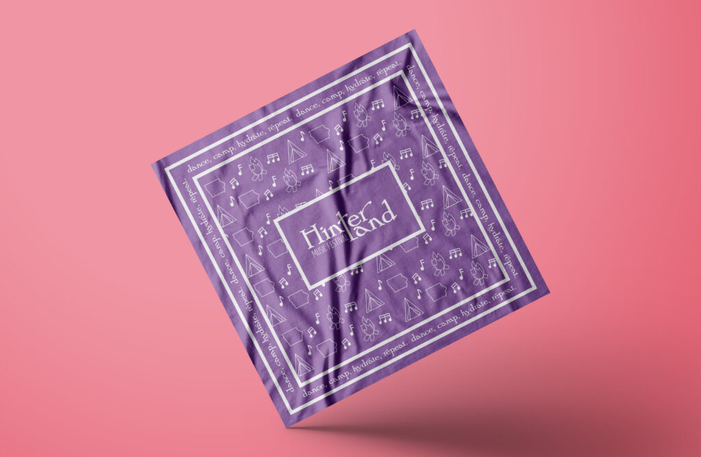
bandana
shirt
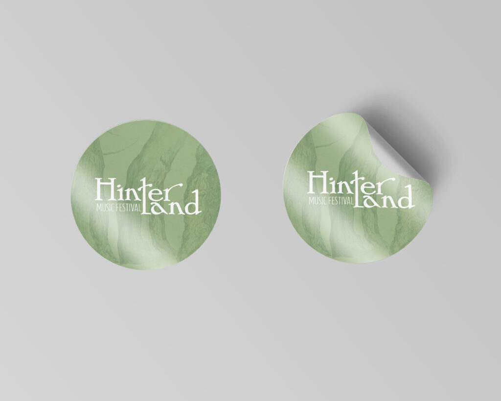
stickers (2)
Stage banner
Social media lineup post
Ads (2)
Festival wristband
I’ve made progress on a stage banner. I’ve kept it simple (there’s not much real estate on a long narrow banner). I used the same font because I was worried to use the logo and have a unreadable banner. (The logo has a width that would be difficult to scale and fill up a majority of the banner)
The banner (it looks small but it is BIG)The banner with a more defined “r”
I’m working on the poster next. I’ll update you soon!
Lately in Layout 3, we’ve been learning about trapping. It’s a printing technique. I’ve learned how to design, but it’s nice knowing the print side as well.
After the exhausting saga of calling my local legislators, I wanted to draft up a quick library flyer design. I’m not looking to print them en mass from another site, so I want to print them on a 11 x 8.5″ sheet of paper.
The Process
I opened up InDesign and started with a 11 x 8.5” size file. I snapped guides to divide it into four even sections.
I looked at my original poster design. I wanted to take the elements of the big poster and condense it into a small flyer.
After looking at the previous poster, I decided I wanted: a headline, short summary, and a qr code with resources.
The Final Flyer Design
Side by Side Comparison
The Flyer The Original Poster
I can’t decide if I need the black outline or not. It might make the flyers easier to cut (or at least, that was the idea).
How do you design flyers? I’m off to finish some homework. Ciao!
Well folks I hit a brick wall. Even google couldn’t give me a clear answer when googling “what is a lead in magazine spread?” I’m furiously researching this because I happen to have a lead in spread due tomorrow afternoon for class. I’ve scavenged the internet and found resources for how to write a lead in spread, but nothing on how to design one. I’ve looked at Linkedin Learning and haven’t found anything directly relating to lead in spreads.
My basic understanding of a lead in spread is that it is a spread that mainly has a large image across one page and a blurb of writing that teases the article.
Here are some Fast Company magazine lead in spreads below
So it seems the formula is simply
large image + banner+ title and introduction blurb= lead in spread
Here is my finished lead in spread
If anyone else has any resources or clarifying information, please let me know in the comments below!