Category: Design Legends

  • winter break update #2

    Well guys, it’s been a busy break! I visited more family, worked on more projects, and am trying to stay in my software.

    Hung out with my family at Falls Park

    After seeing my mom’s side of the family for Christmas, I used my days off of work to start an awareness campaign. Right now, the proposed South Dakota budget reduces the SD Library budget by 64%! Click here for the article. I’ve always loved the library and want to let South Dakotans know. Together we can let our voices be heard and retain our amazing library resources.

    So as a start for my campaign, I wanted to create posters. I like my initial Lorax idea but upon second glance, the Lorax is a copyrighted icon. So he had to go.

    The first poster idea

    I decided to keep my poster simple. I really wanted to make it eye-catching and memorable, but time is of the essence in this moment. By going with a simple poster, I’m able to redirect my energy into the social media aspect.

    The final form! (for now)

    Now that I have a poster made, my plan is to print off copies and hang them up around town. Maybe even in surrounding towns. I also created a social media account (sdlibraryadvocates) on Facebook and Instagram. My goal is to highlight the many resources that our state library provides for us, as well as how to fight the proposed budget cut.

    I’ll keep you posted on my library crusade! Until next time 🙂

  • design legends you should know #7 Jessica Walsh

    Jessica Walsh is a graphic designer, creative director, author, illustrator, design teacher, and founder of the design agency &Walsh.

    Her Career

    Walsh was born in Rhode Island in 1986. Before even stepping foot in college, she coded and designed websites at 11 years old. She got her BFA at Rhode Island School of Design in 2008. Shortly after, she was off to New York City to pursue design. Walsh interned at Pentagram under designer Paula Scher. Her career continued to explode. She was at Sagmeister Inc. for two years, before becoming a partner. After years of working at Sagmeister & Walsh, Walsh split and formed her own agency (&Walsh). Walsh also teaches typography and design at the School of Visual Arts in New York City. She’s worked with Jay Z, the New York Times, Adobe, and Levi’s to name a few.

    Her Work

    Sources

  • design legends you should know #6 Chip Kidd

    Chip Kidd is a book jacket designer, associate art director for Alfred A. Knopf, certified comic nerd, freelancer, and novelist.

    Kidd’s Career

    Kidd got his start in the design world with a graphic design degree at Penn State in 1986. From there he moved to New York, and became a junior assistant in the Alfred A. Knopf publishing art department. He worked his way up the company ladder, becoming the Associate Art Director in 2013. Kidd has created book covers for David Sedaris, Neil Gaiman, Cormac McCarthy and many more authors.

    In 2001, Kidd published his first novel, The Cheese Monkeys. He wrote a sequel, The Learners. He has helped write and design other books, as well as writing his own children’s graphic design guide, A Kidd’s Guide to Graphic Design.

    In 2014, he was awarded an AIGA medal. He continues to work at Alfred A. Knopf and has also given a Ted Talk on design philosophy.

    His Work

    Kidd designed the iconic Jurassic Park book cover

    Sources

  • design legends you should know #5 Paula Scher

    design legends you should know #5 Paula Scher

    Paula Scher is a painter, album covers, educator, layout artist and renowned graphic designer.

    Her Work Through The Years

    With a start at the Tyler School of Art, Scher graduated with a Bachelor in Fine Arts in 1970. She then became a layout artist at the children’s division at Random House. Switching gears, she worked at CBS and then Atlantic Records. Her album covers received four Grammy nominations.

    In the 80’s she sought out freelance graphic design, before starting a firm in 1984 with Tyler Koppel. The firm dissolved during the recession and Scher went to work for the design firm, Pentagram, in 1991. Currently, she is the principal at Pentagram.

    As well as working Pentagram, Scher taught at the School of Visual Arts, Tyler School of Art, Yale, and Cooper Union.

    Iconic Work

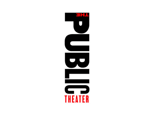
    What put Scher on the map, was her identity creation for the Public Theater in New York City. Through her unique, graffiti-inspired typography, Scher was able to inspire the graphic design world.

    One of Paula Scher’s poster design for The Public Theater
    Scher’s rebranded Public Theater Logo

    Other notable logo designs are Tiffany and Co., Citibank, Windows, and the Metropolitan Opera.

    Album Covers

    Album Ginseng Woman designed by Paula Scher and Andy Engel
    Boston’s album designed by Paula Scher and illustrated by Roger Huyssen

    That’s really just a snippet of her expansive portfolio. Here’s a great book of her work! Preview it here.

    Sources

    From the blog

    Stay up to date with the latest from our blog.

    • finally making a dent in my to do list

      After a crazy week, I’ve managed to cross most of my things off my list! So far I’ve finished: It’s hard to believe that the…

    • almost done with my ten-piece campaign

      After what seems like actual AGES, I’m almost done with my ten-piece campaign for Layout 3. I’ve finished I only have the festival map left!…

    • the library hiatus is over

      After all of the advocacy work I’ve done for the library, I was hopeful that I was done. However, with the shutdown of the Institute…

    • the ten piece poster final form

      After way too long, I’ve finally finished the ten-piece campaign poster. Deep down, I wanted to create more of an art-centered poster. But with all…

  • design legends you should know #4 David Carson

    design legends you should know #4 David Carson

    Rulebreaker, Father of Grunge Typography, prolific surfer. All things that aptly describe David Carson.

    Carson started out as a high school teacher in Oregon, where he caught wind of a graphic design summer program at University of Arizona. Soon after he was off to Switzerland to another summer program under the instruction of instructor Hans-Rudolf Lutz. He began working at various magazines such as, Transworld Skateboarding, Beach Culture, and Surfer. In the early 90s, he landed at an alternative music magazine, Ray Gun, and really developed his style. Working at Ray Gun in the peak grunge era, Carson was able to lean into it and make it his own. After three years, Carson left Ray Gun in pursuit of his own design business.

    What makes David Carson so unique is his fresh perspective on design. He tosses out the traditional design rules and forges his own. This take on design is what gives him his edge and personality. That’s essentially his brand.

    Some of his work

    poster for his 2014 AIGA lecture (not my pic)
    dvd navigation design for Nine Inch Nails (not my pic)
    obama election design from 2009 (not my pic)

    A really great interview article to better understand Carson and his philosophies: click here!

    Sources

  • design legends you should know #3 Henri Privat-Livemont

    design legends you should know #3 Henri Privat-Livemont

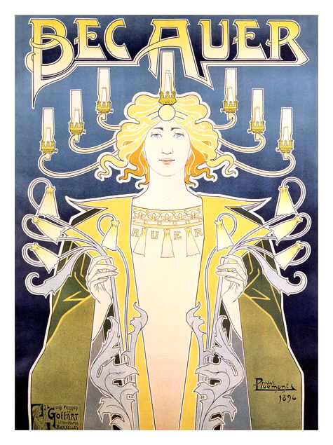
    Another one of Privat’s works that advertises light fittings

    Let me take you way back to the 1890s, when minimalism is out and fanciful Art Nouveau is in. My first exposure to this style was seeing one of my mom’s favorite prints in her room, Absinthe Robette.

    The iconic Absinthe Robette by Henri Privat-Livemont

    What is Art Nouveau?

    New art, or Art Nouveau was a popular art movement from around the 1890s to the start of WW1. It mimicked aspects of nature with its curving, free-flowing, organic feel. It encompassed paintings, furniture, architecture, patterns, and art. It was the precursor to the more modern movements, such as Art Deco, that focused on sleek lines and eliminated excessive decoration.

    Henri Privat-Livemont

    Henri was born in 1861, Schaerbeek, Brussels, Belgium. At age 12, he studied at École des Arts Decoratifs in Sint-Joost-ten-Node, Belgium under Louis Hendrickx. Then, he moved to Paris in the 1880s to work with the studios of Lemaire, Lavastre & Duvignaud to learn interior decorating. Henri was initially an interior decorator for very wealthy families. Although most famous for his iconic posters, it happened by chance. He won a local poster competition around 1889 and decided to lean more into them. With new economic demands, the need for poster advertisements increased and Privat-Livemont rode the wave. Some prominent works of his include the aforementioned Absinthe Robette and the 1897 Exposition Internationale (a World’s Fair held in Belgium) poster. He kept himself busy teaching  ‘Ornament, Figure and Ornamental Composition’ at the Josephat School for Drawing and Crafts from 1891-1935. After the decline of poster art he kept interior decorating, oil painting, and photography.

    Non-poster-related work

    1 of 4 tile panels designed by Privat-Livemont for the Grande Maison de Blanc in Brussels, Belgium
    stained glass window designed by Privat-Livemont and made by  Raphaël Évaldre for the Hotel Saintenoy in Brussels, Belgium

    For more info I highly suggest checking out this blog post! It goes more into depth on Privat-Livemont as well as his rival Alphonse Mucha.

    Sources

    Is there anything I missed? Have you heard of this legendary Belgian designer? Let me know below.

    From the blog

    Stay up to date with the latest from our blog.

    • finally making a dent in my to do list

      After a crazy week, I’ve managed to cross most of my things off my list! So far I’ve finished: It’s hard to believe that the…

    • almost done with my ten-piece campaign

      After what seems like actual AGES, I’m almost done with my ten-piece campaign for Layout 3. I’ve finished I only have the festival map left!…

    • the library hiatus is over

      After all of the advocacy work I’ve done for the library, I was hopeful that I was done. However, with the shutdown of the Institute…

    • the ten piece poster final form

      After way too long, I’ve finally finished the ten-piece campaign poster. Deep down, I wanted to create more of an art-centered poster. But with all…

  • design legends you should know #1 Susan Kare

    In school they teach you about influential people, founding fathers, famous artist, etc. But in college, we haven’t discussed important graphic designers. So I’ve taken it upon myself to educate myself and ya’ll while I’m at it.

    Today’s design star is Susan Kare

    So who is Susan Kare, the “woman who gave the Macintosh a smile”?

    Susan Kare is most known for her work at Apple. She got her start there in 1983 as a Macintosh Artist. Despite not knowing anything about computer graphics and typefaces, she educated herself at the local library and aced the interview.

    At Apple, Kare was in charge of designing icons and typefaces for the Mac operating system. She worked with graph paper to design some of Apple’s most iconic icons such as the ticking bomb for system error, trash can, the pointed arrow cursor and more.

    Because her icon designs were universal and friendly, they encouraged technology-illiterate users to try out computers.

    Susan Kare’s icon designs, courtesy of kareprints.com

    She also designed fonts, contributed to the Mac rollout campaign, and demonstrated the capabilities of the MacPaint application.

    Kare went on to create her own design firm, Susan Kare LLP, in 1989. Her design skills were used at companies like Microsoft, Oracle, Facebook, and even Pinterest.

    source

    Have you heard of Susan Kare? Are there any graphic designers I should look into next? Let me know 🙂

    From the blog

    Stay up to date with the latest from our blog.

    • finally making a dent in my to do list

      After a crazy week, I’ve managed to cross most of my things off my list! So far I’ve finished: It’s hard to believe that the…

    • almost done with my ten-piece campaign

      After what seems like actual AGES, I’m almost done with my ten-piece campaign for Layout 3. I’ve finished I only have the festival map left!…

    • the library hiatus is over

      After all of the advocacy work I’ve done for the library, I was hopeful that I was done. However, with the shutdown of the Institute…

    • the ten piece poster final form

      After way too long, I’ve finally finished the ten-piece campaign poster. Deep down, I wanted to create more of an art-centered poster. But with all…