Hey ya’ll! It’s about time I got back to my rootsβ my arts and crafts roots. I thought I’d take you along my lil craft journey.
I’ve got two of my best friends birthdays coming up and I’d really like to make them some cute cards. Instead of choosing my go-to (handmade watercolor cards), I think I’m gonna try making Victorian puzzle purse letters. They look so intricate and I’m a sucker for any letter-making thing.
here’s an unfolded Victorian puzzle purse letter (not mine)here’s a folded-up Victorian puzzle purse (not mine)
A Victorian puzzle purse is basically an ornately folded letter! Kind of similar to origami.
I started my process by consulting google for some easy tutorials. I came across this one.
I got to work by using some old sketchbook paper, folding it accordingly, and then sketching out my designs. I wanted to keep the designs relevant to my friend. So I included little doodles of their favorite things and interests. I also wanted to make sure I had enough room for the actual message/letter.
The folding wasn’t hard, but getting the paper into the spiral/pinwheel took awhile. I watched this tutorial because it gave more direction on that part.
My finished Victorian puzzle letter!
The frontThe second layer (after opening it)The inside with doodles and the message (where the sticky note it)The back!
Have you guys made anything like this? Let me know!
In my Media Development class, we are mocking up and designing the interface of our own apps. This sounds pretty straightforward, but I’ve learned I need to know more about how to make proper surveys, determine my target market, add links to my social media stories, and create personas.
What I’ve learned:
I need to have a wider audience on social media.
If I want the best swath of information, I have to reach a lot of people. And as a person with a small personal following, that has made me get creative.
So some of my own suggestions for widening that survey scope is to post it to Facebook, Facebook groups, Instagram (stories and posts), Snapchat, Substack, Reddit, literally everything. Check out survey swap response websites, and text relatives who fall into the target market. Try it all, the worst they can say is no, or just not respond at all.
Ask the right questions!
Ask what is only relevant. People aren’t going to want to fill out any extra questions. Research what good questions to ask users. Articles like this are helpful.
Format your survey correctly
Run through your survey in preview mode if possible and see if friends can read through it. I sent my survey out into the wild and realized that where I had a short answer option, a multiple-choice format would’ve made it easier to analyze.
Get tech savy!
Learn how to post links onto all social media platforms. I had no idea how to post links on Instagram and Snapchat, but now I do.
That’s all I have for now! After I learn how to create personas, I’ll have more to update you on. What else should I cover? Let me know below.
Born in 1914, in NY, Rand was an art director, writer, graphic designer, and design professor (teaching at Yale, Pratt, and Cooper University). He was renowned for his logo design at IBM, AIGA, UPS, ABC, and Steve Jobs’ start-up NeXT.
Merely a few of his logo designs, click here for more
He wrote a book in 1947, “Thoughts on Design”. It’s still used in classrooms to this day and lays out Rand’s ideas on what makes good design. But he didn’t stop at writing one book, he went on to write over eight more.
He was a fan of the Swiss style. It is “aΒ minimalist designΒ style, favoring a block layout, sans serif typefaces, and photographs.” (source) The overall purpose of Swiss style is to communicate an idea clearly and clean cut. You can see that a lot of Paul Rand’s work is no frills, it’s has its own style– yet it very simple.
Despite his death in 1996, his logos remain timeless– a true testament to his prolific design prowess.
In school they teach you about influential people, founding fathers, famous artist, etc. But in college, we haven’t discussed important graphic designers. So I’ve taken it upon myself to educate myself and ya’ll while I’m at it.
Today’s design star is Susan Kare
So who is Susan Kare, the “woman who gave the Macintosh a smile”?
Susan Kare is most known for her work at Apple. She got her start there in 1983 as a Macintosh Artist. Despite not knowing anything about computer graphics and typefaces, she educated herself at the local library and aced the interview.
At Apple, Kare was in charge of designing icons and typefaces for the Mac operating system. She worked with graph paper to design some of Apple’s most iconic icons such as the ticking bomb for system error, trash can, the pointed arrow cursor and more.
Because her icon designs were universal and friendly, they encouraged technology-illiterate users to try out computers.
Susan Kare’s icon designs, courtesy of kareprints.com
She also designed fonts, contributed to the Mac rollout campaign, and demonstrated the capabilities of the MacPaint application.
Kare went on to create her own design firm, Susan Kare LLP, in 1989. Her design skills were used at companies like Microsoft, Oracle, Facebook, and even Pinterest.
Class has started! And of course on day one, I already have an assigned presentation for the second week of school. Basically the class was split into groups and given design rules we have to learn and present.
My two design principles are:
Type is only type when it’s friendly
Use two typeface families, maximum
So I’d figure in an effort to prepare for my presentation, I’d share my thoughts and some typography research with yall.
Type is only type when it’s friendly
According to the book: Type is only type when it’s friendly begs designers to keep type expressive but legible. You want your font to have some personality, but more importantly, be easy to read. So make sure you choose a friendly font and color when working with type to ensure your message comes across clearly to your audience.
Use two typeface families, maximum
Use two typeface families, maximum is rather straightforward. Overall, you want your two fonts to work together, and adding additional fonts may mess with the flow of unity. When you use two fonts, make sure they have a broad family with different thicknesses, italics, etc. When choosing two typeface families make sure there is some contrast like sans serif vs. serif or thick vs. thin.
Well, that about sums it all up. Are there any other typeface rules you follow? Let me know below.
First, lets tackle the meaning of user experience. According to Baymard Institute, user experience is “any interaction a user has with a product. The goal of UX is to meet the user’s needs and create easy, relevant, efficient experiences.”
But that brings us back to our original question, what is user experience design?
UX design is the process that designers use to create accessible, functional, and positive experiences for consumers.
Although UX design is often synonymous with technology, apps, and products, it can be applied to many more things. In fact, even if you didn’t know the definition of user experience, you still have been impacted by it.
For example, I’ve run into some frustrations shopping online. Some websites don’t have great filter options, and it’s hard to find exactly what I’m looking for. I’m less motivated to visit that site again due to poor user experience.
So whether you’ve run into poor return experiences, technology issues, or even unclear instructions, you’ve experienced a lack of user-centered design.
The father of UX design is often credited to Don Norman. He is “a psychologist and usability consultant who’s worked with Apple, HP, and theΒ Nielsen Norman Group“ according to Massachusetts Libraries. Click here to learn more!
That’s all folks! What do you think about UX design?
Hey guys! As I’m sure you’re all aware, I’m really into music. I like pop, musicals, indie, rock, jazz, and even a bit of country. So I figured I’d walk you through some of the concerts I’ve been to and let you get to know me a bit better π
My First Concert Ever May 2019
When I was 15 I went to my very first concert in Chicago. I was really into k-pop at the time and I was so psyched to see BTS (a very popular Korean boyband). I dragged my dad along with me and it was a really memorable trip. The concert, however, was out of this world and felt unreal. It was pretty windy and chilly. I remember BTS saying it felt like a winter concert! (If only they knew what winter really is like in the Midwest)
The Eras Tour June 2023
And yes, I made that mirror disco cowgirl hat. I’m crafty like that π
Surprise, surprise: I’m a bit of a Swiftie! While I’m not a super fan by any means, I still love Taylor Swift’s music and lyricism. I was able to use some of the money I had been saving up through high school to be able to experience the Eras Tour with my sister. It was so nostalgic for us, I remember getting her first CD and playing nonstop. The atmosphere was great and Taylor was soooo good. The backup dancers, the props, I just can’t say enough good things about it.
The Car Tour August 2023
This was a concert I decided to go to on a whim. My sister and I went to Minneapolis to see the Arctic Monkeys at the Armory. They’re a British rock band that’s been together since 2006. General admission was all standing, so we lined up hours before the doors opened to get a decent spot. It was so cool being that close to the band, and the opener was pretty good too! It was so fun being able to hear all of my favorite songs live.
TopHouse June 2024
TopHouse was a cool band that I was able to see for free in Sioux Falls! Every summer, Sioux Falls has free concerts at the Levitt. The band’s sound was very reminiscent of the Lumineers. It kinda had a bit of southern twang and was really cool to hear.
Hinterland Music Festival August 2024
Yep, it was that crowded. Only like 18,000 people
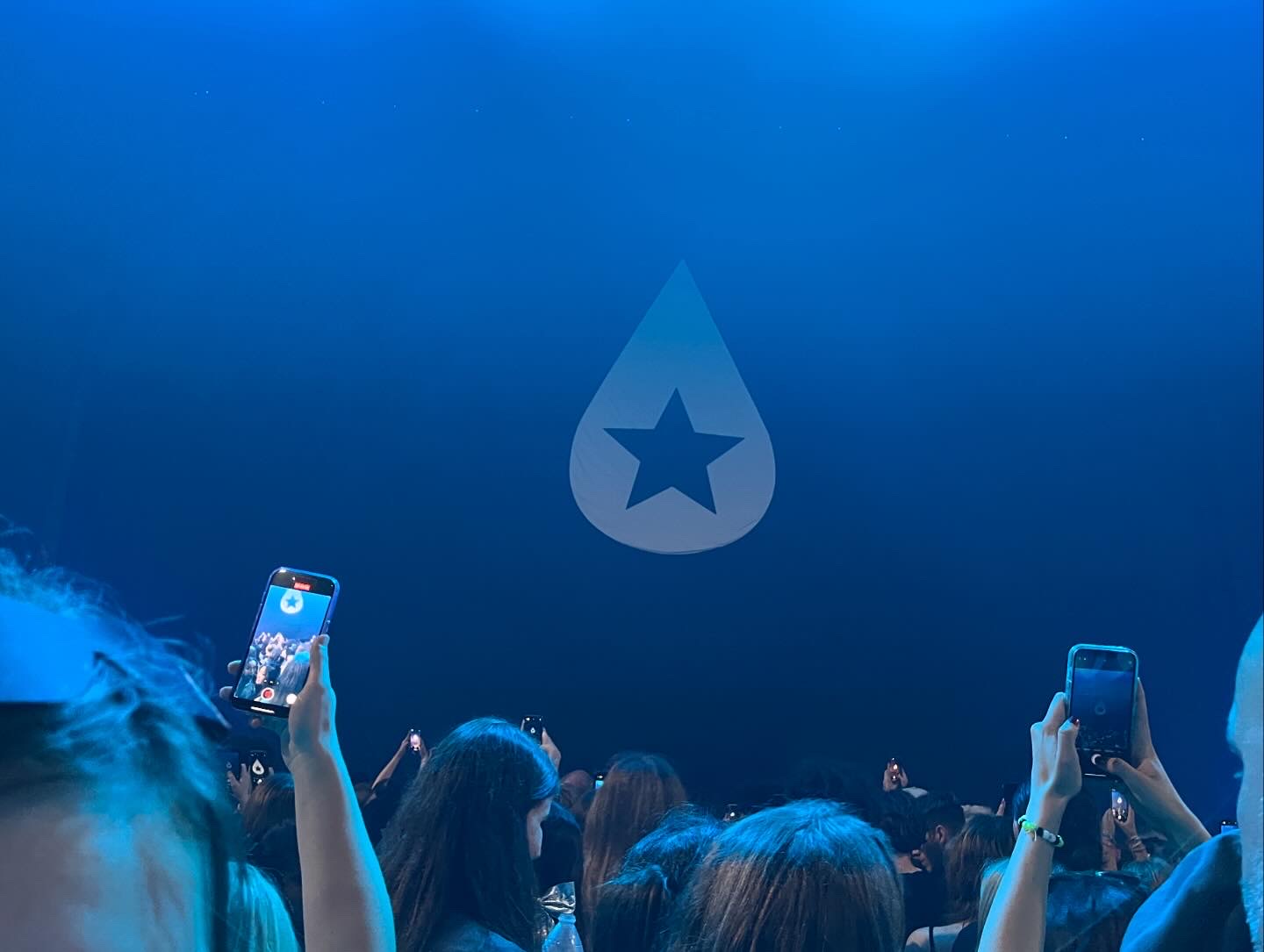
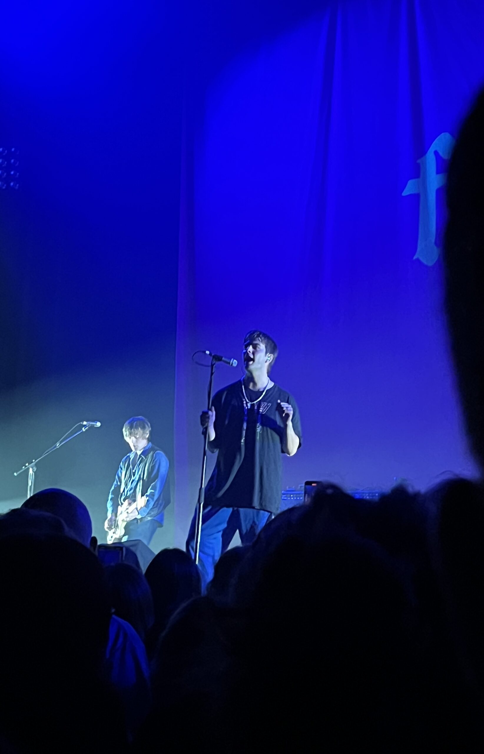
Most recently I was able to go to a music festival in Iowa for a day! This was a lot different than most concerts I’ve been to. It was neat to be able to see a line up of musicians that I liked. While the live music was incredible, it was really overcrowded and super hot. Despite the heat, I had so much fun and was finally able to see Chappell Roan and Ethel Cain live! They had such different vibes but the energy was electric and I’d bear the 96 degree heat all over again.
I do have a concert lined up next month, but we’ll see what happens.
Until then, see ya! Read more of my blog posts below.
Trader Joe’s is a grocery store, and while there aren’t any in SD it’s still one of my favorite grocery stores. It has good prices (perfect for a broke college student like me) and unique products with fun packaging.
I only visit TJ’s occasionally when I visit family and I’m always down to try new things. The neat packaging always draws my eye.
The last time I went, I saw the bright graphics for the Strawberries and Creme Pancake mix and I just had to get it. The vibrant colors and cute strawberries really made an impact. They just had a fun vibe that other boring pancake mix boxes just couldn’t live up to.
Disclaimer: all images in this post are not mine
Even after I made the (mediocre) pancakes, I was drawn to keep parts of the box. I’m crafty and like to make collages in my spare time, so I definitely cut and saved the little strawberries.
This summer has flown by so fast! One thing I like to do every summer is some sort of craft. So I dug out my fabric paint and made some sick custom t-shirts. There’s something cool about bringing a sketched out design to life and then being able to wear it out and about.
Here’s the sketch w/some of the shirt in the background
But yesterday I finished a sketch and thought it was decent enough to actually mock up in Adobe Illustrator. It reminded me of a similar project I did last semester at STC. The goal was to create a school club t-shirt that could potentially be sold in the bookstore. We considered graphic placement, fonts, and school colors.
My goal with this design was to create my own fan merch that was simple and true to the artist. Instead of a actual picture I opted for a silhouette. I used bold contrasting fonts to convey the song lyrics complicated heavy message.
I brought the sketch into illustrator and started tracing it. I liked my initial design, but it was a bit hard to read the bold font.
After some feedback, I expanded the size of the halo to include the text and tried a solid color font.
I like the reworked design (above) but I think the halo could be thinner. The contrast of thickness seems a bit off and the halo and the text seem to be competing for dominance.
Here’s the initial mockup! I added the Ethel Cain logo to the back because some of her merch includes it. (example of her merch below)
I’m gonna look for some more free tshirt psd mock ups, clean up the design and then share the final product with you!
Thanks for reading! Let me know your thoughts and check out my posts below.
Hey yall, I’m back! Before jumping into the software I decided to look for a tutorial. I found this one and it was pretty straightforward. If you’re looking for a tutorial on how to make a zine by hand check out this video from brattyxbre.
So first up is finding inspiration. Right now I’ve been really into musicians Chapell Roan and Ethel Cain. I’d be a shell of myself without Spotify. My zine will be called music on my mind to reflect my current song infatuations.
Now that I have my topic, I split my pages up.
Cover
Intro Page
Artist
Artist
Artist
Artist
Artist
Back
Here’s the rough sketched out page design layout!
Designing
The hardest part is next. I followed this tutorial to figure out my layout in the software. From there I found corresponding fonts and scrapbook-like elements. The colors, elements, and fonts corresponded with the main picture and the vibe of the artist. I got most of my fonts and elements from Adobe Fonts and Adobe Stock Images.
The Final Product
Initially, I had the layout similar to the video tutorial. However I ran into issues figuring out how to print it. More on that below.
Printing
Printing is a different beast entirely. At first, I printed my facing pages as spreads. But I thought I’d be smart and print them doublesided to save on paper. However, my double sided pages didn’t face the same way and one side was up and the other was flipped. To save my remaining sanity I brought the pages into a 8.5″ x 11″ document (split into 8). This allowed me to save on paper and simply fold and cut to make a zine without needing binding. For some reason, I still ended up with a white border after printing. I used the school’s printers but will try UPS next time.
This is how I folded my mini zine!
Thoughts
If I were to do this again (hopefully soon!) I would change a couple of things.
Font Unity
I used a lot of fonts to try to adhere to the featured artist, but doing so made it hard to read and overall not uniform
Readability
I’d change the font size to be legible, it was hard to tell before printing
Printing Process
I ran into patchy ink printing so I’d find another way to print next time
Layout
Instead of doing multiple facing pages, I’d stick to a 8.5 x 11″ split into 8 sections. The simplified layout doesn’t make my head hurt as much and would save money on printing if I decide to sell/print multiple.
What would you make a zine about? Have you made one before? Let me know below π