I’m not sure if anyone noticed, but the KitKat packaging looks different. I wasn’t sure if I was hallucinating or if it had actually changed. But when you put the new and old logos side by side you can start to see the changes.

Maybe I’m just a sucker for the original but the new version feels flat.
It seems as though I’m not the only one that noticed. There are plenty of articles online picking apart the rebranding.
The logic behind the rebrand, according to the branding agency Sterling Brands, is “activating the brand with the upbeat, kinetic energy of Kit Kat’s iconic ‘break.” The rebrand goal seems to aim at selling more product.
My Thoughts
The Pros
- I like the size of the new lettering. The letters all feel they are the size of a broken off kit kat. The dark brown drop shadow adds some depth and is a better choice than black.
- I think getting rid of the pale yellow color makes sense. Cost wise, it’s less ink and less money. I think color palette wise it makes sense to limit your colors as well.
The Cons
- I miss the outer oval swoop. I think it’s fun and dynamic. The newer look just falls flat for some reason.
- I like how the old logo had curved edges in its’ type. The curves reinforced the oval swoop.
For some more reading, check out Fast Company’s article on KitKat.
What do you guys think? Do you like the new logo?
-
how do you even contact your reps?
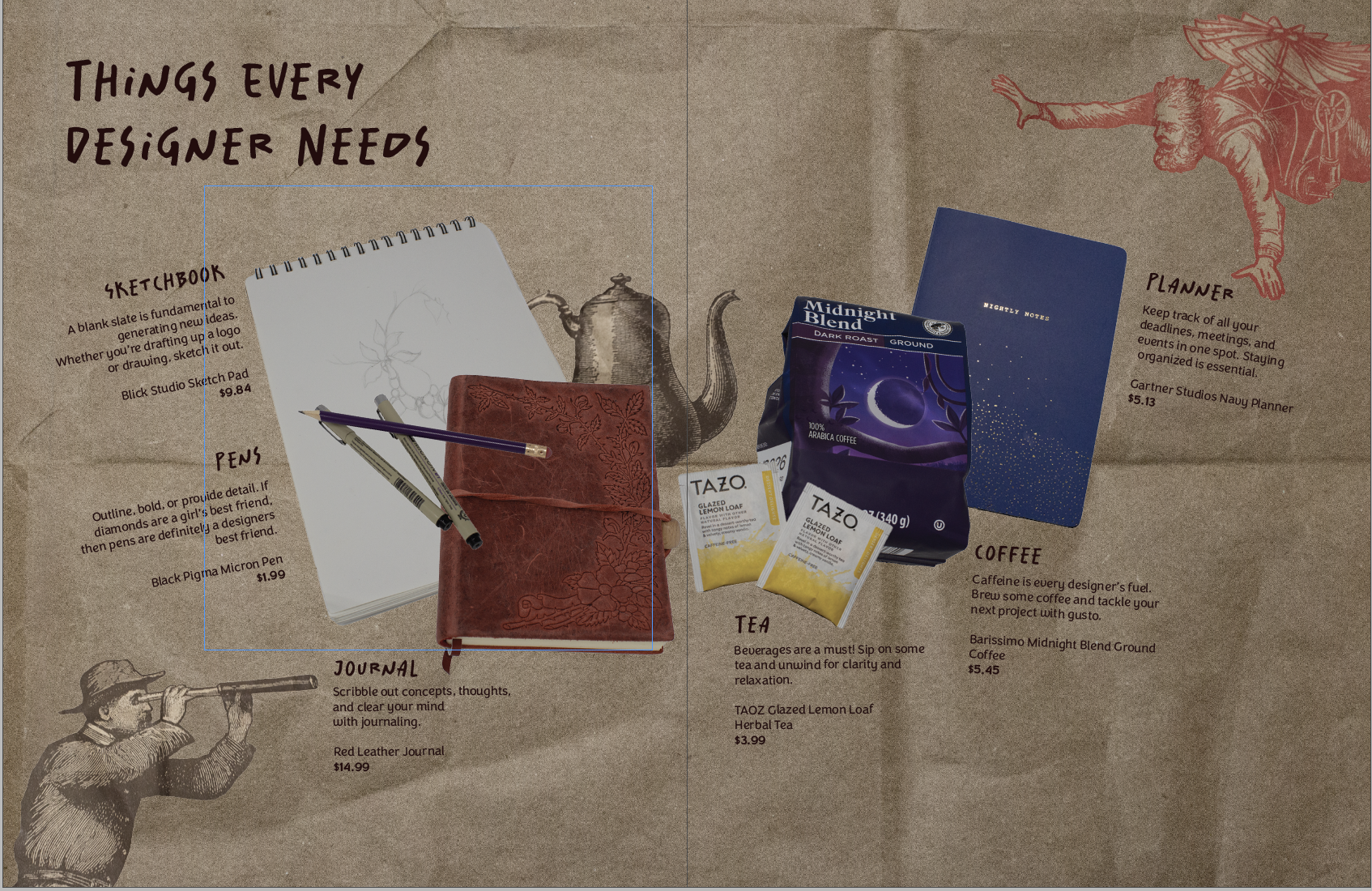
I’ve been wanting to make an informative social media post about contacting reps for my library awareness campaign. So, the only way I could give a lot of helpful information was to do it myself. The Process I didn’t want to go in completely blind so I found some articles. Here’s one on calling reps.…
-
winter break update #3
I’m alive I swear! I’ve been busy with work and catching up on adulting. The current library campaign has also been taking up a lot of my energy. (sdlibraryadvocates on Insta and FB if you wanna take a look!) I’ve been trying to create posts highlighting library resources and spreading awareness of the proposed budget…