
Design is all around us! It’s on labels, posters, papers, hand towels, you name it. So today, I thought I’d look at one of my favorite movies, Labyrinth, through the eyes of a designer.

Labyrinth is a dark 80s fantasy movie with a cast of puppets as well as humans. Because of its genre, the design choices are over the top to portray the whimsical nature of the film. The muted colors, torn/decaying fabrics, and textures, and creepy masquerade masks contribute to the macabre fairytale feel. However, the lavish lace, brick structures, and elaborate costumes cement the viewer in a fantasy world.


The design choices are very intentional and support world-building and character/character growth. One great example is the ballroom dream scene. The main character, teenage Sarah, bites into a peach. This sends her into a dreamlike sleep, where she imagines entering a masquerade ball. Sarah’s big white dress and lack of a mask are symbols of her innocence and naivety as she navigates this more adult-centric scene. Sarah’s white dress and Jareth’s blue sequined suit suggest importance in contrast among the rest of the muted costumes. In this case, the design choices reflect character importance and growth as Sarah is caught between her childhood and impending adulthood.

Here’s a great video of the scene. And then a video of bts, with the team explaining their choices.
As designers, our decisions must have a purpose. After all, our job is to convey a client’s message. So do your research and be able to explain your work and choices.
Happy designing! What should I cover next?
From the blog
Stay up to date with the latest from our blog.
-

design legends you should know #4 David Carson
Rulebreaker, Father of Grunge Typography, prolific surfer. All things that aptly describe David Carson. Carson started out as a high school teacher in Oregon, where…
-

manipulating type in Illustrator
The college homework saga continues! We are currently designing the nameplate, or title, of our magazine. After scrolling through adobe fonts, I finally found my…
-
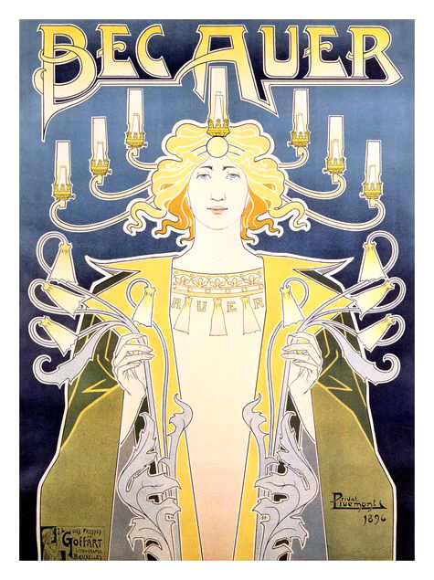
design legends you should know #3 Henri Privat-Livemont
Let me take you way back to the 1890s, when minimalism is out and fanciful Art Nouveau is in. My first exposure to this style…
-
SD AAF student day reflections
I was able to go to the SD AAF (American Advertising Federation) student day! It was such a great opportunity and I thought I’d share…